Fabric Data Days starts November 4th!
Advance your Data & AI career with 50 days of live learning, dataviz contests, hands-on challenges, study groups & certifications and more!
Get registered- Power BI forums
- Get Help with Power BI
- Desktop
- Service
- Report Server
- Power Query
- Mobile Apps
- Developer
- DAX Commands and Tips
- Custom Visuals Development Discussion
- Health and Life Sciences
- Power BI Spanish forums
- Translated Spanish Desktop
- Training and Consulting
- Instructor Led Training
- Dashboard in a Day for Women, by Women
- Galleries
- Data Stories Gallery
- Themes Gallery
- Contests Gallery
- QuickViz Gallery
- Quick Measures Gallery
- Visual Calculations Gallery
- Notebook Gallery
- Translytical Task Flow Gallery
- TMDL Gallery
- R Script Showcase
- Webinars and Video Gallery
- Ideas
- Custom Visuals Ideas (read-only)
- Issues
- Issues
- Events
- Upcoming Events
Get Fabric Certified for FREE during Fabric Data Days. Don't miss your chance! Request now
- Power BI forums
- Forums
- Get Help with Power BI
- Desktop
- Re: Switch Metrics Tip - strange behaviour
- Subscribe to RSS Feed
- Mark Topic as New
- Mark Topic as Read
- Float this Topic for Current User
- Bookmark
- Subscribe
- Printer Friendly Page
- Mark as New
- Bookmark
- Subscribe
- Mute
- Subscribe to RSS Feed
- Permalink
- Report Inappropriate Content
Switch Metrics Tip - strange behaviour
Hi all,
Have a strange behaviour with a line and column chart when simulating a switch measure tip found on forum.
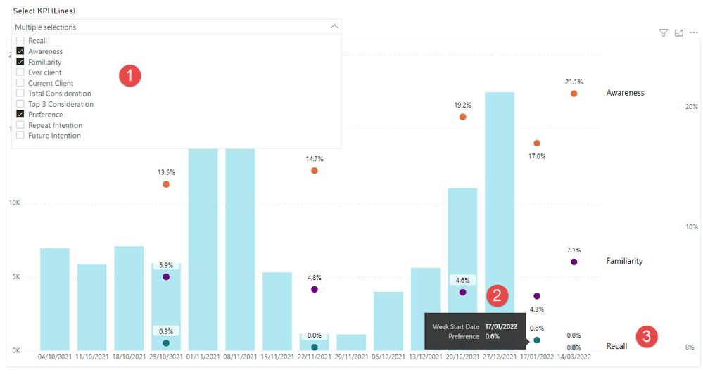
See picture below :
(1) In the slicer I choose 3 KPIs
(2) The tooltip shows the correct KPI name
(3) However the legend shows something else .....and playing around with the KPI slicer it's always "Recall" that shows up
Any help more than welcome
Thanks
ADP
PBIX can be found here Pwer BI - BLM
- Mark as New
- Bookmark
- Subscribe
- Mute
- Subscribe to RSS Feed
- Permalink
- Report Inappropriate Content
Hi @ADP007
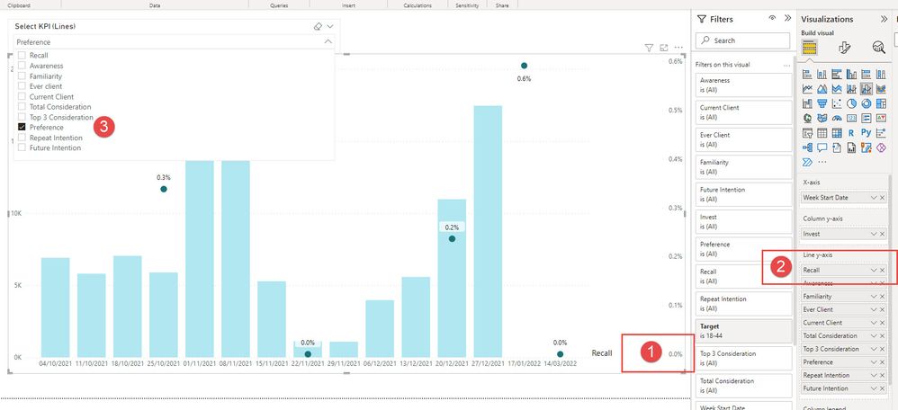
It seems to me that your issue is with the calculation when the value of the Preference is 0 has you can see below if you select only preference the name changes also:
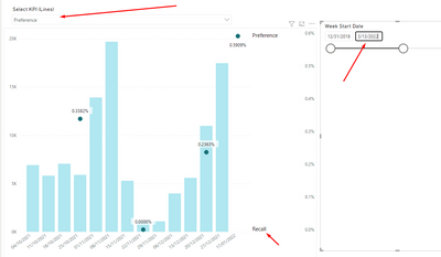
Not really sure what is hapenning here but it seems to be something related with the data since when you also change the filtering of the date has you can see altough only one is selected they both are presented on the chart:
I understand what
Regards
Miguel Félix
Did I answer your question? Mark my post as a solution!
Proud to be a Super User!
Check out my blog: Power BI em Português- Mark as New
- Bookmark
- Subscribe
- Mute
- Subscribe to RSS Feed
- Permalink
- Report Inappropriate Content
Hi @MFelix , thanks for taking your time to look at this.
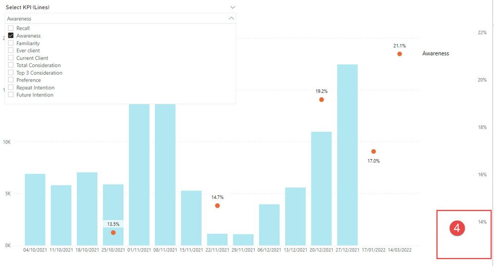
I have played around again with the filters and notice that whenever the value of the secondary y-axis starts at 0 (1) then the label of the first KPI selected in the visual definition is shown (2) probably on top of the label that should be shown (3).
As soon as the secondary y-axis starts with a higher value (4) the label "Recall" is no longer displayed
No idea how to fix this
Helpful resources

Power BI Monthly Update - November 2025
Check out the November 2025 Power BI update to learn about new features.

Fabric Data Days
Advance your Data & AI career with 50 days of live learning, contests, hands-on challenges, study groups & certifications and more!

| User | Count |
|---|---|
| 97 | |
| 70 | |
| 50 | |
| 42 | |
| 40 |


