Join us at the 2025 Microsoft Fabric Community Conference
Microsoft Fabric Community Conference 2025, March 31 - April 2, Las Vegas, Nevada. Use code MSCUST for a $150 discount.
Register now- Power BI forums
- Get Help with Power BI
- Desktop
- Service
- Report Server
- Power Query
- Mobile Apps
- Developer
- DAX Commands and Tips
- Custom Visuals Development Discussion
- Health and Life Sciences
- Power BI Spanish forums
- Translated Spanish Desktop
- Training and Consulting
- Instructor Led Training
- Dashboard in a Day for Women, by Women
- Galleries
- Webinars and Video Gallery
- Data Stories Gallery
- Themes Gallery
- Power BI DataViz World Championships Gallery
- Quick Measures Gallery
- R Script Showcase
- COVID-19 Data Stories Gallery
- Community Connections & How-To Videos
- 2021 MSBizAppsSummit Gallery
- 2020 MSBizAppsSummit Gallery
- 2019 MSBizAppsSummit Gallery
- Events
- Ideas
- Custom Visuals Ideas
- Issues
- Issues
- Events
- Upcoming Events
The Power BI DataViz World Championships are on! With four chances to enter, you could win a spot in the LIVE Grand Finale in Las Vegas. Show off your skills.
- Power BI forums
- Forums
- Get Help with Power BI
- Desktop
- Re: Sum repeating rows as one
- Subscribe to RSS Feed
- Mark Topic as New
- Mark Topic as Read
- Float this Topic for Current User
- Bookmark
- Subscribe
- Printer Friendly Page
- Mark as New
- Bookmark
- Subscribe
- Mute
- Subscribe to RSS Feed
- Permalink
- Report Inappropriate Content
Sum repeating rows as one
Newbie to Power BI. Looking for some help regarding repeating rows.
I have a dataset that has repeating rows because the data is presented by day. The column is a "goal" and is for a specific duration of time, and not for the specific day. When visualized, the "goal" because it is listed in each of the rows is "summed". Is there a way not to have this totaled, and use the value independently?
i.e. Joe wants to lose 100lbs in 90 days. "100 lbs" is repeated in each of the 90 rows (each day). Power BI currently makes this look like Joe's goal is to lose 9000 lbs. (100 lbs * 90 days).
Thanks in advance for any help you can provide.
- Mark as New
- Bookmark
- Subscribe
- Mute
- Subscribe to RSS Feed
- Permalink
- Report Inappropriate Content
@Anonymous
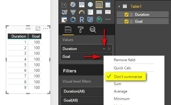
Please try to check Don’t summarize but not Sum in the dropdown menu.
Best Regards,
Herbert
- Mark as New
- Bookmark
- Subscribe
- Mute
- Subscribe to RSS Feed
- Permalink
- Report Inappropriate Content
Thanks Herbert. I think this may get me close, but with the end in mind - perhaps a different example will help illustrate the challenge I am having. I have a flat dataset but there is a hierarchical relationship within the dataset of:
Advertiser>Campaign>Order or put another way...Orders are properties of a Campaign, Campaigns are properties of an Advertiser.
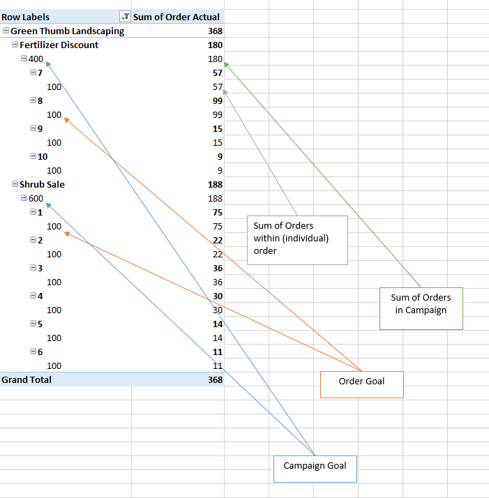
Since the information is presented "by day" for each row, there is certain data from my source system that is "static", and other data that needs to be summed, etc. See the sample dataset below, along with the questions I am trying to answer and how I would want to present it in Power BI. In the past, I would have pivoted it in Excel (also below) and I can't quite put my thumb on whether I should leverage a "Group By" or "Pivot" function in Power BI (which I can't quite figure out anyway).
Pivoted below, this is what I am looking to reproduce in a more visual way in Power BI:
Basically, the questions I am trying to answer are as follows:
- How many Orders have I delivered against my Order Goal?
- How many Orders have I delivered against my Camapign Goal?
- What/How Many Orders belong to a Campaign?
- What are my Toal Order goals for all my campaigns (1,000)? (Power BI would make this look like 5,200)
Hopefully this sheds some more light on my current limitation. I am sure it is a rather simple solution, but being a newbie - I am trying to get out of my own way (with your help). Thanks.
- Mark as New
- Bookmark
- Subscribe
- Mute
- Subscribe to RSS Feed
- Permalink
- Report Inappropriate Content
@Anonymous
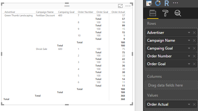
Try with a matrix visual that look like this:
Lima - Peru
- Mark as New
- Bookmark
- Subscribe
- Mute
- Subscribe to RSS Feed
- Permalink
- Report Inappropriate Content
Great call on the matrix view, however looking to do something more visual. I know the issue is inherently that the hierarchical data repeats. Any other suggestions?
- Mark as New
- Bookmark
- Subscribe
- Mute
- Subscribe to RSS Feed
- Permalink
- Report Inappropriate Content
@Anonymous
The matrix visual should be same as the pivoted table in excel. Do you want to look for some other visuals? Except the built-in visuals in Power BI Desktop, you can also find some awesome visuals in https://app.powerbi.com/visuals/. Maybe you can take a look.
Best Regards,
Herbert
- Mark as New
- Bookmark
- Subscribe
- Mute
- Subscribe to RSS Feed
- Permalink
- Report Inappropriate Content
If it's just for aesthetics in a table, have you tried changing the field in the table to show as the 'average' rather than the 'sum'? That way every day will still show 100, but your totals will also reflect 100 as the average of all the repeated goal amounts.
To work with this goal amount independently, say in a DAX measure, the goal should be removed from the table that holds the daily rows (since 100 doesn’t really mean anything to a particular day), and listed separately in to its own 'dimension' table', one row for just Joe, with a goal of 100 (along with the other customers and goals).
Relating these two tables together on customer# will let you work with the goal in a DAX Calculate() measure if need be. You'll be able to use the related goal against any other aggregation from your detail log. i.e. if you keep track daily of each pound lost, you could sum the total pounds lost (from the detail table), then compare them to the goal of 100 from the goal table.
Hope this helps.
Helpful resources

Join us at the Microsoft Fabric Community Conference
March 31 - April 2, 2025, in Las Vegas, Nevada. Use code MSCUST for a $150 discount!

Join our Community Sticker Challenge 2025
If you love stickers, then you will definitely want to check out our Community Sticker Challenge!

| User | Count |
|---|---|
| 124 | |
| 76 | |
| 71 | |
| 57 | |
| 50 |
| User | Count |
|---|---|
| 162 | |
| 84 | |
| 68 | |
| 66 | |
| 61 |


