FabCon is coming to Atlanta
Join us at FabCon Atlanta from March 16 - 20, 2026, for the ultimate Fabric, Power BI, AI and SQL community-led event. Save $200 with code FABCOMM.
Register now!- Power BI forums
- Get Help with Power BI
- Desktop
- Service
- Report Server
- Power Query
- Mobile Apps
- Developer
- DAX Commands and Tips
- Custom Visuals Development Discussion
- Health and Life Sciences
- Power BI Spanish forums
- Translated Spanish Desktop
- Training and Consulting
- Instructor Led Training
- Dashboard in a Day for Women, by Women
- Galleries
- Data Stories Gallery
- Themes Gallery
- Contests Gallery
- QuickViz Gallery
- Quick Measures Gallery
- Visual Calculations Gallery
- Notebook Gallery
- Translytical Task Flow Gallery
- TMDL Gallery
- R Script Showcase
- Webinars and Video Gallery
- Ideas
- Custom Visuals Ideas (read-only)
- Issues
- Issues
- Events
- Upcoming Events
The Power BI Data Visualization World Championships is back! Get ahead of the game and start preparing now! Learn more
- Power BI forums
- Forums
- Get Help with Power BI
- Desktop
- Re: Suggestion on chart with many categories
- Subscribe to RSS Feed
- Mark Topic as New
- Mark Topic as Read
- Float this Topic for Current User
- Bookmark
- Subscribe
- Printer Friendly Page
- Mark as New
- Bookmark
- Subscribe
- Mute
- Subscribe to RSS Feed
- Permalink
- Report Inappropriate Content
Suggestion on chart with many categories
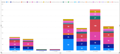
Hi, this bar chart looks kind of silly but I want to show the variety of different customer care categories per day during a week. I don't mind all the cateogies that are small, I would like an easy way to see the name of the largest categories. A grouped bar chart I think is even worse. Is it possible to have something like top 5 categories and the rest as one group to see correct total? Any suggestions?
JG
Solved! Go to Solution.
- Mark as New
- Bookmark
- Subscribe
- Mute
- Subscribe to RSS Feed
- Permalink
- Report Inappropriate Content
The problem with the solution from Curbal is it does not allow any segmentation of the data for a dynamic TopN. It only ranks them based on the total in the data table.
You can create a category table that also contains an 'Other' entry that you join into your main data table.
Categories =
UNION (
    DISTINCT ( 'Table'[Category] ),
    ROW ( "Category", "Other" )
)
Then you can write a measure like this to calculate the top 5 and group the rest in the 'Other' row.
Top 5 + Other
VAR Top_N =
    CALCULATETABLE ( Categories, TOPN ( 5, ALL ( 'Categories' ), [Amount] ) )
RETURN
    IF (
        NOT ISFILTERED ( 'Categories'[Category] ), CALCULATE ( [Amount], ALL ( 'Categories' ) ),
        IF ( SELECTEDVALUE ( 'Categories'[Category] ) = "Other",
            CALCULATE ( [Amount], EXCEPT ( ALL ( 'Categories' ), Top_N ) ),
            CALCULATE ( [Amount], INTERSECT ( 'Categories', Top_N ) )
        )
    )
[Amount] is simply the measure you are showing in your chart.
Then you replace the Category in your whart with the Category from the new Categories table you created (the one with the 'Other' row in it) to your chart.
- Mark as New
- Bookmark
- Subscribe
- Mute
- Subscribe to RSS Feed
- Permalink
- Report Inappropriate Content
Hi @JGG ,
Is your issue solved now?
If not,check the blog below:
https://www.sqlbi.com/articles/showing-the-top-5-products-and-others-row/
Best Regards,
Kelly
Did I answer your question? Mark my post as a solution!
- Mark as New
- Bookmark
- Subscribe
- Mute
- Subscribe to RSS Feed
- Permalink
- Report Inappropriate Content
- Mark as New
- Bookmark
- Subscribe
- Mute
- Subscribe to RSS Feed
- Permalink
- Report Inappropriate Content
The problem with the solution from Curbal is it does not allow any segmentation of the data for a dynamic TopN. It only ranks them based on the total in the data table.
You can create a category table that also contains an 'Other' entry that you join into your main data table.
Categories =
UNION (
    DISTINCT ( 'Table'[Category] ),
    ROW ( "Category", "Other" )
)
Then you can write a measure like this to calculate the top 5 and group the rest in the 'Other' row.
Top 5 + Other
VAR Top_N =
    CALCULATETABLE ( Categories, TOPN ( 5, ALL ( 'Categories' ), [Amount] ) )
RETURN
    IF (
        NOT ISFILTERED ( 'Categories'[Category] ), CALCULATE ( [Amount], ALL ( 'Categories' ) ),
        IF ( SELECTEDVALUE ( 'Categories'[Category] ) = "Other",
            CALCULATE ( [Amount], EXCEPT ( ALL ( 'Categories' ), Top_N ) ),
            CALCULATE ( [Amount], INTERSECT ( 'Categories', Top_N ) )
        )
    )
[Amount] is simply the measure you are showing in your chart.
Then you replace the Category in your whart with the Category from the new Categories table you created (the one with the 'Other' row in it) to your chart.
Helpful resources

Power BI Dataviz World Championships
The Power BI Data Visualization World Championships is back! Get ahead of the game and start preparing now!

Power BI Monthly Update - November 2025
Check out the November 2025 Power BI update to learn about new features.

| User | Count |
|---|---|
| 59 | |
| 46 | |
| 42 | |
| 23 | |
| 17 |
| User | Count |
|---|---|
| 190 | |
| 122 | |
| 96 | |
| 66 | |
| 47 |

