A new Data Days event is coming soon!
This time we’re going bigger than ever. Fabric, Power BI, SQL, AI and more. We're covering it all. You won't want to miss it.
Learn more- Power BI forums
- Get Help with Power BI
- Desktop
- Service
- Report Server
- Power Query
- Mobile Apps
- Developer
- DAX Commands and Tips
- Custom Visuals Development Discussion
- Health and Life Sciences
- Power BI Spanish forums
- Translated Spanish Desktop
- Training and Consulting
- Instructor Led Training
- Dashboard in a Day for Women, by Women
- Galleries
- Data Stories Gallery
- Themes Gallery
- Contests Gallery
- QuickViz Gallery
- Quick Measures Gallery
- Visual Calculations Gallery
- Notebook Gallery
- Translytical Task Flow Gallery
- TMDL Gallery
- R Script Showcase
- Webinars and Video Gallery
- Ideas
- Custom Visuals Ideas (read-only)
- Issues
- Issues
- Events
- Upcoming Events
Level up your Power BI skills this month - build one visual each week and tell better stories with data! Get started
- Power BI forums
- Forums
- Get Help with Power BI
- Desktop
- Re: Structuring data for radar chart
- Subscribe to RSS Feed
- Mark Topic as New
- Mark Topic as Read
- Float this Topic for Current User
- Bookmark
- Subscribe
- Printer Friendly Page
- Mark as New
- Bookmark
- Subscribe
- Mute
- Subscribe to RSS Feed
- Permalink
- Report Inappropriate Content
Structuring data for radar chart
Hi All, this forum has been super useful in my PowerBI learning journey as I'm able to solve 80% of the questions just from reading this forum alone !
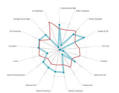
However, recently I've encountered some issues to produce the following visual with Radar Chart, where i would like to overlay each City (represented by different coloured lines) as I toggle the City Name in the slicer:
My sample data set used to generate the above radar chart is as follows:
City | Attributes | Rank |
Adelaide | Crime Rate | 1 |
Adelaide | Unemployment Rate | 3 |
Adelaide | English Proficiency | 1 |
Adelaide | GDP | 2 |
Adelaide | Air Passenger | 3 |
Beijing | Crime Rate | 2 |
Beijing | Unemployment Rate | 1 |
Beijing | English Proficiency | 2 |
Beijing | GDP | 1 |
Beijing | Air Passenger | 1 |
Pune | Crime Rate | 3 |
Pune | Unemployment Rate | 2 |
Pune | English Proficiency | 3 |
Pune | GDP | 3 |
Pune | Air Passenger | 3 |
Currently, i've placed "Attributes" under Category and "Rank" under Y-Axis. I can't pivot the City column as it is the main link in the relationship to my other data sets.
Appreciate if anyone has a good suggestion to the above visual.
Thank you !
- Mark as New
- Bookmark
- Subscribe
- Mute
- Subscribe to RSS Feed
- Permalink
- Report Inappropriate Content
How to fill custom colors for each circle of this radar chart as similar to Excel filled radar chart.
- Mark as New
- Bookmark
- Subscribe
- Mute
- Subscribe to RSS Feed
- Permalink
- Report Inappropriate Content
HI @slackerhx,
I'd like to suggest you to take a look at following link to know how to achieve multiple axis.
Power BI Custom Visuals - Radar Chart
Regards,
Xiaoxin Sheng
- Mark as New
- Bookmark
- Subscribe
- Mute
- Subscribe to RSS Feed
- Permalink
- Report Inappropriate Content
Hi Xiaoxin,
Thanks for the suggestion, unfortunately, it doesn't achieve my intended visuals as the Category section only accepts one field instead of two (which for my case is "City" and "Attributes").
I've also tried pivoting the respective attributes to form column names with the values filled by the respective ranks of each city but it still doesn't achieve the desired outcome.
- Mark as New
- Bookmark
- Subscribe
- Mute
- Subscribe to RSS Feed
- Permalink
- Report Inappropriate Content
HI @slackerhx,
For this requirem, you can submit an idea or contact custom visual team to get more support.
In my opinion, I think current it impossible to achieve your requirement on radar visual.
BTW, you can also try to use R visual to draw these graph.
Regards,
Xiaoxin Sheng
- Mark as New
- Bookmark
- Subscribe
- Mute
- Subscribe to RSS Feed
- Permalink
- Report Inappropriate Content
Hi Xiaoxin @Anonymous,
Does plotly requires one to be well-verse in R script as I don't have any knowledge of it? Are there any other alternatives that can be used?
Thank you.
- Mark as New
- Bookmark
- Subscribe
- Mute
- Subscribe to RSS Feed
- Permalink
- Report Inappropriate Content
HI @slackerhx,
Nope, I haven't found any other custom visual can achieve this, maybe you can contact to custom visual team to submit this requirement.
Regards,
Xiaoxin Sheng
- Mark as New
- Bookmark
- Subscribe
- Mute
- Subscribe to RSS Feed
- Permalink
- Report Inappropriate Content
Dear Xiaoxin,
Thanks, i've submitted an idea at
Helpful resources

Power BI Monthly Update - April 2026
Check out the April 2026 Power BI update to learn about new features.

Data Days 2026 coming soon!
Sign up to receive a private message when registration opens and key events begin.

New to Fabric Survey
If you have recently started exploring Fabric, we'd love to hear how it's going. Your feedback can help with product improvements.

| User | Count |
|---|---|
| 36 | |
| 28 | |
| 28 | |
| 21 | |
| 18 |
| User | Count |
|---|---|
| 68 | |
| 39 | |
| 33 | |
| 24 | |
| 23 |

