FabCon is coming to Atlanta
Join us at FabCon Atlanta from March 16 - 20, 2026, for the ultimate Fabric, Power BI, AI and SQL community-led event. Save $200 with code FABCOMM.
Register now!- Power BI forums
- Get Help with Power BI
- Desktop
- Service
- Report Server
- Power Query
- Mobile Apps
- Developer
- DAX Commands and Tips
- Custom Visuals Development Discussion
- Health and Life Sciences
- Power BI Spanish forums
- Translated Spanish Desktop
- Training and Consulting
- Instructor Led Training
- Dashboard in a Day for Women, by Women
- Galleries
- Data Stories Gallery
- Themes Gallery
- Contests Gallery
- Quick Measures Gallery
- Notebook Gallery
- Translytical Task Flow Gallery
- TMDL Gallery
- R Script Showcase
- Webinars and Video Gallery
- Ideas
- Custom Visuals Ideas (read-only)
- Issues
- Issues
- Events
- Upcoming Events
Calling all Data Engineers! Fabric Data Engineer (Exam DP-700) live sessions are back! Starting October 16th. Sign up.
- Power BI forums
- Forums
- Get Help with Power BI
- Desktop
- Re: Stacked column chart not displaying all the Ba...
- Subscribe to RSS Feed
- Mark Topic as New
- Mark Topic as Read
- Float this Topic for Current User
- Bookmark
- Subscribe
- Printer Friendly Page
- Mark as New
- Bookmark
- Subscribe
- Mute
- Subscribe to RSS Feed
- Permalink
- Report Inappropriate Content
Stacked column chart not displaying all the Bars on X axis
Hi,
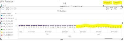
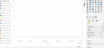
Could you please help in resolving the issue. One of our dashboard is using 'Stacked column chart' visual which suddenly not displaying Bars on visual. The dashboard is having Date slicer from 1st of Feb 2020 to till date. If I don't make Date selection, the bars on the visual are not displaying from the 1st of June (last 3 months). If I make date selection the bars are displaying data for the last 3 months.
The issue is if I don't make any filter selection on date the dashboard is not displaying data for last 3 months. I have attached screenshots of the issue.
Thanks
Raghu
- Mark as New
- Bookmark
- Subscribe
- Mute
- Subscribe to RSS Feed
- Permalink
- Report Inappropriate Content
Hi @raghukumarch,
Any update on your requirement? Did these suggestions help with your scenario? If that is the case, you can consider Kudo or accept the useful suggestions to help others who faced similar requirements to find them more quickly.
If these also don't help, please share more detailed information to help us clarify your scenario to test.
How to Get Your Question Answered Quickly
Regards,
Xiaoxin Sheng
- Mark as New
- Bookmark
- Subscribe
- Mute
- Subscribe to RSS Feed
- Permalink
- Report Inappropriate Content
Hi @raghukumarch,
I think this should be related to your records amounts. (they are too small to display with other values)
For this scenario, you can consider changing the axis units and start/end ranges to show all the data bars at the same time.
Customize X-axis and Y-axis properties - Power BI | Microsoft Docs
Regards,
Xiaoxin Sheng
- Mark as New
- Bookmark
- Subscribe
- Mute
- Subscribe to RSS Feed
- Permalink
- Report Inappropriate Content
@raghukumarch , can you share the measure used. Because when you did filter the date, it may take max date from the date table.
You can think of setting default value for date slicer
Default Date Today/ This Month / This Year: https://www.youtube.com/watch?v=hfn05preQYA&list=PLPaNVDMhUXGaaqV92SBD5X2hk3TMNlHhb&index=35
- Mark as New
- Bookmark
- Subscribe
- Mute
- Subscribe to RSS Feed
- Permalink
- Report Inappropriate Content
Hi Amit,
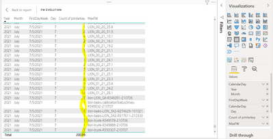
Thanks for responding to my post. we are not using any measure. we are using max of one of the table column on visual.
The data is displaying if I use any other visual. for example table visual. the problem with stacked column visual which is not displaying the bars on x-axis. I tested the same visual converting it into table visual. please find the below screenshot.


