FabCon is coming to Atlanta
Join us at FabCon Atlanta from March 16 - 20, 2026, for the ultimate Fabric, Power BI, AI and SQL community-led event. Save $200 with code FABCOMM.
Register now!- Power BI forums
- Get Help with Power BI
- Desktop
- Service
- Report Server
- Power Query
- Mobile Apps
- Developer
- DAX Commands and Tips
- Custom Visuals Development Discussion
- Health and Life Sciences
- Power BI Spanish forums
- Translated Spanish Desktop
- Training and Consulting
- Instructor Led Training
- Dashboard in a Day for Women, by Women
- Galleries
- Data Stories Gallery
- Themes Gallery
- Contests Gallery
- Quick Measures Gallery
- Notebook Gallery
- Translytical Task Flow Gallery
- TMDL Gallery
- R Script Showcase
- Webinars and Video Gallery
- Ideas
- Custom Visuals Ideas (read-only)
- Issues
- Issues
- Events
- Upcoming Events
To celebrate FabCon Vienna, we are offering 50% off select exams. Ends October 3rd. Request your discount now.
- Power BI forums
- Forums
- Get Help with Power BI
- Desktop
- Stacked bar chart with date value
- Subscribe to RSS Feed
- Mark Topic as New
- Mark Topic as Read
- Float this Topic for Current User
- Bookmark
- Subscribe
- Printer Friendly Page
- Mark as New
- Bookmark
- Subscribe
- Mute
- Subscribe to RSS Feed
- Permalink
- Report Inappropriate Content
Stacked bar chart with date value
Dear Power BI community,
I am currently working on a graph that shows the status of various projects. The basic idea is the show the data on the x axis, and horizontal bars representing the timespan of the project on the y-axis.
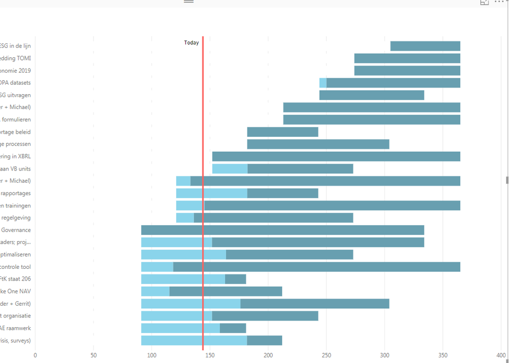
Since it is not possible to use the date as a value, I had to use a workaround. The workaround consists of using a a stacked bar chart and converted date columns, using the days of the year instead of the date values. I added a vertical line representing 'today'. The stacked bars consist of a component that is the days of the year that the project hasn't started (component is in the color white so that it is not visible), another component that is progression in the project (measured as the percentage of progression * (end day-beginning day)), and a final component that is the amount of work that still has to be done ((end day-beginning day-progression in the project).
This results in the stacked bar chart depicted below:
There are two problems with this approach.
1) One of the requirements is that I show the date on the x-axis. Now it shows the days of the year. Would it somehow be possible to convert the 'days of year' to a date value in the labels?
2) One of the requirements is that the bar should have conditional formatting; the light blue portion should be green of the current progress is satisfactory and red if the progress is not considered satisfactory (whether the progress is satisfactory is deteremined by a text value in another column).
I am afraid that I might need to use a different approach than using the stacked bar chart. Suggestions on how to create a graph that meets my requirements would be really welcome.
Thanks in advance for your help.
Kind regards,
Martijn
- Mark as New
- Bookmark
- Subscribe
- Mute
- Subscribe to RSS Feed
- Permalink
- Report Inappropriate Content
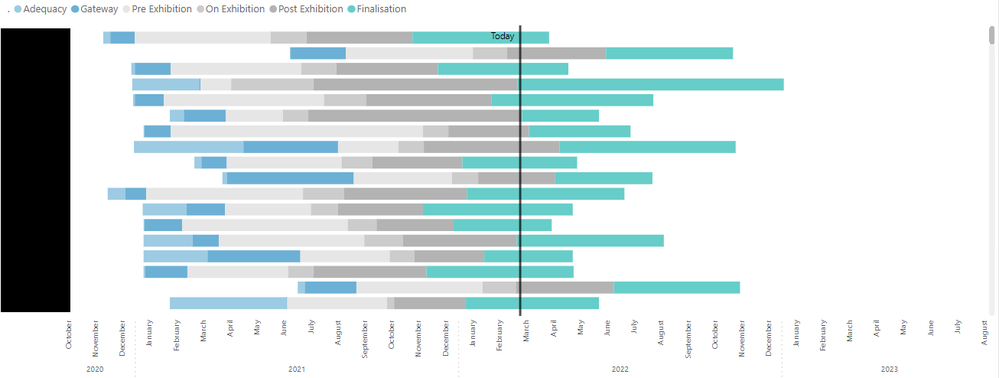
I used a line chart with a date axis behind the stacked bar to achieve this. You have to make sure that the date axis of the line chart and the X-Axis of the bar chart are in sync. Both the axis are dynamic based on the filters applied on the charts and always in sync.
- Mark as New
- Bookmark
- Subscribe
- Mute
- Subscribe to RSS Feed
- Permalink
- Report Inappropriate Content
Hi,
Came across this, trying to do something very like this, can you please share some of the steps that you used etc.
Thanks
- Mark as New
- Bookmark
- Subscribe
- Mute
- Subscribe to RSS Feed
- Permalink
- Report Inappropriate Content
Hello @Anonymous
Could you please explain how you did the x axis so beautifully? And how are the two visuals synched? Would be really grateful.
Best regards,
Xeniia
- Mark as New
- Bookmark
- Subscribe
- Mute
- Subscribe to RSS Feed
- Permalink
- Report Inappropriate Content
Hi @MWN1990
Have you got the solution which you were looking for? I am also having similar problem?
Thanks and Regards,
Nilesh
- Mark as New
- Bookmark
- Subscribe
- Mute
- Subscribe to RSS Feed
- Permalink
- Report Inappropriate Content
Hi MWN1990,
Based on your description, you can add days to 1/1 of that year. Firstly you should format your column like yyyy/01/01, then you can use function like dateadd(table[columns], days_number, day) to convert the days to a date value.
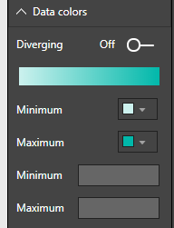
In addtion, to conditionally format the value in stacked bar chart, drag the column to Color saturation in Fields pane, then click Format pane-> Data colors, you can set minimun value and maximun value here:

Regards,
Jimmy Tao


