Join us at FabCon Vienna from September 15-18, 2025
The ultimate Fabric, Power BI, SQL, and AI community-led learning event. Save €200 with code FABCOMM.
Get registered- Power BI forums
- Get Help with Power BI
- Desktop
- Service
- Report Server
- Power Query
- Mobile Apps
- Developer
- DAX Commands and Tips
- Custom Visuals Development Discussion
- Health and Life Sciences
- Power BI Spanish forums
- Translated Spanish Desktop
- Training and Consulting
- Instructor Led Training
- Dashboard in a Day for Women, by Women
- Galleries
- Data Stories Gallery
- Themes Gallery
- Contests Gallery
- Quick Measures Gallery
- Notebook Gallery
- Translytical Task Flow Gallery
- TMDL Gallery
- R Script Showcase
- Webinars and Video Gallery
- Ideas
- Custom Visuals Ideas (read-only)
- Issues
- Issues
- Events
- Upcoming Events
Enhance your career with this limited time 50% discount on Fabric and Power BI exams. Ends September 15. Request your voucher.
- Power BI forums
- Forums
- Get Help with Power BI
- Desktop
- Re: Stacked bar chart help to use multiple values
- Subscribe to RSS Feed
- Mark Topic as New
- Mark Topic as Read
- Float this Topic for Current User
- Bookmark
- Subscribe
- Printer Friendly Page
- Mark as New
- Bookmark
- Subscribe
- Mute
- Subscribe to RSS Feed
- Permalink
- Report Inappropriate Content
Stacked bar chart help to use multiple values
I've 3 tables
Table - GroupData (GroupName, MaxCount)
WorkData(GroupName, HostName, CategoryName, Count, Date)
Calendar(Date, Year)
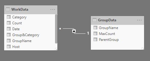
GroupData and WorkData are mapped 1-Many and Calendar-GroupData is 1-Many
On the stacked bar chart, i want to display the Group Max count along with counts for each category in the group and legend. I am unable to use multiple values along with legend i.e., use GroupData (MaxCount) and WorkData(Count) for every category (legend)
GroupData
| ParentGroup | GroupName | MaxCount |
| 1 | A | 100 |
| 1 | B | 200 |
| 2 | C | 150 |
| 3 | D | 75 |
WorkData
| Date | GroupName | Category | Host | Count |
| 03-18-2020 | A | A1 | Host1 | 10 |
| 03-18-2020 | A | A2 | Host2 | 70 |
| 03-18-2020 | A | A1 | Host3 | 5 |
| 03-19-2020 | A | A2 | Host1 | 20 |
| 03-20-2020 | B | A1 | Host10 | 15 |
| 03-20-2020 | B | A2 | Host11 | 20 |
| 03-18-2020 | C | A2 | Host14 | 15 |
| 03-19-2020 | C | A1 | Host14 | 25 |
please help. TIA
Solved! Go to Solution.
- Mark as New
- Bookmark
- Subscribe
- Mute
- Subscribe to RSS Feed
- Permalink
- Report Inappropriate Content
Hi,
Please try to create this table first:
Table = UNION(DISTINCT('WorkData'[Category]),{{"MaxCount"}})Then try this measure:
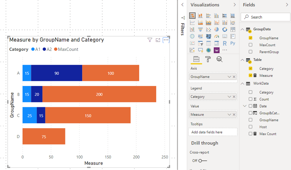
Measure = SWITCH(SELECTEDVALUE('Table'[Category]),"MaxCount",MAX('GroupData'[MaxCount]),CALCULATE(SUM(WorkData[Count]),FILTER('WorkData','WorkData'[Category] in DISTINCT('Table'[Category]))))The result shows:
Here is my changed pbix file:
Best Regards,
Giotto Zhi
- Mark as New
- Bookmark
- Subscribe
- Mute
- Subscribe to RSS Feed
- Permalink
- Report Inappropriate Content
Hi,
According to your description, i choose GroupData and WorkData tables to test without calendar table.
Then try to create a calculated column first:
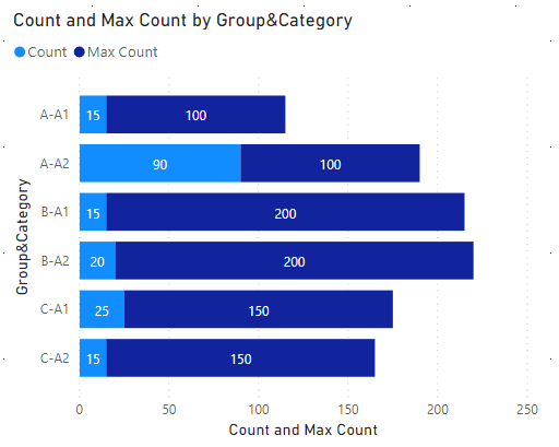
Group&Category = WorkData[GroupName]&"-"&WorkData[Category]Try this measure:
Max Count = CALCULATE(SUM(GroupData[MaxCount]),FILTER(WorkData,WorkData[GroupName] in FILTERS(GroupData[GroupName])))Choose the above column,measure and [Count] as a stacked bar chart, it shows:
Here is my test pbix file:
Hope this helps.
Best Regards,
Giotto Zhi
- Mark as New
- Bookmark
- Subscribe
- Mute
- Subscribe to RSS Feed
- Permalink
- Report Inappropriate Content
Thank you for you help but requirement has changed and this isn't needed any more. The output i was looking for is as below. Also, legend needs to show the category names
- Mark as New
- Bookmark
- Subscribe
- Mute
- Subscribe to RSS Feed
- Permalink
- Report Inappropriate Content
- Mark as New
- Bookmark
- Subscribe
- Mute
- Subscribe to RSS Feed
- Permalink
- Report Inappropriate Content
Hi,
If my answer has solved your issue, please mark it as a solution for others to see.
Thanks!
Best Regards,
Giotto Zhi
- Mark as New
- Bookmark
- Subscribe
- Mute
- Subscribe to RSS Feed
- Permalink
- Report Inappropriate Content
Hi,
Please try to create this table first:
Table = UNION(DISTINCT('WorkData'[Category]),{{"MaxCount"}})Then try this measure:
Measure = SWITCH(SELECTEDVALUE('Table'[Category]),"MaxCount",MAX('GroupData'[MaxCount]),CALCULATE(SUM(WorkData[Count]),FILTER('WorkData','WorkData'[Category] in DISTINCT('Table'[Category]))))The result shows:
Here is my changed pbix file:
Best Regards,
Giotto Zhi
- Mark as New
- Bookmark
- Subscribe
- Mute
- Subscribe to RSS Feed
- Permalink
- Report Inappropriate Content
You need a disconnected table for your legend that lists your groups and then something like "MaxCount". Then a measure that returns the correct values based upon the slicer value. See the Disconnected Table Trick as this article demonstrates: https://community.powerbi.com/t5/Community-Blog/Solving-Attendance-with-the-Disconnected-Table-Trick...
Follow on LinkedIn
@ me in replies or I'll lose your thread!!!
Instead of a Kudo, please vote for this idea
Become an expert!: Enterprise DNA
External Tools: MSHGQM
YouTube Channel!: Microsoft Hates Greg
Latest book!: DAX For Humans
DAX is easy, CALCULATE makes DAX hard...
- Mark as New
- Bookmark
- Subscribe
- Mute
- Subscribe to RSS Feed
- Permalink
- Report Inappropriate Content
Thank you for your quick reply but I do not understand how that would fit into my issue
It seems, if i can group by, pivot the WorkData table by category and merge the data by groupName to extract MaxCount, i would be able to easily plot the graph. I tested this in Excel but still cannot figure out how to acheive the same in power bi
Helpful resources
| User | Count |
|---|---|
| 69 | |
| 69 | |
| 66 | |
| 54 | |
| 28 |
| User | Count |
|---|---|
| 112 | |
| 82 | |
| 66 | |
| 48 | |
| 43 |


