FabCon is coming to Atlanta
Join us at FabCon Atlanta from March 16 - 20, 2026, for the ultimate Fabric, Power BI, AI and SQL community-led event. Save $200 with code FABCOMM.
Register now!- Power BI forums
- Get Help with Power BI
- Desktop
- Service
- Report Server
- Power Query
- Mobile Apps
- Developer
- DAX Commands and Tips
- Custom Visuals Development Discussion
- Health and Life Sciences
- Power BI Spanish forums
- Translated Spanish Desktop
- Training and Consulting
- Instructor Led Training
- Dashboard in a Day for Women, by Women
- Galleries
- Data Stories Gallery
- Themes Gallery
- Contests Gallery
- QuickViz Gallery
- Quick Measures Gallery
- Visual Calculations Gallery
- Notebook Gallery
- Translytical Task Flow Gallery
- TMDL Gallery
- R Script Showcase
- Webinars and Video Gallery
- Ideas
- Custom Visuals Ideas (read-only)
- Issues
- Issues
- Events
- Upcoming Events
The Power BI Data Visualization World Championships is back! Get ahead of the game and start preparing now! Learn more
- Power BI forums
- Forums
- Get Help with Power BI
- Desktop
- Stacked bar chart default color for a single categ...
- Subscribe to RSS Feed
- Mark Topic as New
- Mark Topic as Read
- Float this Topic for Current User
- Bookmark
- Subscribe
- Printer Friendly Page
- Mark as New
- Bookmark
- Subscribe
- Mute
- Subscribe to RSS Feed
- Permalink
- Report Inappropriate Content
Stacked bar chart default color for a single category
I've generated a stacked column chart to display the count of Boolean values for YES and NO. However, since the data field lacks information for NO, I'm only seeing the count for YES. Despite this, I'm unable to change the color of the bar. Assistance in resolving this issue would be greatly appreciated.
Solved! Go to Solution.
- Mark as New
- Bookmark
- Subscribe
- Mute
- Subscribe to RSS Feed
- Permalink
- Report Inappropriate Content
Hi @achand ,
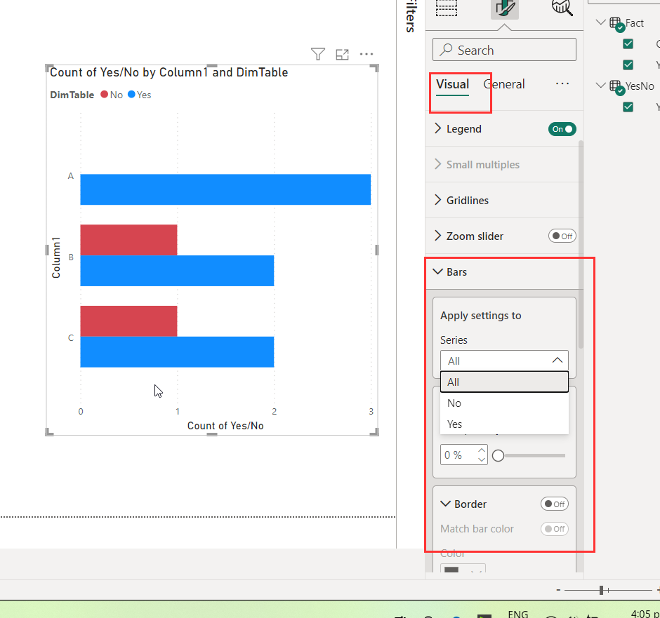
You can make a No row exist in your fact table but appending a row or you can create a separate Yes/No dimensions table and relate to fact. You then use this dimension column in your bar so you'll have the option to format the bar for No. Please refer to the attached pbix for details.
Dane Belarmino | Microsoft MVP | Proud to be a Super User!
Did I answer your question? Mark my post as a solution!
"Tell me and I’ll forget; show me and I may remember; involve me and I’ll understand."
Need Power BI consultation, get in touch with me on LinkedIn or hire me on UpWork.
Learn with me on YouTube @DAXJutsu or follow my page on Facebook @DAXJutsuPBI.
- Mark as New
- Bookmark
- Subscribe
- Mute
- Subscribe to RSS Feed
- Permalink
- Report Inappropriate Content
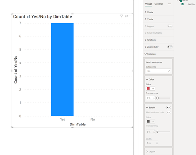
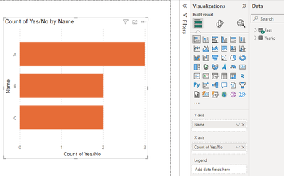
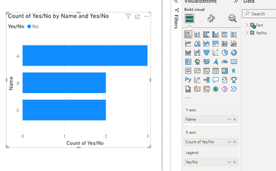
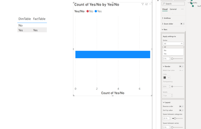
I've attached a snippet below to provide clarity on the matter. Below there's a stacked bar chart with a Legend added on the second chart, while the first one lacks it. Interestingly, I can modify the color of the bars on chart without Legend, but I'm encountering difficulty in changing the color on the chart with Legend.
- Mark as New
- Bookmark
- Subscribe
- Mute
- Subscribe to RSS Feed
- Permalink
- Report Inappropriate Content
The option to change the color of a legend should be in Bars tile under Formatting pane.
Dane Belarmino | Microsoft MVP | Proud to be a Super User!
Did I answer your question? Mark my post as a solution!
"Tell me and I’ll forget; show me and I may remember; involve me and I’ll understand."
Need Power BI consultation, get in touch with me on LinkedIn or hire me on UpWork.
Learn with me on YouTube @DAXJutsu or follow my page on Facebook @DAXJutsuPBI.
- Mark as New
- Bookmark
- Subscribe
- Mute
- Subscribe to RSS Feed
- Permalink
- Report Inappropriate Content
Yes I know, but when there's no data available for the NO category, attempting to change the color for the YES category is restricted. Despite the restriction on changing the color for the YES category when there's no data available for the NO category, I found a workaround. I created a separate table with values for the NO category, appended it to the main table, and this successfully resolved the issue. However, if there's an alternative solution available, I would greatly appreciate it.
Thank you so much!
- Mark as New
- Bookmark
- Subscribe
- Mute
- Subscribe to RSS Feed
- Permalink
- Report Inappropriate Content
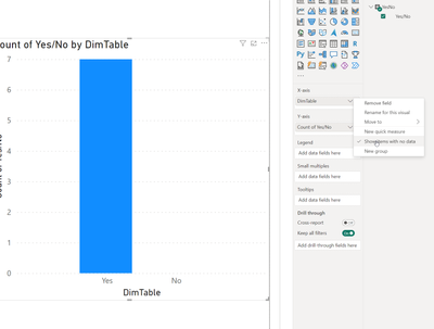
I did mention appending an extra row in my initial reply. Also using a separate dimenions table would have also worked. In the pbix I attached, No doesnt exist in fact but in the dimensions table so you can still format the No in the dimensions table as it exists there. You'll just have to use the column from that table instead and enable show items with no data before formatting the legend.
Dane Belarmino | Microsoft MVP | Proud to be a Super User!
Did I answer your question? Mark my post as a solution!
"Tell me and I’ll forget; show me and I may remember; involve me and I’ll understand."
Need Power BI consultation, get in touch with me on LinkedIn or hire me on UpWork.
Learn with me on YouTube @DAXJutsu or follow my page on Facebook @DAXJutsuPBI.
Helpful resources

Power BI Dataviz World Championships
The Power BI Data Visualization World Championships is back! Get ahead of the game and start preparing now!

| User | Count |
|---|---|
| 39 | |
| 35 | |
| 33 | |
| 32 | |
| 29 |
| User | Count |
|---|---|
| 136 | |
| 96 | |
| 77 | |
| 67 | |
| 65 |
