FabCon is coming to Atlanta
Join us at FabCon Atlanta from March 16 - 20, 2026, for the ultimate Fabric, Power BI, AI and SQL community-led event. Save $200 with code FABCOMM.
Register now!- Power BI forums
- Get Help with Power BI
- Desktop
- Service
- Report Server
- Power Query
- Mobile Apps
- Developer
- DAX Commands and Tips
- Custom Visuals Development Discussion
- Health and Life Sciences
- Power BI Spanish forums
- Translated Spanish Desktop
- Training and Consulting
- Instructor Led Training
- Dashboard in a Day for Women, by Women
- Galleries
- Data Stories Gallery
- Themes Gallery
- Contests Gallery
- QuickViz Gallery
- Quick Measures Gallery
- Visual Calculations Gallery
- Notebook Gallery
- Translytical Task Flow Gallery
- TMDL Gallery
- R Script Showcase
- Webinars and Video Gallery
- Ideas
- Custom Visuals Ideas (read-only)
- Issues
- Issues
- Events
- Upcoming Events
The Power BI Data Visualization World Championships is back! Get ahead of the game and start preparing now! Learn more
- Power BI forums
- Forums
- Get Help with Power BI
- Desktop
- Stacked Area accumulative Chart issue
- Subscribe to RSS Feed
- Mark Topic as New
- Mark Topic as Read
- Float this Topic for Current User
- Bookmark
- Subscribe
- Printer Friendly Page
- Mark as New
- Bookmark
- Subscribe
- Mute
- Subscribe to RSS Feed
- Permalink
- Report Inappropriate Content
Stacked Area accumulative Chart issue
Hi
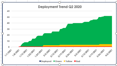
I need to create a visual of a trend aggrigating all the items ( total 3 different items) over the quarter.
The chart should look like this:
My table looks like this :
| Item Type | date |
| Deployed | 25/1/2021 |
| Green | 29/1/2021 |
| Red | 6/2/2021 |
| Yellow | 7/2/2021 |
| Red | 9/3/2021 |
| Green | 10/4/2021 |
Could you please guide me how to go about it ?
Thanks in advanced !
Solved! Go to Solution.
- Mark as New
- Bookmark
- Subscribe
- Mute
- Subscribe to RSS Feed
- Permalink
- Report Inappropriate Content
Hi @Anonymous ,
Please check:
1. Create a Calendar table and a Item Types table.
Calendar = CALENDAR(DATE(2021,1,1),DATE(2021,12,31))Item Types = DISTINCT('Table'[Item Type])
2. Create relationships.
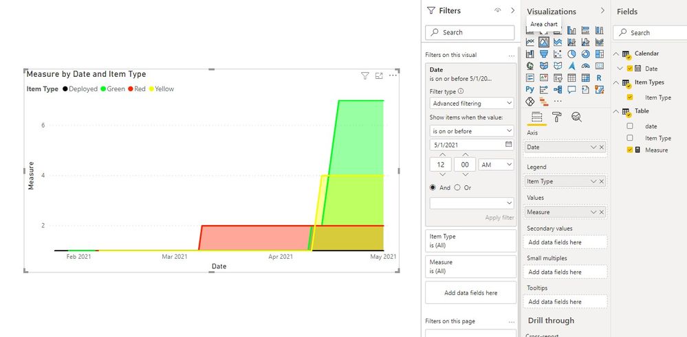
3. Create a measure and create a Area chart.
Measure =
CALCULATE (
    COUNT ( 'Table'[Item Type] ),
    FILTER (
        ALLSELECTED ( 'Table' ),
        'Table'[Item Type] = MAX ( 'Item Types'[Item Type] )
            && 'Table'[date] <= MAX ( 'Calendar'[Date] )
    )
)
Best regards
Icey
If this post helps, then consider Accepting it as the solution to help other members find it faster.
Helpful resources

Power BI Monthly Update - November 2025
Check out the November 2025 Power BI update to learn about new features.

Fabric Data Days
Advance your Data & AI career with 50 days of live learning, contests, hands-on challenges, study groups & certifications and more!


