- Power BI forums
- Get Help with Power BI
- Desktop
- Service
- Report Server
- Power Query
- Mobile Apps
- Developer
- DAX Commands and Tips
- Custom Visuals Development Discussion
- Health and Life Sciences
- Power BI Spanish forums
- Translated Spanish Desktop
- Training and Consulting
- Instructor Led Training
- Dashboard in a Day for Women, by Women
- Galleries
- Data Stories Gallery
- Themes Gallery
- Contests Gallery
- QuickViz Gallery
- Quick Measures Gallery
- Visual Calculations Gallery
- Notebook Gallery
- Translytical Task Flow Gallery
- TMDL Gallery
- R Script Showcase
- Webinars and Video Gallery
- Ideas
- Custom Visuals Ideas (read-only)
- Issues
- Issues
- Events
- Upcoming Events
Learn from the best! Meet the four finalists headed to the FINALS of the Power BI Dataviz World Championships! Register now
- Power BI forums
- Forums
- Get Help with Power BI
- Desktop
- Re: Stack bar chart visualization
- Subscribe to RSS Feed
- Mark Topic as New
- Mark Topic as Read
- Float this Topic for Current User
- Bookmark
- Subscribe
- Printer Friendly Page
- Mark as New
- Bookmark
- Subscribe
- Mute
- Subscribe to RSS Feed
- Permalink
- Report Inappropriate Content
Stack bar chart visualization
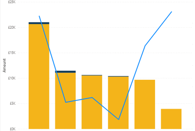
I have Line stacked bar chart in powerbi desktop.
I want to add mean line only on stack two area, Is that possible to do like that ? I added average line for both stacks, I still couldnt able to figure out how to fix that.
Thank you
Solved! Go to Solution.
- Mark as New
- Bookmark
- Subscribe
- Mute
- Subscribe to RSS Feed
- Permalink
- Report Inappropriate Content
Hi @Anonymous ,
Try to create a measure like below and then put it into line value field.
Measure =
AVERAGEX ( FILTER ( ALL ( 'Table' ), 'Table'[type] = 2 ), [value] )
Best regards
Icey
If this post helps, then consider Accepting it as the solution to help other members find it faster.
- Mark as New
- Bookmark
- Subscribe
- Mute
- Subscribe to RSS Feed
- Permalink
- Report Inappropriate Content
I will try that,
One other thing, can we do below steps in line and stacked column chart ?
right click on one column --> data point as table
because I cant do that in my visualiation, It an process when only remove the line.
Does that option not avalable in line and stacked column chart ? or is their any necessary steps to continue that.
Thank you
- Mark as New
- Bookmark
- Subscribe
- Mute
- Subscribe to RSS Feed
- Permalink
- Report Inappropriate Content
Hi @Anonymous ,
Based on my test, line and stacked column chart doesn't support Data point table in Power BI currently.
You can choose to post your idea on Power BI Ideas platform.
Best regards
Icey
If this post helps, then consider Accepting it as the solution to help other members find it faster.
- Mark as New
- Bookmark
- Subscribe
- Mute
- Subscribe to RSS Feed
- Permalink
- Report Inappropriate Content
Thank you for the help.
- Mark as New
- Bookmark
- Subscribe
- Mute
- Subscribe to RSS Feed
- Permalink
- Report Inappropriate Content
@Anonymous , Not very clear. Can you try Stacked Area. https://www.tutorialgateway.org/stacked-area-chart-in-power-bi/
- Mark as New
- Bookmark
- Subscribe
- Mute
- Subscribe to RSS Feed
- Permalink
- Report Inappropriate Content
I have stacked bar chart like this
I added line for total graph amount , but I only need mean number for yellow coloured area. Not from total values. How can I do that ?
- Mark as New
- Bookmark
- Subscribe
- Mute
- Subscribe to RSS Feed
- Permalink
- Report Inappropriate Content
Hi,
Share some data and show the expected result in a simple table format.
Regards,
Ashish Mathur
http://www.ashishmathur.com
https://www.linkedin.com/in/excelenthusiasts/
- Mark as New
- Bookmark
- Subscribe
- Mute
- Subscribe to RSS Feed
- Permalink
- Report Inappropriate Content
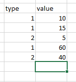
Thats the expected visualization,
If we consider thats the data table , i need to display line for only type 2 data. Is that possible to do without measure or with measure ?
can you provide measure example ?
Thank you
- Mark as New
- Bookmark
- Subscribe
- Mute
- Subscribe to RSS Feed
- Permalink
- Report Inappropriate Content
Hi @Anonymous ,
Try to create a measure like below and then put it into line value field.
Measure =
AVERAGEX ( FILTER ( ALL ( 'Table' ), 'Table'[type] = 2 ), [value] )
Best regards
Icey
If this post helps, then consider Accepting it as the solution to help other members find it faster.
- Mark as New
- Bookmark
- Subscribe
- Mute
- Subscribe to RSS Feed
- Permalink
- Report Inappropriate Content
I wanted dynamic average line, but this is worked. I changed AVERAGEX --> AVERAGE .
It works fine.
Thank you
Helpful resources

Power BI DataViz World Championships - June 2026
A new Power BI DataViz World Championship is coming this June! Don't miss out on submitting your entry.

Join our Fabric User Panel
Share feedback directly with Fabric product managers, participate in targeted research studies and influence the Fabric roadmap.

| User | Count |
|---|---|
| 46 | |
| 36 | |
| 27 | |
| 15 | |
| 15 |
| User | Count |
|---|---|
| 59 | |
| 55 | |
| 38 | |
| 21 | |
| 20 |


