Fabric Data Days starts November 4th!
Advance your Data & AI career with 50 days of live learning, dataviz contests, hands-on challenges, study groups & certifications and more!
Get registered- Power BI forums
- Get Help with Power BI
- Desktop
- Service
- Report Server
- Power Query
- Mobile Apps
- Developer
- DAX Commands and Tips
- Custom Visuals Development Discussion
- Health and Life Sciences
- Power BI Spanish forums
- Translated Spanish Desktop
- Training and Consulting
- Instructor Led Training
- Dashboard in a Day for Women, by Women
- Galleries
- Data Stories Gallery
- Themes Gallery
- Contests Gallery
- Quick Measures Gallery
- Visual Calculations Gallery
- Notebook Gallery
- Translytical Task Flow Gallery
- TMDL Gallery
- R Script Showcase
- Webinars and Video Gallery
- Ideas
- Custom Visuals Ideas (read-only)
- Issues
- Issues
- Events
- Upcoming Events
Join us at FabCon Atlanta from March 16 - 20, 2026, for the ultimate Fabric, Power BI, AI and SQL community-led event. Save $200 with code FABCOMM. Register now.
- Power BI forums
- Forums
- Get Help with Power BI
- Desktop
- Re: Stack and line bar converts to 100% stack bar ...
- Subscribe to RSS Feed
- Mark Topic as New
- Mark Topic as Read
- Float this Topic for Current User
- Bookmark
- Subscribe
- Printer Friendly Page
- Mark as New
- Bookmark
- Subscribe
- Mute
- Subscribe to RSS Feed
- Permalink
- Report Inappropriate Content
Stack and line bar converts to 100% stack bar when using %
TOTAL_RECH = CALCULATE(SUM(Recharge[RECHAGE_AMT]),FILTER(Recharge,Recharge[Rchrg_Source]="Voice_Recharge"))
My requirement is to show the denomination by percentage and not the actuals.
So I created the below measure.
Percent of Total =
DIVIDE (
[TOTAL_RECH],
CALCULATE ( [TOTAL_RECH], ALLSELECTED(Recharge[DIMO1])))
However when I use this in the same graph the graph gets converted in the 100% stacked graph. I need to see the trend along with % and Total Values.
- Mark as New
- Bookmark
- Subscribe
- Mute
- Subscribe to RSS Feed
- Permalink
- Report Inappropriate Content
Hi @atifshikoh,
Per my understanding,you just need to add the percentage value to the "Line Values" section of the line and stacked column chart.
Waht do you mean "the graph gets converted in the 100% stacked graph"? Please show us the screenshot. Besides, please provide some dummy data and show us your desired output so that I can test on my side.
Regards,
Yuliana Gu
If this post helps, then please consider Accept it as the solution to help the other members find it more quickly.
- Mark as New
- Bookmark
- Subscribe
- Mute
- Subscribe to RSS Feed
- Permalink
- Report Inappropriate Content
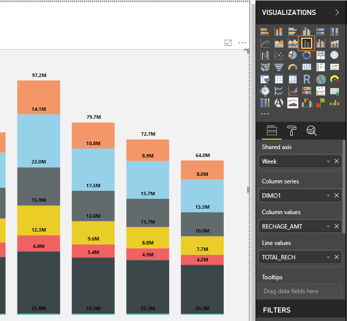
PIC 1 shows the trend of recharges according to the denominations used, but instead of absolute values , I want the percent of each denomination, which I have tried in PIC2. after the measures which were provided earlier.


But as in PIC2 , graph is changing to 100% stacked as the sum of all % is being equal to 100% , so I need your help in getting me the trend along with percent for each denomination for each day.
Regards,Atif
- Mark as New
- Bookmark
- Subscribe
- Mute
- Subscribe to RSS Feed
- Permalink
- Report Inappropriate Content
https://1drv.ms/u/s!Av7bDXhE9zWmck5n1Scb8VHtgBc
SAMPLE DATA is attached here.... Please copy and paste the link, it is not working if the link is directly clicked upon.
- Mark as New
- Bookmark
- Subscribe
- Mute
- Subscribe to RSS Feed
- Permalink
- Report Inappropriate Content
Helpful resources

FabCon Global Hackathon
Join the Fabric FabCon Global Hackathon—running virtually through Nov 3. Open to all skill levels. $10,000 in prizes!

Power BI Monthly Update - October 2025
Check out the October 2025 Power BI update to learn about new features.

| User | Count |
|---|---|
| 85 | |
| 42 | |
| 30 | |
| 27 | |
| 26 |
