This is best Fabric, Power BI, SQL and AI community event. How do we know? The last event sold out! Save €200 with code FABCMTY200.
Register nowA new Data Days event is coming soon! This time we’re going bigger than ever. Fabric, Power BI, SQL, AI and more. Don't miss out.
Hello,
I am looking at year to date date and want to have a bit of a space between the beginning of each series. Is there a way to create that addition space?
Many thanks,
Olha
@ribisht17 thank you so much for your graphs and attachment -very helpful.
Question: in yoyr first graph, how do you make the months range (Jan - Jul) to be shown only instead of the list of each month?
If you can enter another axis with year only at the bottom with horizontal label, it may be helpful to convey the message specially when you have continuous lines as well
Enter August for every year with Null value can also create the gap but then your lines will be broken
Regards,
Ritesh
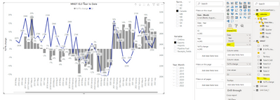
@ribisht17 thank you for your reply. I really like your suggesting "enter another axis with year only at the bottom with horizontal label". How do I create a horizonatl label though?I added another axis ("Year" only) added to the shared axis. Do you i need to build a relationship between the tables? As I have a separate "calendar" table used in this graph. Please see the screenshot for more details:
Hi @AndreOlha
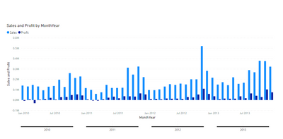
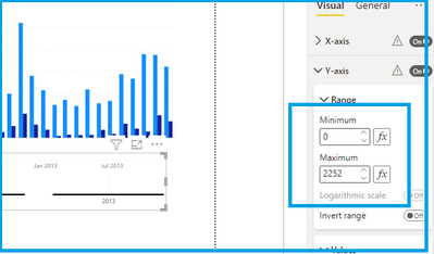
This is the best I could do for now, I have used a separate Visual with dummy measure with value 0,it is not fitting it in a perfect fashion though
Also, I had to make some adjustment to get that thin line there
Please check the attachment
Regards,
Ritesh
Check out the May 2026 Power BI update to learn about new features.
Sign up to receive a private message when registration opens and key events begin.
If you have recently started exploring Fabric, we'd love to hear how it's going. Your feedback can help with product improvements.
| User | Count |
|---|---|
| 32 | |
| 25 | |
| 23 | |
| 22 | |
| 13 |
| User | Count |
|---|---|
| 61 | |
| 47 | |
| 27 | |
| 24 | |
| 19 |