Join the #PBI10 DataViz contest
Power BI is turning 10, and we’re marking the occasion with a special community challenge. Use your creativity to tell a story, uncover trends, or highlight something unexpected.
Get started- Power BI forums
- Get Help with Power BI
- Desktop
- Service
- Report Server
- Power Query
- Mobile Apps
- Developer
- DAX Commands and Tips
- Custom Visuals Development Discussion
- Health and Life Sciences
- Power BI Spanish forums
- Translated Spanish Desktop
- Training and Consulting
- Instructor Led Training
- Dashboard in a Day for Women, by Women
- Galleries
- Webinars and Video Gallery
- Data Stories Gallery
- Themes Gallery
- Contests Gallery
- Quick Measures Gallery
- Notebook Gallery
- Translytical Task Flow Gallery
- R Script Showcase
- Ideas
- Custom Visuals Ideas (read-only)
- Issues
- Issues
- Events
- Upcoming Events
Join us for an expert-led overview of the tools and concepts you'll need to become a Certified Power BI Data Analyst and pass exam PL-300. Register now.
- Power BI forums
- Forums
- Get Help with Power BI
- Desktop
- Space out columns values with same date axis
- Subscribe to RSS Feed
- Mark Topic as New
- Mark Topic as Read
- Float this Topic for Current User
- Bookmark
- Subscribe
- Printer Friendly Page
- Mark as New
- Bookmark
- Subscribe
- Mute
- Subscribe to RSS Feed
- Permalink
- Report Inappropriate Content
Space out columns values with same date axis
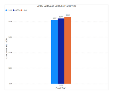
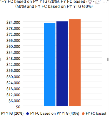
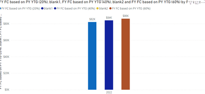
Dont seem to find a clear answer on this anywhere..is there a way to space out the columns on my chart with the same (year) axis? Is there a different approach to my +20%,+40%,+60% measures that Im not thinking about ?
Solved! Go to Solution.
- Mark as New
- Bookmark
- Subscribe
- Mute
- Subscribe to RSS Feed
- Permalink
- Report Inappropriate Content
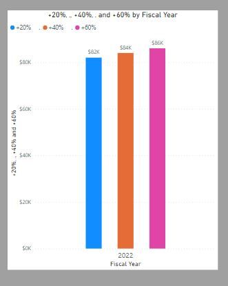
Using the default clustered bar chart, there is a clumsy way which involves creating measure which return blank and place them between the other measures (though I haven´t found a way to change the colour for the legend)
Or you can create a new table with the % Values:
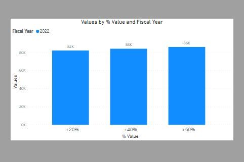
and use the % Value field as the x-axis, the Fiscal Year for the "column series" and create this measure for the values:
Values =
SWITCH (
    SELECTEDVALUE ( '% Table'[% Value] ),
    "+20%", [FY FC based on PY YTG (20%)],
    "+40%", [FY FC based on PY YTG (40%)],
    "+60%", [FY FC based on PY YTG (60%)]
)
You can then use the formatting options for the x-axis to get:
I've attached you PBIX file
Did I answer your question? Mark my post as a solution!
In doing so, you are also helping me. Thank you!
Proud to be a Super User!
Paul on Linkedin.
- Mark as New
- Bookmark
- Subscribe
- Mute
- Subscribe to RSS Feed
- Permalink
- Report Inappropriate Content
Hi, @AldoJavier26 ;
You could use custom visual-Definitive Logic PBI Clustered Column Chart with Custom Labels;
The final output is shown below:
In addition ,you also could create two blank measure.
blank1 = blank2 = The final output is shown below:
Best Regards,
Community Support Team_ Yalan Wu
If this post helps, then please consider Accept it as the solution to help the other members find it more quickly.
- Mark as New
- Bookmark
- Subscribe
- Mute
- Subscribe to RSS Feed
- Permalink
- Report Inappropriate Content
Thank you for these options. Personally I dont love the blank measure option and for my purposes, the alternate visual does not allow you to update the display unit
- Mark as New
- Bookmark
- Subscribe
- Mute
- Subscribe to RSS Feed
- Permalink
- Report Inappropriate Content
- Mark as New
- Bookmark
- Subscribe
- Mute
- Subscribe to RSS Feed
- Permalink
- Report Inappropriate Content
Using the default clustered bar chart, there is a clumsy way which involves creating measure which return blank and place them between the other measures (though I haven´t found a way to change the colour for the legend)
Or you can create a new table with the % Values:
and use the % Value field as the x-axis, the Fiscal Year for the "column series" and create this measure for the values:
Values =
SWITCH (
    SELECTEDVALUE ( '% Table'[% Value] ),
    "+20%", [FY FC based on PY YTG (20%)],
    "+40%", [FY FC based on PY YTG (40%)],
    "+60%", [FY FC based on PY YTG (60%)]
)
You can then use the formatting options for the x-axis to get:
I've attached you PBIX file
Did I answer your question? Mark my post as a solution!
In doing so, you are also helping me. Thank you!
Proud to be a Super User!
Paul on Linkedin.
Helpful resources

Join our Fabric User Panel
This is your chance to engage directly with the engineering team behind Fabric and Power BI. Share your experiences and shape the future.

Power BI Monthly Update - June 2025
Check out the June 2025 Power BI update to learn about new features.

| User | Count |
|---|---|
| 72 | |
| 71 | |
| 57 | |
| 38 | |
| 36 |
| User | Count |
|---|---|
| 81 | |
| 67 | |
| 62 | |
| 46 | |
| 45 |
