Party with Power BI’s own Guy in a Cube
Power BI is turning 10! Tune in for a special live episode on July 24 with behind-the-scenes stories, product evolution highlights, and a sneak peek at what’s in store for the future.
Save the date- Power BI forums
- Get Help with Power BI
- Desktop
- Service
- Report Server
- Power Query
- Mobile Apps
- Developer
- DAX Commands and Tips
- Custom Visuals Development Discussion
- Health and Life Sciences
- Power BI Spanish forums
- Translated Spanish Desktop
- Training and Consulting
- Instructor Led Training
- Dashboard in a Day for Women, by Women
- Galleries
- Data Stories Gallery
- Themes Gallery
- Contests Gallery
- Quick Measures Gallery
- Notebook Gallery
- Translytical Task Flow Gallery
- TMDL Gallery
- R Script Showcase
- Webinars and Video Gallery
- Ideas
- Custom Visuals Ideas (read-only)
- Issues
- Issues
- Events
- Upcoming Events
Enhance your career with this limited time 50% discount on Fabric and Power BI exams. Ends August 31st. Request your voucher.
- Power BI forums
- Forums
- Get Help with Power BI
- Desktop
- Re: Space out columns values with same date axis
- Subscribe to RSS Feed
- Mark Topic as New
- Mark Topic as Read
- Float this Topic for Current User
- Bookmark
- Subscribe
- Printer Friendly Page
- Mark as New
- Bookmark
- Subscribe
- Mute
- Subscribe to RSS Feed
- Permalink
- Report Inappropriate Content
Space out columns values with same date axis
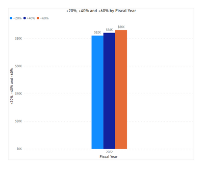
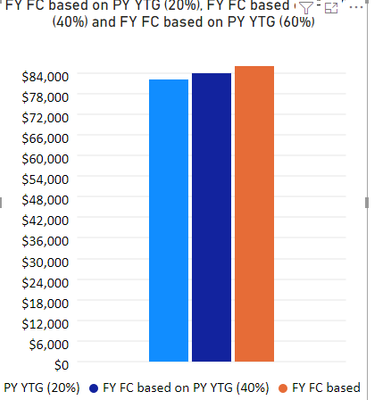
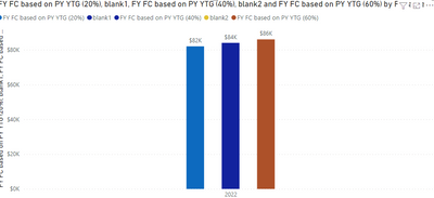
Dont seem to find a clear answer on this anywhere..is there a way to space out the columns on my chart with the same (year) axis? Is there a different approach to my +20%,+40%,+60% measures that Im not thinking about ?
Solved! Go to Solution.
- Mark as New
- Bookmark
- Subscribe
- Mute
- Subscribe to RSS Feed
- Permalink
- Report Inappropriate Content
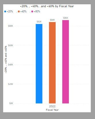
Using the default clustered bar chart, there is a clumsy way which involves creating measure which return blank and place them between the other measures (though I haven´t found a way to change the colour for the legend)
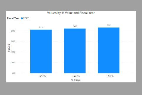
Or you can create a new table with the % Values:
and use the % Value field as the x-axis, the Fiscal Year for the "column series" and create this measure for the values:
Values =
SWITCH (
    SELECTEDVALUE ( '% Table'[% Value] ),
    "+20%", [FY FC based on PY YTG (20%)],
    "+40%", [FY FC based on PY YTG (40%)],
    "+60%", [FY FC based on PY YTG (60%)]
)
You can then use the formatting options for the x-axis to get:
I've attached you PBIX file
Did I answer your question? Mark my post as a solution!
In doing so, you are also helping me. Thank you!
Proud to be a Super User!
Paul on Linkedin.
- Mark as New
- Bookmark
- Subscribe
- Mute
- Subscribe to RSS Feed
- Permalink
- Report Inappropriate Content
Hi, @AldoJavier26 ;
You could use custom visual-Definitive Logic PBI Clustered Column Chart with Custom Labels;
The final output is shown below:
In addition ,you also could create two blank measure.
blank1 = blank2 = The final output is shown below:
Best Regards,
Community Support Team_ Yalan Wu
If this post helps, then please consider Accept it as the solution to help the other members find it more quickly.
- Mark as New
- Bookmark
- Subscribe
- Mute
- Subscribe to RSS Feed
- Permalink
- Report Inappropriate Content
Thank you for these options. Personally I dont love the blank measure option and for my purposes, the alternate visual does not allow you to update the display unit
- Mark as New
- Bookmark
- Subscribe
- Mute
- Subscribe to RSS Feed
- Permalink
- Report Inappropriate Content
- Mark as New
- Bookmark
- Subscribe
- Mute
- Subscribe to RSS Feed
- Permalink
- Report Inappropriate Content
Using the default clustered bar chart, there is a clumsy way which involves creating measure which return blank and place them between the other measures (though I haven´t found a way to change the colour for the legend)
Or you can create a new table with the % Values:
and use the % Value field as the x-axis, the Fiscal Year for the "column series" and create this measure for the values:
Values =
SWITCH (
    SELECTEDVALUE ( '% Table'[% Value] ),
    "+20%", [FY FC based on PY YTG (20%)],
    "+40%", [FY FC based on PY YTG (40%)],
    "+60%", [FY FC based on PY YTG (60%)]
)
You can then use the formatting options for the x-axis to get:
I've attached you PBIX file
Did I answer your question? Mark my post as a solution!
In doing so, you are also helping me. Thank you!
Proud to be a Super User!
Paul on Linkedin.
Helpful resources
| User | Count |
|---|---|
| 73 | |
| 72 | |
| 39 | |
| 25 | |
| 23 |
| User | Count |
|---|---|
| 96 | |
| 93 | |
| 51 | |
| 43 | |
| 42 |
