Join us at FabCon Vienna from September 15-18, 2025
The ultimate Fabric, Power BI, SQL, and AI community-led learning event. Save €200 with code FABCOMM.
Get registered- Power BI forums
- Get Help with Power BI
- Desktop
- Service
- Report Server
- Power Query
- Mobile Apps
- Developer
- DAX Commands and Tips
- Custom Visuals Development Discussion
- Health and Life Sciences
- Power BI Spanish forums
- Translated Spanish Desktop
- Training and Consulting
- Instructor Led Training
- Dashboard in a Day for Women, by Women
- Galleries
- Data Stories Gallery
- Themes Gallery
- Contests Gallery
- Quick Measures Gallery
- Notebook Gallery
- Translytical Task Flow Gallery
- TMDL Gallery
- R Script Showcase
- Webinars and Video Gallery
- Ideas
- Custom Visuals Ideas (read-only)
- Issues
- Issues
- Events
- Upcoming Events
Enhance your career with this limited time 50% discount on Fabric and Power BI exams. Ends September 15. Request your voucher.
- Power BI forums
- Forums
- Get Help with Power BI
- Desktop
- Re: Sorting stacks in a Stacked Bar Chart
- Subscribe to RSS Feed
- Mark Topic as New
- Mark Topic as Read
- Float this Topic for Current User
- Bookmark
- Subscribe
- Printer Friendly Page
- Mark as New
- Bookmark
- Subscribe
- Mute
- Subscribe to RSS Feed
- Permalink
- Report Inappropriate Content
Sorting stacks in a Stacked Bar Chart
Hi All,
I'm new to PBI, and am hoping you can help me. I am visualizing data from a satisfaction survey, and am having issues with a stacked bar chart.
My data consists of 14 questions with values on a 5-point scale. Each question is a column, and each survey is a row.
I need to have a stacked bar chart that shows how many people responded with each of the five points, so each stack would include:
- Strongly Agree x #responses
- Agree x #responses
- N/A x #responses
- Disagree x #responses
- Strongly Disagree x #responses
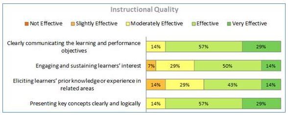
The final result something like this:
I've tried using text values and creating COUNTROW measures for each value per question. I've tried using numeric values and working with the data that way. No matter what, all the data just stacks up in one bar, or if I move my data to the Axis section, I get no bars. I've been searching Google and the Power BI site, but I'm not finding instructions for what I'm sure is a pretty basic action.
Help? Please? 🙂 Thanks in advance - I really appreciate it.
Solved! Go to Solution.
- Mark as New
- Bookmark
- Subscribe
- Mute
- Subscribe to RSS Feed
- Permalink
- Report Inappropriate Content
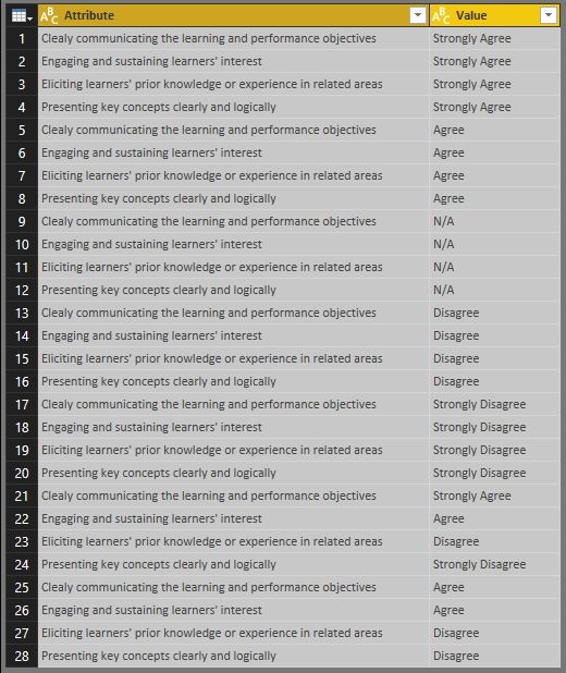
If you survey table is like below. You can select all columns in this table and click Unpivot Columns in Query Editor.
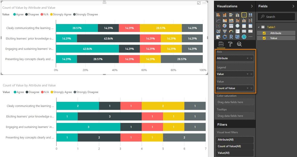
With above transformed table, we can use the 100% Stacked bar chart to get the expected report.
Best Regards,
Herbert
- Mark as New
- Bookmark
- Subscribe
- Mute
- Subscribe to RSS Feed
- Permalink
- Report Inappropriate Content
Helpful resources
| User | Count |
|---|---|
| 69 | |
| 69 | |
| 66 | |
| 54 | |
| 28 |
| User | Count |
|---|---|
| 112 | |
| 82 | |
| 66 | |
| 48 | |
| 43 |


