Fabric Data Days starts November 4th!
Advance your Data & AI career with 50 days of live learning, dataviz contests, hands-on challenges, study groups & certifications and more!
Get registered- Power BI forums
- Get Help with Power BI
- Desktop
- Service
- Report Server
- Power Query
- Mobile Apps
- Developer
- DAX Commands and Tips
- Custom Visuals Development Discussion
- Health and Life Sciences
- Power BI Spanish forums
- Translated Spanish Desktop
- Training and Consulting
- Instructor Led Training
- Dashboard in a Day for Women, by Women
- Galleries
- Data Stories Gallery
- Themes Gallery
- Contests Gallery
- QuickViz Gallery
- Quick Measures Gallery
- Visual Calculations Gallery
- Notebook Gallery
- Translytical Task Flow Gallery
- TMDL Gallery
- R Script Showcase
- Webinars and Video Gallery
- Ideas
- Custom Visuals Ideas (read-only)
- Issues
- Issues
- Events
- Upcoming Events
Get Fabric Certified for FREE during Fabric Data Days. Don't miss your chance! Request now
- Power BI forums
- Forums
- Get Help with Power BI
- Desktop
- Sorting stacks in a Stacked Bar Chart
- Subscribe to RSS Feed
- Mark Topic as New
- Mark Topic as Read
- Float this Topic for Current User
- Bookmark
- Subscribe
- Printer Friendly Page
- Mark as New
- Bookmark
- Subscribe
- Mute
- Subscribe to RSS Feed
- Permalink
- Report Inappropriate Content
Sorting stacks in a Stacked Bar Chart
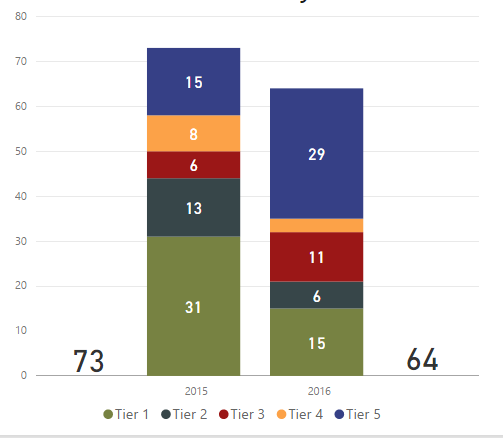
BI novice here, I've been playing with the software for about a month and I am beginning to use it seriously. I have read posts about how to sort the different columns in a stacked bar chart, but I don't understand how to sort the inidividual stacks within each column. I have tried dragging them in the values field, renaming them , changing their values etc.
Again, I know how to sort the full columns and I have tried using the top right corner options, but to no avail.
In the attached picture, I would like to display the 5 tiers from 5 to 1, instead of from 1 to 5.
Any suggestion?
Solved! Go to Solution.
- Mark as New
- Bookmark
- Subscribe
- Mute
- Subscribe to RSS Feed
- Permalink
- Report Inappropriate Content
Ok so thanks to your help I've figured it out. I simply created a new table with two columns:
Column one: original category name (numerical value)
Column two: tweaked category names with increasingly more spaces (classified as categorical)
I then established a relationship between the new table and and the old one with the data, and in the "Legend" field of the chart I dragged the new field (Column two).
And it worked! Definitely more complex than needed though
Thanks
- Mark as New
- Bookmark
- Subscribe
- Mute
- Subscribe to RSS Feed
- Permalink
- Report Inappropriate Content
AFAIK no direct way.
You could try & see if you can enhance the visual it to add a sorter attribute to the column stacks.
Finally, check the ideas section to see if there is already a request and vote for it; else add an idea; Will certainly be useful for the masses.
Regards!
- Mark as New
- Bookmark
- Subscribe
- Mute
- Subscribe to RSS Feed
- Permalink
- Report Inappropriate Content
On second thoughs - a dirty approach - play with spaces in front of description. Hope this helps!
- Mark as New
- Bookmark
- Subscribe
- Mute
- Subscribe to RSS Feed
- Permalink
- Report Inappropriate Content
Very interesting, thanks. I am not sure how to connect the original tiers to the new spaced description but I'll try, thanks!
- Mark as New
- Bookmark
- Subscribe
- Mute
- Subscribe to RSS Feed
- Permalink
- Report Inappropriate Content
Ok so thanks to your help I've figured it out. I simply created a new table with two columns:
Column one: original category name (numerical value)
Column two: tweaked category names with increasingly more spaces (classified as categorical)
I then established a relationship between the new table and and the old one with the data, and in the "Legend" field of the chart I dragged the new field (Column two).
And it worked! Definitely more complex than needed though
Thanks
Helpful resources

Power BI Monthly Update - November 2025
Check out the November 2025 Power BI update to learn about new features.

Fabric Data Days
Advance your Data & AI career with 50 days of live learning, contests, hands-on challenges, study groups & certifications and more!

| User | Count |
|---|---|
| 97 | |
| 74 | |
| 51 | |
| 50 | |
| 46 |


