FabCon is coming to Atlanta
Join us at FabCon Atlanta from March 16 - 20, 2026, for the ultimate Fabric, Power BI, AI and SQL community-led event. Save $200 with code FABCOMM.
Register now!- Power BI forums
- Get Help with Power BI
- Desktop
- Service
- Report Server
- Power Query
- Mobile Apps
- Developer
- DAX Commands and Tips
- Custom Visuals Development Discussion
- Health and Life Sciences
- Power BI Spanish forums
- Translated Spanish Desktop
- Training and Consulting
- Instructor Led Training
- Dashboard in a Day for Women, by Women
- Galleries
- Data Stories Gallery
- Themes Gallery
- Contests Gallery
- Quick Measures Gallery
- Notebook Gallery
- Translytical Task Flow Gallery
- TMDL Gallery
- R Script Showcase
- Webinars and Video Gallery
- Ideas
- Custom Visuals Ideas (read-only)
- Issues
- Issues
- Events
- Upcoming Events
Join the Fabric FabCon Global Hackathon—running virtually through Nov 3. Open to all skill levels. $10,000 in prizes! Register now.
- Power BI forums
- Forums
- Get Help with Power BI
- Desktop
- Sorting of horizontal bar visual
- Subscribe to RSS Feed
- Mark Topic as New
- Mark Topic as Read
- Float this Topic for Current User
- Bookmark
- Subscribe
- Printer Friendly Page
- Mark as New
- Bookmark
- Subscribe
- Mute
- Subscribe to RSS Feed
- Permalink
- Report Inappropriate Content
Sorting of horizontal bar visual
Hi Team,
Source table
| Table A |
| Script ID | Category | Relience | Tata | Godrej | TCS | Colgate |
| 1 | Equity | 100 | 150 | 120 | 140 | 160 |
| 2 | Comm | 210 | 120 | 235 | 147 | 135 |
| Table B |
| Script ID | Category | MF |
| 1 | Equity | 170 |
| 2 | Comm | 180 |
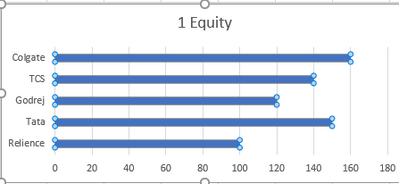
Reqirment : i want to create a bar graph when user select category from the slicer and bar graph it should present
| Relience | Tata | Godrej | TCS | Colgate |
| MF |
and sort by the low to high value
Note:- we dont want to pivot/unpivot the source data
Thanks
Solved! Go to Solution.
- Mark as New
- Bookmark
- Subscribe
- Mute
- Subscribe to RSS Feed
- Permalink
- Report Inappropriate Content
Hi @Anshenterprices ,
I suggest you to create a Dimtable with column headers as "Relience","Tata","Godrej","TCS","Colgate" you need.
Axis =
{"Colgate","TCS","Godrej","Tata","Relience"}
Then create a measure to calcualte the sum of value.
Measure =
SWITCH(
MAX('Axis'[Axis]),
"Colgate",CALCULATE(SUM('Table A'[Colgate])),
"TCS",CALCULATE(SUM('Table A'[TCS])),
"Godrej",CALCULATE(SUM('Table A'[Godrej])),
"Tata",CALCULATE(SUM('Table A'[Tata])),
"Relience",CALCULATE(SUM('Table A'[Relience]))
)
Create a bar chart by Axis[Axis] in Axis and [Measure] in Value, then you can sort your visual by measure.
Best Regards,
Rico Zhou
If this post helps, then please consider Accept it as the solution to help the other members find it more quickly.
- Mark as New
- Bookmark
- Subscribe
- Mute
- Subscribe to RSS Feed
- Permalink
- Report Inappropriate Content
@amitchandak Can you please explain how to do that? Based on the values it will sort?
thank you
- Mark as New
- Bookmark
- Subscribe
- Mute
- Subscribe to RSS Feed
- Permalink
- Report Inappropriate Content
@Anshenterprices , Create 5 measures and put them in visual in the order you want
- Mark as New
- Bookmark
- Subscribe
- Mute
- Subscribe to RSS Feed
- Permalink
- Report Inappropriate Content
@amitchandak but those are already a seperate columns and its a meausure ? Can you please explain how to do that? Based on the values it will sort?
thank you
- Mark as New
- Bookmark
- Subscribe
- Mute
- Subscribe to RSS Feed
- Permalink
- Report Inappropriate Content
Hi @Anshenterprices ,
I suggest you to create a Dimtable with column headers as "Relience","Tata","Godrej","TCS","Colgate" you need.
Axis =
{"Colgate","TCS","Godrej","Tata","Relience"}
Then create a measure to calcualte the sum of value.
Measure =
SWITCH(
MAX('Axis'[Axis]),
"Colgate",CALCULATE(SUM('Table A'[Colgate])),
"TCS",CALCULATE(SUM('Table A'[TCS])),
"Godrej",CALCULATE(SUM('Table A'[Godrej])),
"Tata",CALCULATE(SUM('Table A'[Tata])),
"Relience",CALCULATE(SUM('Table A'[Relience]))
)
Create a bar chart by Axis[Axis] in Axis and [Measure] in Value, then you can sort your visual by measure.
Best Regards,
Rico Zhou
If this post helps, then please consider Accept it as the solution to help the other members find it more quickly.


