FabCon is coming to Atlanta
Join us at FabCon Atlanta from March 16 - 20, 2026, for the ultimate Fabric, Power BI, AI and SQL community-led event. Save $200 with code FABCOMM.
Register now!- Power BI forums
- Get Help with Power BI
- Desktop
- Service
- Report Server
- Power Query
- Mobile Apps
- Developer
- DAX Commands and Tips
- Custom Visuals Development Discussion
- Health and Life Sciences
- Power BI Spanish forums
- Translated Spanish Desktop
- Training and Consulting
- Instructor Led Training
- Dashboard in a Day for Women, by Women
- Galleries
- Data Stories Gallery
- Themes Gallery
- Contests Gallery
- QuickViz Gallery
- Quick Measures Gallery
- Visual Calculations Gallery
- Notebook Gallery
- Translytical Task Flow Gallery
- TMDL Gallery
- R Script Showcase
- Webinars and Video Gallery
- Ideas
- Custom Visuals Ideas (read-only)
- Issues
- Issues
- Events
- Upcoming Events
Get Fabric Certified for FREE during Fabric Data Days. Don't miss your chance! Request now
- Power BI forums
- Forums
- Get Help with Power BI
- Desktop
- Re: Sort x-axis by time instead of legend (scatter...
- Subscribe to RSS Feed
- Mark Topic as New
- Mark Topic as Read
- Float this Topic for Current User
- Bookmark
- Subscribe
- Printer Friendly Page
- Mark as New
- Bookmark
- Subscribe
- Mute
- Subscribe to RSS Feed
- Permalink
- Report Inappropriate Content
Sort x-axis by time instead of legend (scatter chart) without losing legend colours
Dear community members,
I'm quite new to PowerBI but not to SQL/Excel.
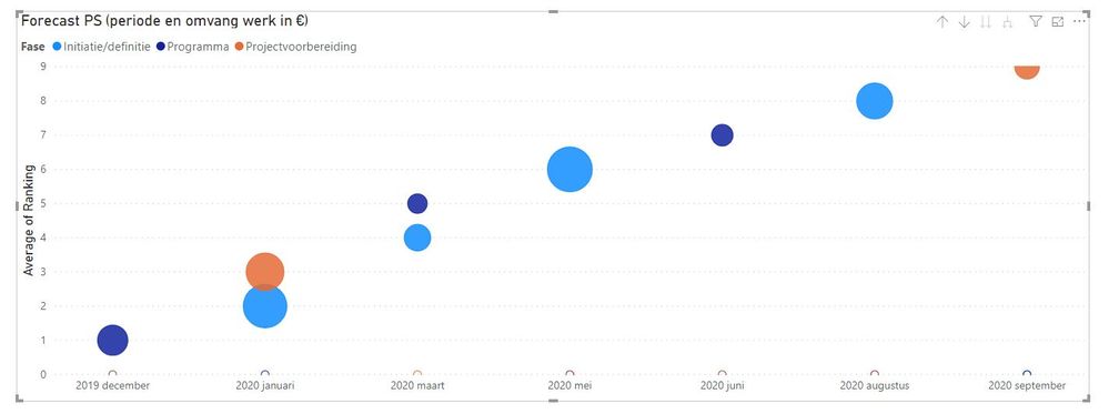
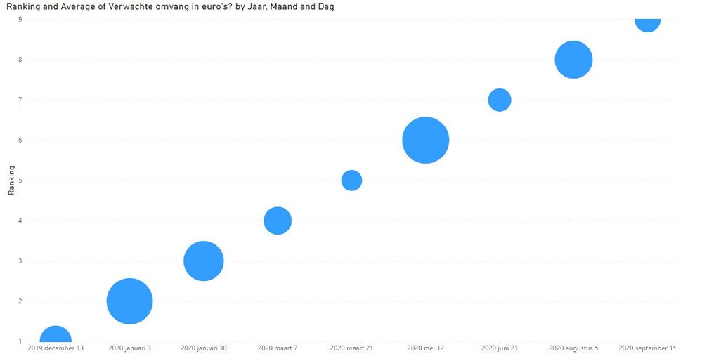
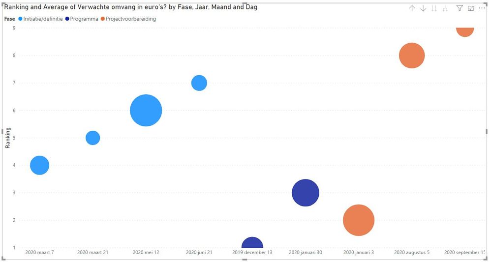
I want to create a scatter chart in which possible opportunities for big projects in the future are shown (time based on x-axis). These projects are ranked so that they all will have an unique data point in the graph.
Now when I add a field as legend, the graph changes itself and sorts by the different categories known in legend first. I don't want to sort by legend, but I do want to keep the same colours for the categories in legend.
I can't seem to combine this.
Does anyone know a solution to this? I did see another similar post but the legend colours weren't saved in the solution...
Thanks in advance,
Nick
Solved! Go to Solution.
- Mark as New
- Bookmark
- Subscribe
- Mute
- Subscribe to RSS Feed
- Permalink
- Report Inappropriate Content
Hi @Nick_de_Beijer ,
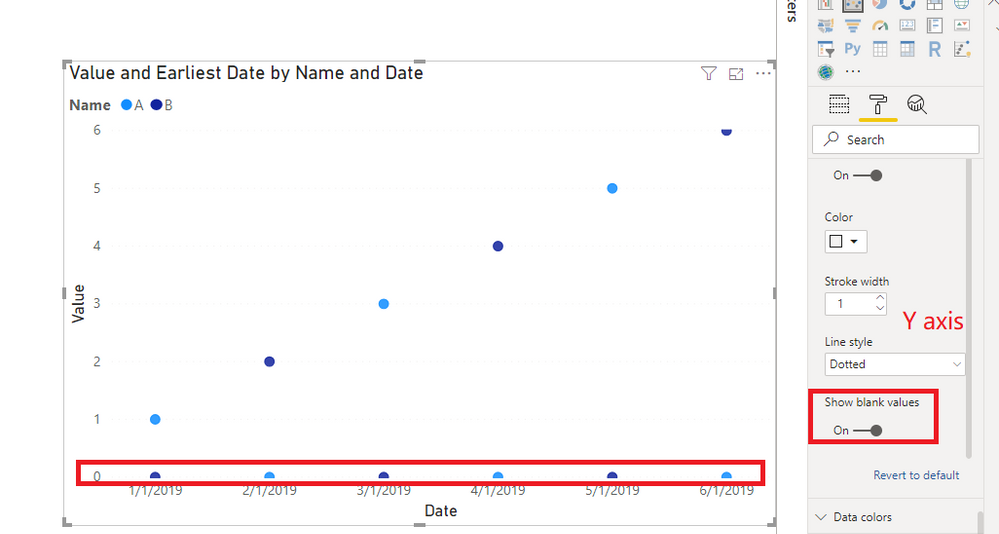
You can keep "Show blank values" on.
Best Regards,
Icey
If this post helps, then please consider Accept it as the solution to help the other members find it more quickly.
- Mark as New
- Bookmark
- Subscribe
- Mute
- Subscribe to RSS Feed
- Permalink
- Report Inappropriate Content
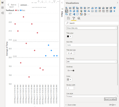
What if I can't find the "show blank values" under Y-axis of the format pane? My last line is "Line Style" and it appears to be partial. Appreciate knowing any other way to display data sorted by X-axis while showing legend colours. I'm a new user. Thanks. Diane
- Mark as New
- Bookmark
- Subscribe
- Mute
- Subscribe to RSS Feed
- Permalink
- Report Inappropriate Content
I should have scrolled down to see "show blank values". Time sorting worked!
- Mark as New
- Bookmark
- Subscribe
- Mute
- Subscribe to RSS Feed
- Permalink
- Report Inappropriate Content
Hi @Nick_de_Beijer ,
You can keep "Show blank values" on.
Best Regards,
Icey
If this post helps, then please consider Accept it as the solution to help the other members find it more quickly.
- Mark as New
- Bookmark
- Subscribe
- Mute
- Subscribe to RSS Feed
- Permalink
- Report Inappropriate Content
superb!
- Mark as New
- Bookmark
- Subscribe
- Mute
- Subscribe to RSS Feed
- Permalink
- Report Inappropriate Content
Is it possible to not show the dots in bottom?
- Mark as New
- Bookmark
- Subscribe
- Mute
- Subscribe to RSS Feed
- Permalink
- Report Inappropriate Content
@Icey ,
Thanks for your time and this sollution, it seems to do the trick!
When I apply the option to show blank values the graph is able to keep the sort option on the x-axis including showing the legend in the same graph.
Can you explain me why this option has to be selected?
Thanks in advance,
Nick
- Mark as New
- Bookmark
- Subscribe
- Mute
- Subscribe to RSS Feed
- Permalink
- Report Inappropriate Content
Hi, I try to reproduce this and it is real. It looks like something to report a ticket in support. Anyway, I figure out that the visualization won't work with a legend and a hierarchy. If you have an axis X with date hierarchy you won't be able. It crashes when it has to sort by one of the columns of the hierarchy. It won't sort taking care of the father of it.
Hope this helps,
If this post helps, then please consider Accept it as the solution to help the other members find it more quickly.
Happy to help!
- Mark as New
- Bookmark
- Subscribe
- Mute
- Subscribe to RSS Feed
- Permalink
- Report Inappropriate Content
Ibarrau,
Thanks for your time and your reply.
Helpful resources

Power BI Monthly Update - November 2025
Check out the November 2025 Power BI update to learn about new features.

Fabric Data Days
Advance your Data & AI career with 50 days of live learning, contests, hands-on challenges, study groups & certifications and more!

