FabCon is coming to Atlanta
Join us at FabCon Atlanta from March 16 - 20, 2026, for the ultimate Fabric, Power BI, AI and SQL community-led event. Save $200 with code FABCOMM.
Register now!- Power BI forums
- Get Help with Power BI
- Desktop
- Service
- Report Server
- Power Query
- Mobile Apps
- Developer
- DAX Commands and Tips
- Custom Visuals Development Discussion
- Health and Life Sciences
- Power BI Spanish forums
- Translated Spanish Desktop
- Training and Consulting
- Instructor Led Training
- Dashboard in a Day for Women, by Women
- Galleries
- Data Stories Gallery
- Themes Gallery
- Contests Gallery
- Quick Measures Gallery
- Notebook Gallery
- Translytical Task Flow Gallery
- TMDL Gallery
- R Script Showcase
- Webinars and Video Gallery
- Ideas
- Custom Visuals Ideas (read-only)
- Issues
- Issues
- Events
- Upcoming Events
Calling all Data Engineers! Fabric Data Engineer (Exam DP-700) live sessions are back! Starting October 16th. Sign up.
- Power BI forums
- Forums
- Get Help with Power BI
- Desktop
- Sort clustered column chart based on slicer
- Subscribe to RSS Feed
- Mark Topic as New
- Mark Topic as Read
- Float this Topic for Current User
- Bookmark
- Subscribe
- Printer Friendly Page
- Mark as New
- Bookmark
- Subscribe
- Mute
- Subscribe to RSS Feed
- Permalink
- Report Inappropriate Content
Sort clustered column chart based on slicer
Relative beginner in PowerBI here. I have this table, showing the last month's profits for a company in several different countries. The next column shows the change of this figure relative to a previous period. The last column specifies which previous period it is compared with, either last month, or the same month in the previous year.
| Country | Profit | Change | Period |
| USA | 72404,00 | -12,60 | Last Month |
| UK | 40032,00 | 5,5 | Last Month |
| Germany | 43103,00 | -1,3 | Last Month |
| France | 22872,00 | 2,7 | Last Month |
| Netherlands | 14099,00 | -0,3 | Last Month |
| Italy | 20385,00 | -5,2 | Last Month |
| Belgium | 9398,00 | 3,3 | Last Month |
| India | 12674,00 | -0,8 | Last Month |
| China | 18837,00 | -14,8 | Last Month |
| Canada | 10297,00 | 5,3 | Last Month |
| Mexico | 4722,00 | -2 | Last Month |
| Australia | 15810,00 | 4,7 | Last Month |
| Luxembourg | 1427,00 | -9,4 | Last Month |
| Poland | 8838,00 | 1,9 | Last Month |
| Czech Republic | 4552,00 | -2,6 | Last Month |
| Switzerland | 7981,00 | 5,3 | Last Month |
| Austria | 6330,00 | -0,4 | Last Month |
| Spain | 26477,00 | 13,8 | Last Month |
| Portugal | 10825,00 | 2,7 | Last Month |
| Denmark | 11699,00 | 0,7 | Last Month |
| Sweden | 10483,00 | 1,5 | Last Month |
| Norway | 5008,00 | -9,4 | Last Month |
| USA | 72404,00 | -4,8 | Same Month Last Year |
| UK | 40032,00 | 21,5 | Same Month Last Year |
| Germany | 43103,00 | 4,2 | Same Month Last Year |
| France | 22872,00 | 10,4 | Same Month Last Year |
| Netherlands | 14099,00 | -1,4 | Same Month Last Year |
| Italy | 20385,00 | -18,2 | Same Month Last Year |
| Belgium | 9398,00 | 0,5 | Same Month Last Year |
| India | 12674,00 | 1,6 | Same Month Last Year |
| China | 18837,00 | -28 | Same Month Last Year |
| Canada | 10297,00 | 1,5 | Same Month Last Year |
| Mexico | 4722,00 | -9,4 | Same Month Last Year |
| Australia | 15810,00 | 39,1 | Same Month Last Year |
| Luxembourg | 1427,00 | -15,4 | Same Month Last Year |
| Poland | 8838,00 | -2 | Same Month Last Year |
| Czech Republic | 4552,00 | 72,4 | Same Month Last Year |
| Switzerland | 7981,00 | 13,1 | Same Month Last Year |
| Austria | 6330,00 | 6,7 | Same Month Last Year |
| Spain | 26477,00 | 58,2 | Same Month Last Year |
| Portugal | 10825,00 | 28,5 | Same Month Last Year |
| Denmark | 11699,00 | -11,9 | Same Month Last Year |
| Sweden | 10483,00 | -7,4 | Same Month Last Year |
| Norway | 5008,00 | -44,9 | Same Month Last Year |
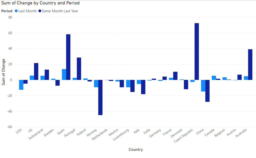
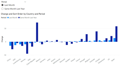
I have made a clustered column chart in PowerBI, which looks like this:
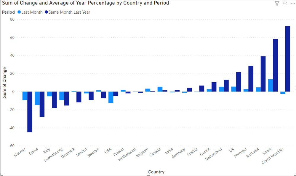
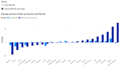
The next thing I want to do is have a slicer, where you can select either "Last Month" or "Same Month Last Year", and then sort the clustered column chart based on that value. So if you were to select "Same Month Last Year", you should get:
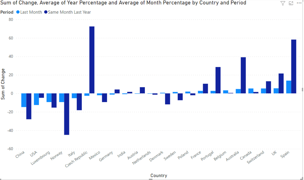
And if you select "Last Month", you should get:
So what I need is this chart to check a slicer, and then to sort its data based on the value in the column "Period", ascending.
I found one previous thread that dealt with a similar problem, here: Solved: Sorting based on a slicer values selection - Microsoft Power BI Community.
However, this solution showed how to make the chart read the slicer and select the right column, but I need an extra step of looking within that column and selecting one of the two possible categories there ("last month" or "same month previous year"), and then sorting the nations from best to worst based on their score for that particular category.
I'm currently stumped how I can do this, so any help would be greatly appreciated.
Here is the link to the pbix file: https://drive.google.com/file/d/1QgFedVVr7A55U-DceqJf6D4RKMMVO6gM/view?usp=sharing
Solved! Go to Solution.
- Mark as New
- Bookmark
- Subscribe
- Mute
- Subscribe to RSS Feed
- Permalink
- Report Inappropriate Content
Try this solution.
1. Create table SlicerPeriod (no relationships):
2. Create measures:
Change = SUM ( FactTable[Change] )Sort Order =
VAR vPeriodSelection =
SELECTEDVALUE ( SlicerPeriod[Period] )
VAR vCurrentCountry =
SELECTEDVALUE ( FactTable[Country] )
VAR vTableAmount =
ADDCOLUMNS (
ALLSELECTED ( FactTable[Country] ),
"@Amount", CALCULATE ( [Change], FactTable[Period] = vPeriodSelection )
)
VAR vTableRank =
ADDCOLUMNS ( vTableAmount, "@Rank", RANKX ( vTableAmount, [@Amount],, ASC ) )
VAR vResult =
MAXX ( FILTER ( vTableRank, FactTable[Country] = vCurrentCountry ), [@Rank] )
RETURN
vResult
3. Create slicer using SlicerPeriod[Period].
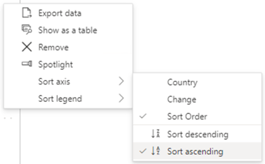
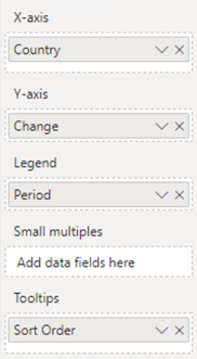
4. Create matrix and add the measure [Sort Order] as a Tooltip (sort Ascending):
5. Add remaining fields to matrix. Legend uses FactTable[Period].
6. Result:
---
Did I answer your question? Mark my post as a solution!
Proud to be a Super User!
- Mark as New
- Bookmark
- Subscribe
- Mute
- Subscribe to RSS Feed
- Permalink
- Report Inappropriate Content
Correction: "Clustered column chart", not matrix. 🙂
Did I answer your question? Mark my post as a solution!
Proud to be a Super User!
- Mark as New
- Bookmark
- Subscribe
- Mute
- Subscribe to RSS Feed
- Permalink
- Report Inappropriate Content
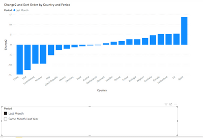
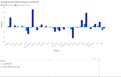
For some reason, after adding all that I do get a sorted chart, but it doesn't show both 'Last Month' and 'Same Month Last Year', only the one I selected.
When I deselect, I get a graph with both again, though unsorted:
(btw the new measure Change I named 'Change2' because it won't allow me to name it Change as there is already a column with that name).
Is there maybe some step I missed?
- Mark as New
- Bookmark
- Subscribe
- Mute
- Subscribe to RSS Feed
- Permalink
- Report Inappropriate Content
Note step 3: Create slicer using SlicerPeriod[Period]. It appears your slicer uses the Period field from your data table, causing it to filter the data. The table SlicerPeriod doesn't filter the visual; it's merely a way to capture the user's selection.
I use a measures table to avoid naming conflicts like the one you mentioned, and to organize measures so they aren't scattered throughout tables. This is just a personal preference, and won't impact results.
Did I answer your question? Mark my post as a solution!
Proud to be a Super User!
- Mark as New
- Bookmark
- Subscribe
- Mute
- Subscribe to RSS Feed
- Permalink
- Report Inappropriate Content
I got it to work, fortunately. The slicer selected the SlicerPeriod table as it should, but apparently PowerBI had automatically created a link between the tables because they both had a column named Period. So removing that link solved the issue.
Thank you very much for your help, I've accepted your original post as the solution.
- Mark as New
- Bookmark
- Subscribe
- Mute
- Subscribe to RSS Feed
- Permalink
- Report Inappropriate Content
Glad to hear that works. That's a good point about the automatic relationships. You can disable that feature in Options.
Did I answer your question? Mark my post as a solution!
Proud to be a Super User!
- Mark as New
- Bookmark
- Subscribe
- Mute
- Subscribe to RSS Feed
- Permalink
- Report Inappropriate Content
Hi @FrankvanDorp ,
Could you pls share your pbix file ,remember to remove confidential data.
Best Regards
Lucien
- Mark as New
- Bookmark
- Subscribe
- Mute
- Subscribe to RSS Feed
- Permalink
- Report Inappropriate Content
Apologies, I forgot, I have now updated the post with a link to the pbix file.
Helpful resources

FabCon Global Hackathon
Join the Fabric FabCon Global Hackathon—running virtually through Nov 3. Open to all skill levels. $10,000 in prizes!

Power BI Monthly Update - September 2025
Check out the September 2025 Power BI update to learn about new features.

