A new Data Days event is coming soon!
This time we’re going bigger than ever. Fabric, Power BI, SQL, AI and more. We're covering it all. You won't want to miss it.
Learn more- Power BI forums
- Get Help with Power BI
- Desktop
- Service
- Report Server
- Power Query
- Mobile Apps
- Developer
- DAX Commands and Tips
- Custom Visuals Development Discussion
- Health and Life Sciences
- Power BI Spanish forums
- Translated Spanish Desktop
- Training and Consulting
- Instructor Led Training
- Dashboard in a Day for Women, by Women
- Galleries
- Data Stories Gallery
- Themes Gallery
- Contests Gallery
- QuickViz Gallery
- Quick Measures Gallery
- Visual Calculations Gallery
- Notebook Gallery
- Translytical Task Flow Gallery
- TMDL Gallery
- R Script Showcase
- Webinars and Video Gallery
- Ideas
- Custom Visuals Ideas (read-only)
- Issues
- Issues
- Events
- Upcoming Events
Did you hear? There's a new SQL AI Developer certification (DP-800). Start preparing now and be one of the first to get certified. Register now
- Power BI forums
- Forums
- Get Help with Power BI
- Desktop
- Re: Sort by value
- Subscribe to RSS Feed
- Mark Topic as New
- Mark Topic as Read
- Float this Topic for Current User
- Bookmark
- Subscribe
- Printer Friendly Page
- Mark as New
- Bookmark
- Subscribe
- Mute
- Subscribe to RSS Feed
- Permalink
- Report Inappropriate Content
Sort by value
Hi dear,
I have three independent tables , that is, no relationships between them.
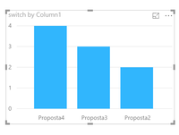
Each table has a column and I created a bar graph with them and I want to order it by value.
Thanks
Wneiton
Solved! Go to Solution.
- Mark as New
- Bookmark
- Subscribe
- Mute
- Subscribe to RSS Feed
- Permalink
- Report Inappropriate Content
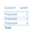
i hope this could help you visual.
old situation:
you have 4 separte measures
create a separte table for the legend.
create a switch that combine your measure to the table.
it would look like this.switch =
VAR Legend = SELECTEDVALUE(Table1[Column1])
RETURN
SWITCH(TRUE();
    Legend = "Proposta2"; [Measure 2] ;
    Legend = "Proposta3"; [Measure 3];
    Legend = "Proposta4"; [Measure 4])
Now you have 1 measure that you can sort.
choose you visual and i think you are done.
change your setting in the colors if you want every measure to be a differnt colour.
- Mark as New
- Bookmark
- Subscribe
- Mute
- Subscribe to RSS Feed
- Permalink
- Report Inappropriate Content
Yes @Maddy99
Thanks for help, I've slightly changed a dax formula.
switch = SWITCH(Teste[Column1];"proposta1";[Media_Impacto1];"proposta2";[Media_Impacto2];"proposta3";[Media_Impacto3])
Teste = Table Name
Media_Impacto = my measure from different tables (no relationships tables)
- Mark as New
- Bookmark
- Subscribe
- Mute
- Subscribe to RSS Feed
- Permalink
- Report Inappropriate Content
You could also use Append Queries (Table.Combine) in Query Editor or UNION Function (DAX) to create a new table.
If this post helps, then please consider Accept it as the solution to help the other members find it more quickly.
- Mark as New
- Bookmark
- Subscribe
- Mute
- Subscribe to RSS Feed
- Permalink
- Report Inappropriate Content
intresting question.
for order value you must get 1 value.
and ofcours you want 3 category.
make a separte table with 3 rows. ever row has a text that repesent a category.
this column you can use in the legend.
then make a measure with a swithc.
when category = A then measure A
category = B then measure B.
i think this could help.
- Mark as New
- Bookmark
- Subscribe
- Mute
- Subscribe to RSS Feed
- Permalink
- Report Inappropriate Content
i hope this could help you visual.
old situation:
you have 4 separte measures
create a separte table for the legend.
create a switch that combine your measure to the table.
it would look like this.switch =
VAR Legend = SELECTEDVALUE(Table1[Column1])
RETURN
SWITCH(TRUE();
    Legend = "Proposta2"; [Measure 2] ;
    Legend = "Proposta3"; [Measure 3];
    Legend = "Proposta4"; [Measure 4])
Now you have 1 measure that you can sort.
choose you visual and i think you are done.
change your setting in the colors if you want every measure to be a differnt colour.
- Mark as New
- Bookmark
- Subscribe
- Mute
- Subscribe to RSS Feed
- Permalink
- Report Inappropriate Content
Yes @Maddy99
Thanks for help, I've slightly changed a dax formula.
switch = SWITCH(Teste[Column1];"proposta1";[Media_Impacto1];"proposta2";[Media_Impacto2];"proposta3";[Media_Impacto3])
Teste = Table Name
Media_Impacto = my measure from different tables (no relationships tables)
- Mark as New
- Bookmark
- Subscribe
- Mute
- Subscribe to RSS Feed
- Permalink
- Report Inappropriate Content
Yes that works to.
i am happy that i could help.
- Mark as New
- Bookmark
- Subscribe
- Mute
- Subscribe to RSS Feed
- Permalink
- Report Inappropriate Content
I created a table with 3 rows.
when I try to drag this table's column to the visualization, it's not possible!
Sorry, but I didn't understand where and how to create this measure.
- Mark as New
- Bookmark
- Subscribe
- Mute
- Subscribe to RSS Feed
- Permalink
- Report Inappropriate Content
What @Maddy99 is talking about is the Disconnected Table Trick. Here is an article that discusses it:
In general, to use a measure in that way, you need to use the Disconnected Table Trick as this article demonstrates: https://community.powerbi.com/t5/Community-Blog/Solving-Attendance-with-the-Disconnected-Table-Trick...
Follow on LinkedIn
@ me in replies or I'll lose your thread!!!
Instead of a Kudo, please vote for this idea
Become an expert!: Enterprise DNA
External Tools: MSHGQM
YouTube Channel!: Microsoft Hates Greg
Latest book!: DAX For Humans
DAX is easy, CALCULATE makes DAX hard...
- Mark as New
- Bookmark
- Subscribe
- Mute
- Subscribe to RSS Feed
- Permalink
- Report Inappropriate Content
I don't believe that you can do that dynamically but you could do it manually by changing the order in the Value area.
Follow on LinkedIn
@ me in replies or I'll lose your thread!!!
Instead of a Kudo, please vote for this idea
Become an expert!: Enterprise DNA
External Tools: MSHGQM
YouTube Channel!: Microsoft Hates Greg
Latest book!: DAX For Humans
DAX is easy, CALCULATE makes DAX hard...
Helpful resources

Power BI Monthly Update - April 2026
Check out the April 2026 Power BI update to learn about new features.

Data Days 2026 coming soon!
Sign up to receive a private message when registration opens and key events begin.

New to Fabric Survey
If you have recently started exploring Fabric, we'd love to hear how it's going. Your feedback can help with product improvements.

| User | Count |
|---|---|
| 36 | |
| 33 | |
| 31 | |
| 21 | |
| 16 |
| User | Count |
|---|---|
| 66 | |
| 55 | |
| 31 | |
| 26 | |
| 23 |


