FabCon is coming to Atlanta
Join us at FabCon Atlanta from March 16 - 20, 2026, for the ultimate Fabric, Power BI, AI and SQL community-led event. Save $200 with code FABCOMM.
Register now!- Power BI forums
- Get Help with Power BI
- Desktop
- Service
- Report Server
- Power Query
- Mobile Apps
- Developer
- DAX Commands and Tips
- Custom Visuals Development Discussion
- Health and Life Sciences
- Power BI Spanish forums
- Translated Spanish Desktop
- Training and Consulting
- Instructor Led Training
- Dashboard in a Day for Women, by Women
- Galleries
- Data Stories Gallery
- Themes Gallery
- Contests Gallery
- QuickViz Gallery
- Quick Measures Gallery
- Visual Calculations Gallery
- Notebook Gallery
- Translytical Task Flow Gallery
- TMDL Gallery
- R Script Showcase
- Webinars and Video Gallery
- Ideas
- Custom Visuals Ideas (read-only)
- Issues
- Issues
- Events
- Upcoming Events
Vote for your favorite vizzies from the Power BI Dataviz World Championship submissions. Vote now!
- Power BI forums
- Forums
- Get Help with Power BI
- Desktop
- Sort Stacked area chart
- Subscribe to RSS Feed
- Mark Topic as New
- Mark Topic as Read
- Float this Topic for Current User
- Bookmark
- Subscribe
- Printer Friendly Page
- Mark as New
- Bookmark
- Subscribe
- Mute
- Subscribe to RSS Feed
- Permalink
- Report Inappropriate Content
Sort Stacked area chart
Hi, I have a data for price monitoring done by 3 rounds, in each round we took the low, mid, and high price for an item, like this:
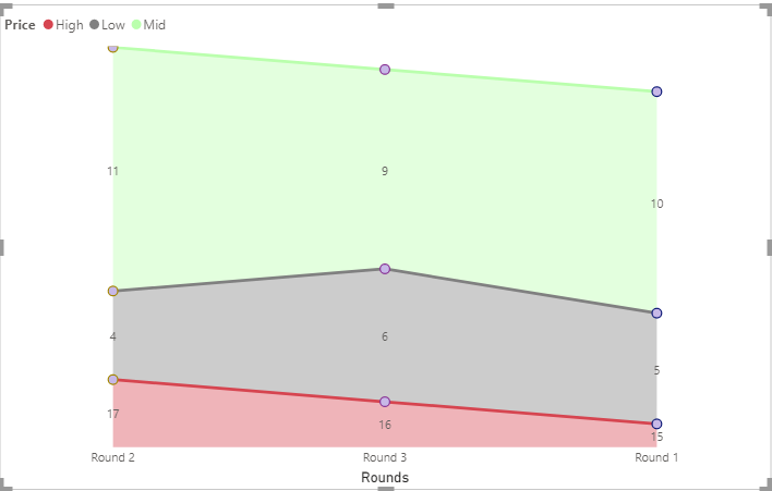
and I want to use the Stacked area chart:
How can I sort the Axis(rounds: round 1, round 2, round 3) and the Legends (Prices: low at the bottom then mid then high)?
Solved! Go to Solution.
- Mark as New
- Bookmark
- Subscribe
- Mute
- Subscribe to RSS Feed
- Permalink
- Report Inappropriate Content
Hi @Anonymous ,
On your area chart, on the top right, click on the 3 dots and you can see options to sort your axis as below:
Use this to sort your x-axis with values - Round1, Round2, Round3.
To sort your Legend, refer following article:
https://www.seerinteractive.com/blog/reorder-powerbi-legend/
Thanks,
Pragati
- Mark as New
- Bookmark
- Subscribe
- Mute
- Subscribe to RSS Feed
- Permalink
- Report Inappropriate Content
Hello @DiaaDag ,
Also, if you want to put the Bass to the bottom,you can create three measures and sort them under Values.
High = CALCULATE(SUM('Table'[Amount]),FILTER('Table','Table'[Price] = "High"))Mid = CALCULATE(SUM('Table'[Amount]),FILTER('Table','Table'[Price] = "Mid"))Low = CALCULATE(SUM('Table'[Amount]),FILTER('Table','Table'[Price] = "Low"))
If you don't meet your requirements, could you show the exact expected result based on the table you shared?
Best regards
Community Support Team _ zhenbw
If this post helps,then consider Accepting it as the solution to help other members find it more quickly.
BTW, pbix as attached.
- Mark as New
- Bookmark
- Subscribe
- Mute
- Subscribe to RSS Feed
- Permalink
- Report Inappropriate Content
Hi @Anonymous ,
On your area chart, on the top right, click on the 3 dots and you can see options to sort your axis as below:
Use this to sort your x-axis with values - Round1, Round2, Round3.
To sort your Legend, refer following article:
https://www.seerinteractive.com/blog/reorder-powerbi-legend/
Thanks,
Pragati
- Mark as New
- Bookmark
- Subscribe
- Mute
- Subscribe to RSS Feed
- Permalink
- Report Inappropriate Content
Thank you very much
Helpful resources

Power BI Dataviz World Championships
Vote for your favorite vizzies from the Power BI World Championship submissions!

Join our Community Sticker Challenge 2026
If you love stickers, then you will definitely want to check out our Community Sticker Challenge!

Power BI Monthly Update - January 2026
Check out the January 2026 Power BI update to learn about new features.

| User | Count |
|---|---|
| 56 | |
| 52 | |
| 45 | |
| 17 | |
| 16 |
| User | Count |
|---|---|
| 108 | |
| 108 | |
| 39 | |
| 33 | |
| 25 |


