- Power BI forums
- Get Help with Power BI
- Desktop
- Service
- Report Server
- Power Query
- Mobile Apps
- Developer
- DAX Commands and Tips
- Custom Visuals Development Discussion
- Health and Life Sciences
- Power BI Spanish forums
- Translated Spanish Desktop
- Training and Consulting
- Instructor Led Training
- Dashboard in a Day for Women, by Women
- Galleries
- Data Stories Gallery
- Themes Gallery
- Contests Gallery
- QuickViz Gallery
- Quick Measures Gallery
- Visual Calculations Gallery
- Notebook Gallery
- Translytical Task Flow Gallery
- TMDL Gallery
- R Script Showcase
- Webinars and Video Gallery
- Ideas
- Custom Visuals Ideas (read-only)
- Issues
- Issues
- Events
- Upcoming Events
We've captured the moments from FabCon & SQLCon that everyone is talking about, and we are bringing them to the community, live and on-demand. Starts on April 14th. Register now
- Power BI forums
- Forums
- Get Help with Power BI
- Desktop
- Smooth lines
- Subscribe to RSS Feed
- Mark Topic as New
- Mark Topic as Read
- Float this Topic for Current User
- Bookmark
- Subscribe
- Printer Friendly Page
- Mark as New
- Bookmark
- Subscribe
- Mute
- Subscribe to RSS Feed
- Permalink
- Report Inappropriate Content
Smooth lines
Is there any way to smooth lines on a line chart?
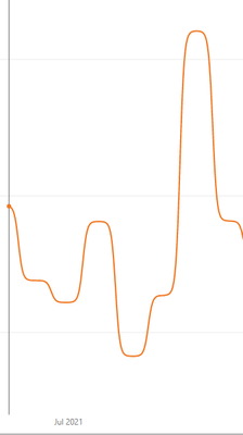
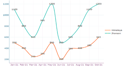
I'd like it to flow more like this one made in Excel, than the one below it made in PBI.
Many thanks
Solved! Go to Solution.
- Mark as New
- Bookmark
- Subscribe
- Mute
- Subscribe to RSS Feed
- Permalink
- Report Inappropriate Content
hi. there is not a way to do this in powerbi that i am aware of.
I know that the smoothed line looks good but is it an accurate representation of the data?
- Mark as New
- Bookmark
- Subscribe
- Mute
- Subscribe to RSS Feed
- Permalink
- Report Inappropriate Content
Hello @Power-BI and @samdthompson :
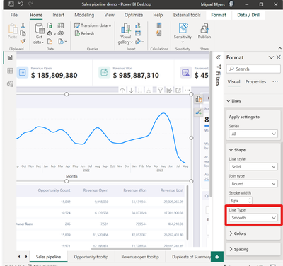
You may be aware of this, but from the july 2023 release smooth lines are available.
See release note :
Release note july 2023
or the snippet from the release note below:
Kind regards!
If this solved your problem, consider marking this answer as a solution.
- Mark as New
- Bookmark
- Subscribe
- Mute
- Subscribe to RSS Feed
- Permalink
- Report Inappropriate Content
So I managed to get a decent result for a smoothed linechart on a monthly basis:

This Formula calculates the Sales on a monthly basis but between each start and end of the month it calculates the change in a logistical curve so it smooths out the numbers betweeen each monts close. Be aware that this only works if you have "dates" on your x-axis. It may not represent your accurate data between months bit it looks just nice.
- Mark as New
- Bookmark
- Subscribe
- Mute
- Subscribe to RSS Feed
- Permalink
- Report Inappropriate Content
Hi @Power-BI,
Here visual shows smooth lines instead of lines which will help you get different line styles. 
Download link for the custom visual file on this page,
https://pbivizedit.com/gallery/smooth-lines-in-line-chart
This was made with our Custom Visual creator tool PBIVizEdit.com. With this tool,
- anyone, irrespective of technical skills, can create their own visuals
- 15 minutes to create a visual from scratch
- opens up many additional attributes to edit (for e.g. labels, tooltips, legends position, etc)
Give this a shot and let us know if you face any problems/errors.
You can use the editor to modify your visual further (some modifications cannot be done in the Power BI window and have to be in the editor).
Thanks,
Team PBIVizEdit
- Mark as New
- Bookmark
- Subscribe
- Mute
- Subscribe to RSS Feed
- Permalink
- Report Inappropriate Content
Hello,! The Power KPI worked in making the lines smooth or monotone.. The probem i encountered is when i publish it to wapp.powerbi workspace.. it is creating an error. the powerBi is already added in the power bi desktop but i dont see how i can add this to app.powerbi
- Mark as New
- Bookmark
- Subscribe
- Mute
- Subscribe to RSS Feed
- Permalink
- Report Inappropriate Content
Hi All,
The below visual offers the same functionality of smoothing as that in excel.
https://appsource.microsoft.com/en-us/product/power-bi-visuals/WA104381083?tab=Overview
- Mark as New
- Bookmark
- Subscribe
- Mute
- Subscribe to RSS Feed
- Permalink
- Report Inappropriate Content
@Kolumam Is correct
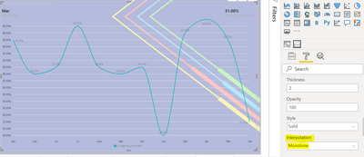
When you download the "Power KPI" viz from the market place, you are going to want to edit the line by selecting 'Monotone'. see screenshot
Best,
Eric
- Mark as New
- Bookmark
- Subscribe
- Mute
- Subscribe to RSS Feed
- Permalink
- Report Inappropriate Content
hi. there is not a way to do this in powerbi that i am aware of.
I know that the smoothed line looks good but is it an accurate representation of the data?
- Mark as New
- Bookmark
- Subscribe
- Mute
- Subscribe to RSS Feed
- Permalink
- Report Inappropriate Content
If you want to represent a "Gauss Bell", it is completely necessary to have smooth lines to understand the distribution.
That's because i think it is necessary to have the possibility to represent a smooth line chart.
Josep.
- Mark as New
- Bookmark
- Subscribe
- Mute
- Subscribe to RSS Feed
- Permalink
- Report Inappropriate Content
"..is it an accurate representation of the data?" - it can often well be more accurate than showing only the measured points..
In case the data in question is anyway an estimate and contains error, representing smooth lines instead of absolute points only indicating that "it is roughly like X" is totally and utterly warranted in my opinion, being more truthful representation of the data. Also, for cases where you have continous phenomenon underneath (such as temperature...) but have only discontinuous measurements (say hourly), again, smoothing the lines to be continuous more truly represents the underlying distribution, of which the collected data is only a partly representing sample. I disagree with your stance for many a dataset of reality.
- Mark as New
- Bookmark
- Subscribe
- Mute
- Subscribe to RSS Feed
- Permalink
- Report Inappropriate Content
"..is it an accurate representation of the data?" - it can well be more accurate than showing only the measured points..
In case the data in question is anyway an estimate and contains error, representing absolute points instead of smooth lines indicating that "it is roughly like X" is totally and utterly warranted in my opinion. Also, for cases where you have continous phenomenon underneath (such as temperature...) but have only discontinuous measurements (say hourly), again, smoothing the lines to be continuous more truly represents the underlying distribution, of which the collected data is only a partly representing sample. I disagree with your stance for many a dataset of reality.
- Mark as New
- Bookmark
- Subscribe
- Mute
- Subscribe to RSS Feed
- Permalink
- Report Inappropriate Content
This was a while back...any chance this is possible in new version?
- Mark as New
- Bookmark
- Subscribe
- Mute
- Subscribe to RSS Feed
- Permalink
- Report Inappropriate Content
Seems like a terrible idea anyway. In that example picture the curves make the lines go higher and lower than the actual data points they're connecting. So the graph is lying. It looks pretty but it's worse than useless for representing data. It's a good thing that we don't have this "feature".
- Mark as New
- Bookmark
- Subscribe
- Mute
- Subscribe to RSS Feed
- Permalink
- Report Inappropriate Content
In case the smooth lines would go over or under the actual observed values, yes, wrong, but in case they remain within the observed boundaries, result may well represent reality better than discontinuous observations of a phenomenon. Think of temperature and hourly measurements of it. Cheers.
- Mark as New
- Bookmark
- Subscribe
- Mute
- Subscribe to RSS Feed
- Permalink
- Report Inappropriate Content
If you do want this feature here you go
https://zoomcharts.com/en/microsoft-power-bi-custom-visuals/
Helpful resources

New to Fabric Survey
If you have recently started exploring Fabric, we'd love to hear how it's going. Your feedback can help with product improvements.

Power BI DataViz World Championships - June 2026
A new Power BI DataViz World Championship is coming this June! Don't miss out on submitting your entry.

Join our Fabric User Panel
Share feedback directly with Fabric product managers, participate in targeted research studies and influence the Fabric roadmap.

| User | Count |
|---|---|
| 53 | |
| 38 | |
| 33 | |
| 17 | |
| 17 |
| User | Count |
|---|---|
| 67 | |
| 62 | |
| 38 | |
| 34 | |
| 22 |


