FabCon is coming to Atlanta
Join us at FabCon Atlanta from March 16 - 20, 2026, for the ultimate Fabric, Power BI, AI and SQL community-led event. Save $200 with code FABCOMM.
Register now!- Power BI forums
- Get Help with Power BI
- Desktop
- Service
- Report Server
- Power Query
- Mobile Apps
- Developer
- DAX Commands and Tips
- Custom Visuals Development Discussion
- Health and Life Sciences
- Power BI Spanish forums
- Translated Spanish Desktop
- Training and Consulting
- Instructor Led Training
- Dashboard in a Day for Women, by Women
- Galleries
- Data Stories Gallery
- Themes Gallery
- Contests Gallery
- QuickViz Gallery
- Quick Measures Gallery
- Visual Calculations Gallery
- Notebook Gallery
- Translytical Task Flow Gallery
- TMDL Gallery
- R Script Showcase
- Webinars and Video Gallery
- Ideas
- Custom Visuals Ideas (read-only)
- Issues
- Issues
- Events
- Upcoming Events
The Power BI Data Visualization World Championships is back! Get ahead of the game and start preparing now! Learn more
- Power BI forums
- Forums
- Get Help with Power BI
- Desktop
- Size Bubbles - Map
- Subscribe to RSS Feed
- Mark Topic as New
- Mark Topic as Read
- Float this Topic for Current User
- Bookmark
- Subscribe
- Printer Friendly Page
- Mark as New
- Bookmark
- Subscribe
- Mute
- Subscribe to RSS Feed
- Permalink
- Report Inappropriate Content
Size Bubbles - Map
Hi All,
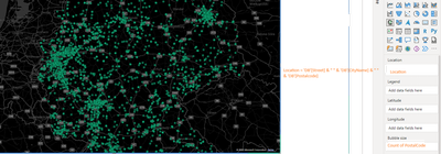
I am trying to build a heat map on PBI Desktop.
The location field of the map is calculated column as follows :

Solved! Go to Solution.
- Mark as New
- Bookmark
- Subscribe
- Mute
- Subscribe to RSS Feed
- Permalink
- Report Inappropriate Content
Hi, @Anonymous
Make sure that the categories and fields are correctly categorized in Power BI Desktop. This helps Bing Maps interpret and geocode the data correctly. You can set a data category by selecting a column in the Data view, and then under the Column Tools tab, you can set the Data Category to the appropriate type (for example, Zip Code, City, Address). For more information about data classification, you can check the link:
Data categorization in Power BI Desktop - Power BI | Microsoft Learn
If possible, add latitude and longitude data to the dataset. This approach eliminates ambiguity in location data, resulting in more accurate mapping. You can then drag these fields into the latitude and longitude buckets in the map visualization settings. This method eliminates the need for Bing to geocode location data, allowing for more accurate clustering and positioning on the map.
If the built-in map visuals in Power BI Desktop don't meet your needs, consider exploring custom visuals from the Power BI Visuals Marketplace, or using Azure Maps visuals for Power BI, which may provide more flexibility and accuracy for specific use cases. Azure Maps visuals allow for detailed customization and potentially more control over how data is displayed and clustered. For more insights on improving map visuals in Power BI, you can review the following documentation:
Tips and Tricks for maps (including Bing Maps integration) - Power BI | Microsoft Learn
If it does not help, please provide more details with your desired output and pbix file without privacy information (or some sample data)
How to Get Your Question Answered Quickly
Best Regards
Yongkang Hua
If this post helps, then please consider Accept it as the solution to help the other members find it more quickly.
- Mark as New
- Bookmark
- Subscribe
- Mute
- Subscribe to RSS Feed
- Permalink
- Report Inappropriate Content
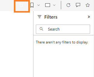
@Anonymous I think the problem is like this...when I select a value from the dropdown and refresh the page link I see the map with multiple bubbles. When I then click the reset green arrow on the dashboard the view becomes fine and shows the clustering. Can you please advise?
Thanks
- Mark as New
- Bookmark
- Subscribe
- Mute
- Subscribe to RSS Feed
- Permalink
- Report Inappropriate Content
Hi, @Anonymous
Make sure that the categories and fields are correctly categorized in Power BI Desktop. This helps Bing Maps interpret and geocode the data correctly. You can set a data category by selecting a column in the Data view, and then under the Column Tools tab, you can set the Data Category to the appropriate type (for example, Zip Code, City, Address). For more information about data classification, you can check the link:
Data categorization in Power BI Desktop - Power BI | Microsoft Learn
If possible, add latitude and longitude data to the dataset. This approach eliminates ambiguity in location data, resulting in more accurate mapping. You can then drag these fields into the latitude and longitude buckets in the map visualization settings. This method eliminates the need for Bing to geocode location data, allowing for more accurate clustering and positioning on the map.
If the built-in map visuals in Power BI Desktop don't meet your needs, consider exploring custom visuals from the Power BI Visuals Marketplace, or using Azure Maps visuals for Power BI, which may provide more flexibility and accuracy for specific use cases. Azure Maps visuals allow for detailed customization and potentially more control over how data is displayed and clustered. For more insights on improving map visuals in Power BI, you can review the following documentation:
Tips and Tricks for maps (including Bing Maps integration) - Power BI | Microsoft Learn
If it does not help, please provide more details with your desired output and pbix file without privacy information (or some sample data)
How to Get Your Question Answered Quickly
Best Regards
Yongkang Hua
If this post helps, then please consider Accept it as the solution to help the other members find it more quickly.
- Mark as New
- Bookmark
- Subscribe
- Mute
- Subscribe to RSS Feed
- Permalink
- Report Inappropriate Content
esri Map Clustering theme doesnot work correctly. ... - Microsoft Fabric Community - Seems similar problem. Can you please guide here @srikanthgr1
Helpful resources

Power BI Dataviz World Championships
The Power BI Data Visualization World Championships is back! Get ahead of the game and start preparing now!

| User | Count |
|---|---|
| 39 | |
| 38 | |
| 38 | |
| 28 | |
| 27 |
| User | Count |
|---|---|
| 124 | |
| 87 | |
| 70 | |
| 66 | |
| 65 |


