FabCon is coming to Atlanta
Join us at FabCon Atlanta from March 16 - 20, 2026, for the ultimate Fabric, Power BI, AI and SQL community-led event. Save $200 with code FABCOMM.
Register now!- Power BI forums
- Get Help with Power BI
- Desktop
- Service
- Report Server
- Power Query
- Mobile Apps
- Developer
- DAX Commands and Tips
- Custom Visuals Development Discussion
- Health and Life Sciences
- Power BI Spanish forums
- Translated Spanish Desktop
- Training and Consulting
- Instructor Led Training
- Dashboard in a Day for Women, by Women
- Galleries
- Data Stories Gallery
- Themes Gallery
- Contests Gallery
- Quick Measures Gallery
- Notebook Gallery
- Translytical Task Flow Gallery
- TMDL Gallery
- R Script Showcase
- Webinars and Video Gallery
- Ideas
- Custom Visuals Ideas (read-only)
- Issues
- Issues
- Events
- Upcoming Events
Join the Fabric FabCon Global Hackathon—running virtually through Nov 3. Open to all skill levels. $10,000 in prizes! Register now.
- Power BI forums
- Forums
- Get Help with Power BI
- Desktop
- Re: Single line displaying several item
- Subscribe to RSS Feed
- Mark Topic as New
- Mark Topic as Read
- Float this Topic for Current User
- Bookmark
- Subscribe
- Printer Friendly Page
- Mark as New
- Bookmark
- Subscribe
- Mute
- Subscribe to RSS Feed
- Permalink
- Report Inappropriate Content
Single line displaying several item
Hi all,
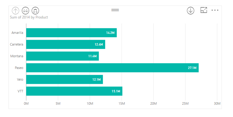
Basically I know how to make the display as below
However, I'm looking for another way to display to save the space for my reporting page. I don't know whether it is possible.
Solved! Go to Solution.
- Mark as New
- Bookmark
- Subscribe
- Mute
- Subscribe to RSS Feed
- Permalink
- Report Inappropriate Content
Hi @s15
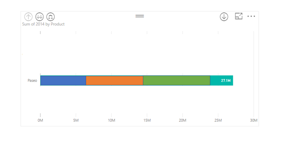
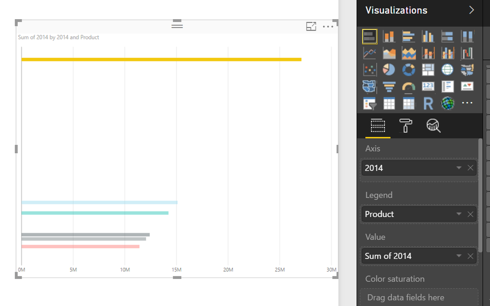
I believe you are using the "Stacked Bar Chart" visual. Instead of dragging the Product on the "Axis" , Could you try putting it on the "Legend" and turn off the X & Y axes. After that you can turn on the "Data Label".
Let me know if this works, Else you could provide me a sample file your dataset. I could try to solve your issues at my end with some other visual
Regards,
Ketan!
- Mark as New
- Bookmark
- Subscribe
- Mute
- Subscribe to RSS Feed
- Permalink
- Report Inappropriate Content
Hi @ketan10
After trying your suggestion, it's like below
You can try with the PBIX file shared here https://collapoint-my.sharepoint.com/personal/thuan_collapoint_onmicrosoft_com/_layouts/15/guestacce...
Sample dataset: https://collapoint-my.sharepoint.com/personal/thuan_collapoint_onmicrosoft_com/_layouts/15/guestacce...
Please let me know if you cannot access it.
Thank you very much!
- Mark as New
- Bookmark
- Subscribe
- Mute
- Subscribe to RSS Feed
- Permalink
- Report Inappropriate Content
I'm done now with your help. I removed everything out of Axis to make it done
Thank you very much!


