FabCon is coming to Atlanta
Join us at FabCon Atlanta from March 16 - 20, 2026, for the ultimate Fabric, Power BI, AI and SQL community-led event. Save $200 with code FABCOMM.
Register now!- Power BI forums
- Get Help with Power BI
- Desktop
- Service
- Report Server
- Power Query
- Mobile Apps
- Developer
- DAX Commands and Tips
- Custom Visuals Development Discussion
- Health and Life Sciences
- Power BI Spanish forums
- Translated Spanish Desktop
- Training and Consulting
- Instructor Led Training
- Dashboard in a Day for Women, by Women
- Galleries
- Data Stories Gallery
- Themes Gallery
- Contests Gallery
- Quick Measures Gallery
- Notebook Gallery
- Translytical Task Flow Gallery
- TMDL Gallery
- R Script Showcase
- Webinars and Video Gallery
- Ideas
- Custom Visuals Ideas (read-only)
- Issues
- Issues
- Events
- Upcoming Events
Calling all Data Engineers! Fabric Data Engineer (Exam DP-700) live sessions are back! Starting October 16th. Sign up.
- Power BI forums
- Forums
- Get Help with Power BI
- Desktop
- Re: Showing percentage and number values in visual...
- Subscribe to RSS Feed
- Mark Topic as New
- Mark Topic as Read
- Float this Topic for Current User
- Bookmark
- Subscribe
- Printer Friendly Page
- Mark as New
- Bookmark
- Subscribe
- Mute
- Subscribe to RSS Feed
- Permalink
- Report Inappropriate Content
Showing percentage and number values in visuals at the same time
Hello
I'm trying to showing percentages and number at the same time in my visual,
ex: 88.15% (100 000)
or: 100 000 ( 88.15%)
but I tried many different visuals and I did not make it.
Do you have any ideas?
Solved! Go to Solution.
- Mark as New
- Bookmark
- Subscribe
- Mute
- Subscribe to RSS Feed
- Permalink
- Report Inappropriate Content
Hi @istik,
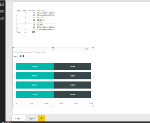
According to the sample data in your screenshot and based on my test, we will need to create a calculated column in the original table and make the values in the calculated column display as 100 000 ( 88.15%) or 88.15% (100 000) format. Please note that after creating the calculated column, we can only drag it into Table visual in order to show the values properly(as shown in the following screenshot). As the calculated column is text type, in other visuals, it will be counted.
For more details about how to create a calculated column in your scenario, you can check the example in the attached PBIX file.
Thanks,
Lydia Zhang
- Mark as New
- Bookmark
- Subscribe
- Mute
- Subscribe to RSS Feed
- Permalink
- Report Inappropriate Content
Hi,
There is no perfect solution for this. However, few workarounds which you can try using Grid/Matrix visual-
1. Concatenate two columns containing values and percentage.
2. Merge two columns in query editor using required delimiter.
3. Pull the required columns in the grid and do the formatting such that it looks like they belong to same column, for instance column shown in below image -
Regards,
Tejasvi
- Mark as New
- Bookmark
- Subscribe
- Mute
- Subscribe to RSS Feed
- Permalink
- Report Inappropriate Content
Hi,
This would be very interesting, is there any new functionnality to achieve that ?
Best regards,
Benjamin
- Mark as New
- Bookmark
- Subscribe
- Mute
- Subscribe to RSS Feed
- Permalink
- Report Inappropriate Content
Hi,
This would be very interesting, is there any new functionnality to achieve that ?
Best regards,
Benjamin
- Mark as New
- Bookmark
- Subscribe
- Mute
- Subscribe to RSS Feed
- Permalink
- Report Inappropriate Content
Hi, I think i have the same problem, did you get the solution for this problem?
- Mark as New
- Bookmark
- Subscribe
- Mute
- Subscribe to RSS Feed
- Permalink
- Report Inappropriate Content
you solved it? I tried using solutions here, but nothing worked perfectly....
- Mark as New
- Bookmark
- Subscribe
- Mute
- Subscribe to RSS Feed
- Permalink
- Report Inappropriate Content
Hi @istik,
According to the sample data in your screenshot and based on my test, we will need to create a calculated column in the original table and make the values in the calculated column display as 100 000 ( 88.15%) or 88.15% (100 000) format. Please note that after creating the calculated column, we can only drag it into Table visual in order to show the values properly(as shown in the following screenshot). As the calculated column is text type, in other visuals, it will be counted.
For more details about how to create a calculated column in your scenario, you can check the example in the attached PBIX file.
Thanks,
Lydia Zhang
- Mark as New
- Bookmark
- Subscribe
- Mute
- Subscribe to RSS Feed
- Permalink
- Report Inappropriate Content
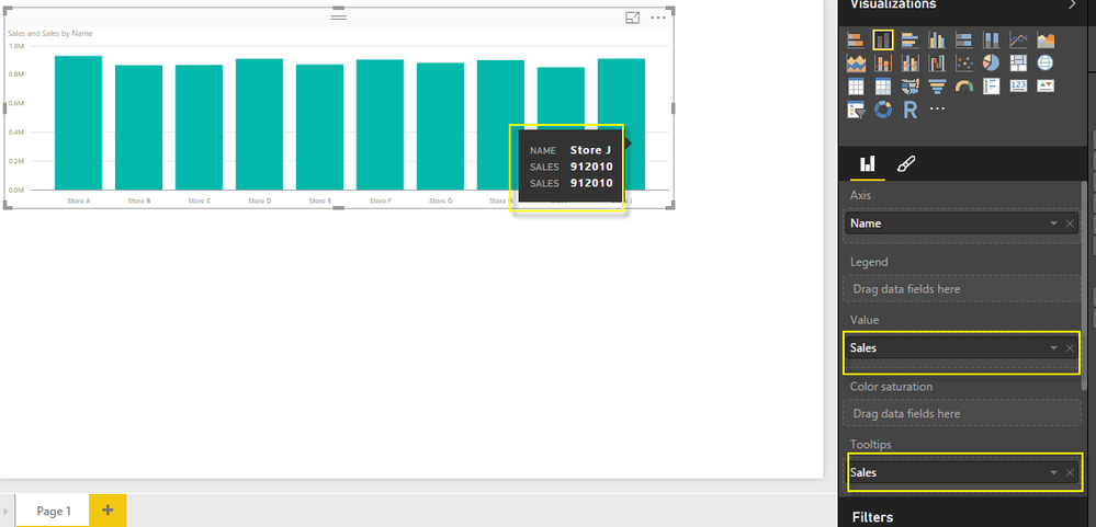
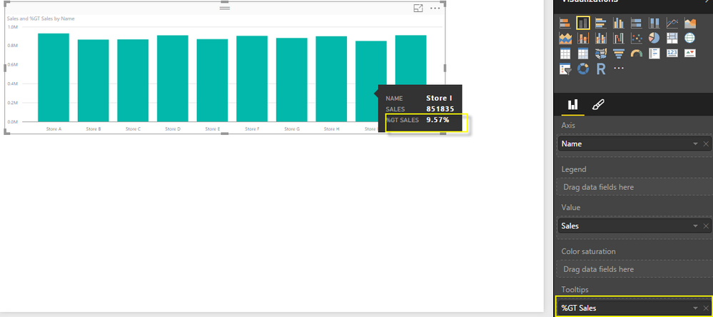
Power BI provides a better solution to calcuate % automatically and you can show these in your tooltips quickly
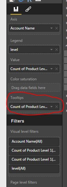
Please refer to below. I have placed a staked chart and put Sales mearure in Value as well as in Tooltip. Now its showing sales two time in tooltips.
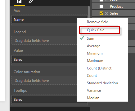
Next do a right click in Tooltip section on Sales and go to Quick Calc Option.
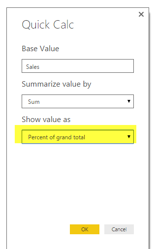
Now change the Show Valu as to Percentage as below
It will conver the tooltip to show as % of GT.
Hope this will resolve your problem.
- Mark as New
- Bookmark
- Subscribe
- Mute
- Subscribe to RSS Feed
- Permalink
- Report Inappropriate Content
My initial thought is do to something with the Tooltip. I'm assuming that the goal of the graph is to find the exception, a category that is, maybe, under 90%. If you use the Tooltip, you can allow users to browse the graph with less clutter, then hover over and get the context of the additional info. something like the image below.
You can accomplish this by adding a measure, as seen below.
Nate
- Mark as New
- Bookmark
- Subscribe
- Mute
- Subscribe to RSS Feed
- Permalink
- Report Inappropriate Content
thanks for the reply, yes I can add a tootips, but I want to know if there any way to show the % and values at the same time
like 90%(1 000 000)

