FabCon is coming to Atlanta
Join us at FabCon Atlanta from March 16 - 20, 2026, for the ultimate Fabric, Power BI, AI and SQL community-led event. Save $200 with code FABCOMM.
Register now!- Power BI forums
- Get Help with Power BI
- Desktop
- Service
- Report Server
- Power Query
- Mobile Apps
- Developer
- DAX Commands and Tips
- Custom Visuals Development Discussion
- Health and Life Sciences
- Power BI Spanish forums
- Translated Spanish Desktop
- Training and Consulting
- Instructor Led Training
- Dashboard in a Day for Women, by Women
- Galleries
- Data Stories Gallery
- Themes Gallery
- Contests Gallery
- Quick Measures Gallery
- Notebook Gallery
- Translytical Task Flow Gallery
- TMDL Gallery
- R Script Showcase
- Webinars and Video Gallery
- Ideas
- Custom Visuals Ideas (read-only)
- Issues
- Issues
- Events
- Upcoming Events
To celebrate FabCon Vienna, we are offering 50% off select exams. Ends October 3rd. Request your discount now.
- Power BI forums
- Forums
- Get Help with Power BI
- Desktop
- Re: Showing multiple items in a graph
- Subscribe to RSS Feed
- Mark Topic as New
- Mark Topic as Read
- Float this Topic for Current User
- Bookmark
- Subscribe
- Printer Friendly Page
- Mark as New
- Bookmark
- Subscribe
- Mute
- Subscribe to RSS Feed
- Permalink
- Report Inappropriate Content
Showing multiple items in a graph
Hi,
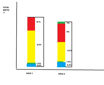
I have a geology database that i want to show what percentage of metals are in a hole, however id also like to display the lithology type on the y axis as well. Im trying to build this (excuse the poor artist rendition) The coloured bars are the Lithology (rock type) and the percentages are the metal percentages. i cant find a way to combine that data and graph it. Im not set on a bar graph, as long as the data is visually displayed well im ok (i.e not datatable as i can do that 🙂 )
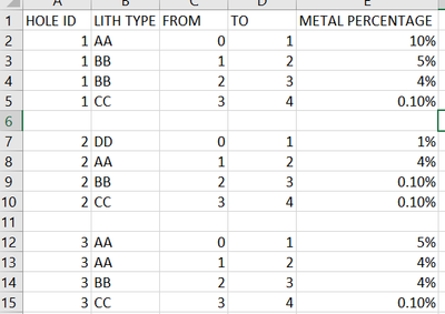
The data is sorted like so
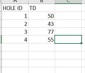
And like so
Im just not having any luck,
could someone help? ive got the correct datatypes etc i just cant build the graph?
Solved! Go to Solution.
- Mark as New
- Bookmark
- Subscribe
- Mute
- Subscribe to RSS Feed
- Permalink
- Report Inappropriate Content
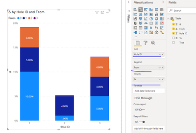
You may create a simple chart like below.
Paul Zheng _ Community Support Team
If this post helps, please Accept it as the solution to help the other members find it more quickly.
- Mark as New
- Bookmark
- Subscribe
- Mute
- Subscribe to RSS Feed
- Permalink
- Report Inappropriate Content
You may create a simple chart like below.
Paul Zheng _ Community Support Team
If this post helps, please Accept it as the solution to help the other members find it more quickly.
- Mark as New
- Bookmark
- Subscribe
- Mute
- Subscribe to RSS Feed
- Permalink
- Report Inappropriate Content
@someonerandom , At first look, seem like a stacked visual with Hole on the x-axis and Lith Type as the legend and metal % as the value
- Mark as New
- Bookmark
- Subscribe
- Mute
- Subscribe to RSS Feed
- Permalink
- Report Inappropriate Content
Cheers it seems to want to count the Y axis, id like to have it show 0-70 or whatever the final depth is instead it just counts..
- Mark as New
- Bookmark
- Subscribe
- Mute
- Subscribe to RSS Feed
- Permalink
- Report Inappropriate Content
Anyone able to help with this one? i just want to show metre for metre on the Y axis and show what lithology type is there and it percentage?> can this be done>?


