FabCon is coming to Atlanta
Join us at FabCon Atlanta from March 16 - 20, 2026, for the ultimate Fabric, Power BI, AI and SQL community-led event. Save $200 with code FABCOMM.
Register now!- Power BI forums
- Get Help with Power BI
- Desktop
- Service
- Report Server
- Power Query
- Mobile Apps
- Developer
- DAX Commands and Tips
- Custom Visuals Development Discussion
- Health and Life Sciences
- Power BI Spanish forums
- Translated Spanish Desktop
- Training and Consulting
- Instructor Led Training
- Dashboard in a Day for Women, by Women
- Galleries
- Data Stories Gallery
- Themes Gallery
- Contests Gallery
- Quick Measures Gallery
- Notebook Gallery
- Translytical Task Flow Gallery
- TMDL Gallery
- R Script Showcase
- Webinars and Video Gallery
- Ideas
- Custom Visuals Ideas (read-only)
- Issues
- Issues
- Events
- Upcoming Events
To celebrate FabCon Vienna, we are offering 50% off select exams. Ends October 3rd. Request your discount now.
- Power BI forums
- Forums
- Get Help with Power BI
- Desktop
- Re: Showing all Column Headers in a matrix
- Subscribe to RSS Feed
- Mark Topic as New
- Mark Topic as Read
- Float this Topic for Current User
- Bookmark
- Subscribe
- Printer Friendly Page
- Mark as New
- Bookmark
- Subscribe
- Mute
- Subscribe to RSS Feed
- Permalink
- Report Inappropriate Content
Showing all Column Headers in a matrix
Good day to all,
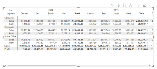
Using the example from enjoysharepoint below:
I am unable to find a suitable way to show the row header for the second line. In the example above, it would be something like 'Region' in a row to match Central, East, etc. 'Segment' would be below it.
I have a measure in the Values.
I discovered that if I used the "Separator trick" for better formatting, it will actually show that header. (Trick = Using a measure to add a '|' then coloring it the same as the background to give a visual appearance of separating sections.
Downside of this is when you know people will extract the data and they see the separator columns in the Excel file....)
Am I missing a setting somewhere to get that last header in the columns to show up?
Note that I find similar examples to the one above in Microsoft's Matrix documentation.
Thanks,
Trent
Solved! Go to Solution.
- Mark as New
- Bookmark
- Subscribe
- Mute
- Subscribe to RSS Feed
- Permalink
- Report Inappropriate Content
That's how they chose to implement it, probably to save some screen real estate. If you feel passionate about this please consider raising an idea at https://ideas.powerbi.com
- Mark as New
- Bookmark
- Subscribe
- Mute
- Subscribe to RSS Feed
- Permalink
- Report Inappropriate Content
That's how they chose to implement it, probably to save some screen real estate. If you feel passionate about this please consider raising an idea at https://ideas.powerbi.com


