Fabric Data Days starts November 4th!
Advance your Data & AI career with 50 days of live learning, dataviz contests, hands-on challenges, study groups & certifications and more!
Get registered- Power BI forums
- Get Help with Power BI
- Desktop
- Service
- Report Server
- Power Query
- Mobile Apps
- Developer
- DAX Commands and Tips
- Custom Visuals Development Discussion
- Health and Life Sciences
- Power BI Spanish forums
- Translated Spanish Desktop
- Training and Consulting
- Instructor Led Training
- Dashboard in a Day for Women, by Women
- Galleries
- Data Stories Gallery
- Themes Gallery
- Contests Gallery
- QuickViz Gallery
- Quick Measures Gallery
- Visual Calculations Gallery
- Notebook Gallery
- Translytical Task Flow Gallery
- TMDL Gallery
- R Script Showcase
- Webinars and Video Gallery
- Ideas
- Custom Visuals Ideas (read-only)
- Issues
- Issues
- Events
- Upcoming Events
Get Fabric Certified for FREE during Fabric Data Days. Don't miss your chance! Request now
- Power BI forums
- Forums
- Get Help with Power BI
- Desktop
- Re: Show zero on Line chart where no data for date
- Subscribe to RSS Feed
- Mark Topic as New
- Mark Topic as Read
- Float this Topic for Current User
- Bookmark
- Subscribe
- Printer Friendly Page
- Mark as New
- Bookmark
- Subscribe
- Mute
- Subscribe to RSS Feed
- Permalink
- Report Inappropriate Content
Show zero on Line chart where no data for date
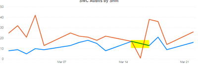
Hello all. I am trying to build a line chart visual that will display Zero when no data is present. I have been reading through the forum for some time and have tried multiple ways suggested and cannot get the chart to display the way I need. I am tracking audits performed by shift. On 03/16/21, the "Orange" shift did 1 audit and the "Blue" shift did none. I do not want to see a gap in the line for the "Blue" shift, but rather have it drop down to zero on the X- Axis.
The chart should look something like this:
I am using the following as my Measure to calculate the Audit Count:
AuditCount = COUNT(Audits[AuditID])+0
My X-Axis is Categorical as I want to display all dates. Changing to Continuous does not show the desired results as the Blue shift data line jumps from 03/15/21 to 03/17/21 and I do not want that.
Any suggestions / support to resolve this would be appreciated. Thank you.
Solved! Go to Solution.
- Mark as New
- Bookmark
- Subscribe
- Mute
- Subscribe to RSS Feed
- Permalink
- Report Inappropriate Content
Ok, here is a true and tested way:
Create a measure along the lines of:
Cutoff =
VAR _MaxDataDate = CALCULATE(MAX('Audits'[ShiftDate]), ALL('Audits'))
RETURN
IF(MAX('Calendar'[Date]) <= _MaxDataDate, 1)
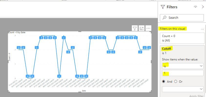
Now select the visual and add this measure to the "Filters on this visual" in the filter pane and set the value to 1.
Use the proven [AuditCount] measure in the visual:
Did I answer your question? Mark my post as a solution!
In doing so, you are also helping me. Thank you!
Proud to be a Super User!
Paul on Linkedin.
- Mark as New
- Bookmark
- Subscribe
- Mute
- Subscribe to RSS Feed
- Permalink
- Report Inappropriate Content
@PaulDBrown as a follow-up to my reply yesterday, I came up with a different solution. As well as yours worked, it did not work for what I need to show. What I ended up doing is adding two calculated columns to my Audit Table.
CountO = If(Audits[Shift]="O",1,0)
CountB = If(Audits[Shift]="B",1,0)
and added them to my visual. I got the chart and the matrix to display with zeros as I wanted and no unwanted dates.
Thank you for putting up with me. 🙂
- Mark as New
- Bookmark
- Subscribe
- Mute
- Subscribe to RSS Feed
- Permalink
- Report Inappropriate Content
@PaulDBrown , so from my report, I have this measure:
+ This measure:
and my chart looks like this.... no change from above....😶
- Mark as New
- Bookmark
- Subscribe
- Mute
- Subscribe to RSS Feed
- Permalink
- Report Inappropriate Content
Ok, here is a true and tested way:
Create a measure along the lines of:
Cutoff =
VAR _MaxDataDate = CALCULATE(MAX('Audits'[ShiftDate]), ALL('Audits'))
RETURN
IF(MAX('Calendar'[Date]) <= _MaxDataDate, 1)
Now select the visual and add this measure to the "Filters on this visual" in the filter pane and set the value to 1.
Use the proven [AuditCount] measure in the visual:
Did I answer your question? Mark my post as a solution!
In doing so, you are also helping me. Thank you!
Proud to be a Super User!
Paul on Linkedin.
- Mark as New
- Bookmark
- Subscribe
- Mute
- Subscribe to RSS Feed
- Permalink
- Report Inappropriate Content
@PaulDBrown as a follow-up to my reply yesterday, I came up with a different solution. As well as yours worked, it did not work for what I need to show. What I ended up doing is adding two calculated columns to my Audit Table.
CountO = If(Audits[Shift]="O",1,0)
CountB = If(Audits[Shift]="B",1,0)
and added them to my visual. I got the chart and the matrix to display with zeros as I wanted and no unwanted dates.
Thank you for putting up with me. 🙂
- Mark as New
- Bookmark
- Subscribe
- Mute
- Subscribe to RSS Feed
- Permalink
- Report Inappropriate Content
Hi @PaulDBrown ... apologies for the delay in getting back to you... was getting pulled away from this project for a couple of days. Now that I am back at it, I have tried your method, above and am getting better results....
A few responses back you had told me to change the X-Axis to the Date field in the Calendar table.... but here's my dilemma... we don't work most weekends so I am getting Zero results for weekend dates because I have no data for these dates. Is there a work-around for that?
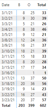
Here is my data in a matrix:
So in the line chart visual, I want to show Zero for B shift on March 16, but I do not want to show any data for March 20 & 21 as we were not working... same for all other weekend dates in March. But if I switch to show February, we did work on Feb 27, so would want to show that data in the line chart visual. Does that make sense?
Helpful resources

Power BI Monthly Update - November 2025
Check out the November 2025 Power BI update to learn about new features.

Fabric Data Days
Advance your Data & AI career with 50 days of live learning, contests, hands-on challenges, study groups & certifications and more!


