FabCon is coming to Atlanta
Join us at FabCon Atlanta from March 16 - 20, 2026, for the ultimate Fabric, Power BI, AI and SQL community-led event. Save $200 with code FABCOMM.
Register now!- Power BI forums
- Get Help with Power BI
- Desktop
- Service
- Report Server
- Power Query
- Mobile Apps
- Developer
- DAX Commands and Tips
- Custom Visuals Development Discussion
- Health and Life Sciences
- Power BI Spanish forums
- Translated Spanish Desktop
- Training and Consulting
- Instructor Led Training
- Dashboard in a Day for Women, by Women
- Galleries
- Data Stories Gallery
- Themes Gallery
- Contests Gallery
- QuickViz Gallery
- Quick Measures Gallery
- Visual Calculations Gallery
- Notebook Gallery
- Translytical Task Flow Gallery
- TMDL Gallery
- R Script Showcase
- Webinars and Video Gallery
- Ideas
- Custom Visuals Ideas (read-only)
- Issues
- Issues
- Events
- Upcoming Events
The Power BI Data Visualization World Championships is back! Get ahead of the game and start preparing now! Learn more
- Power BI forums
- Forums
- Get Help with Power BI
- Desktop
- Show percentage by column/row instead of %GT
- Subscribe to RSS Feed
- Mark Topic as New
- Mark Topic as Read
- Float this Topic for Current User
- Bookmark
- Subscribe
- Printer Friendly Page
- Mark as New
- Bookmark
- Subscribe
- Mute
- Subscribe to RSS Feed
- Permalink
- Report Inappropriate Content
Show percentage by column/row instead of %GT
Hi everyone,
I'm trying to make a clustered column chart to show some data by category by month.
My values are count of text value. PBI only has defualt calculation of show data in %GT.
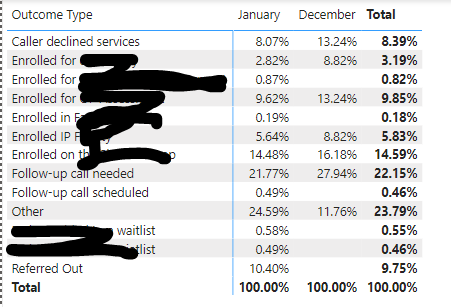
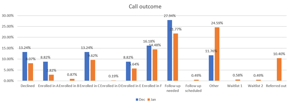
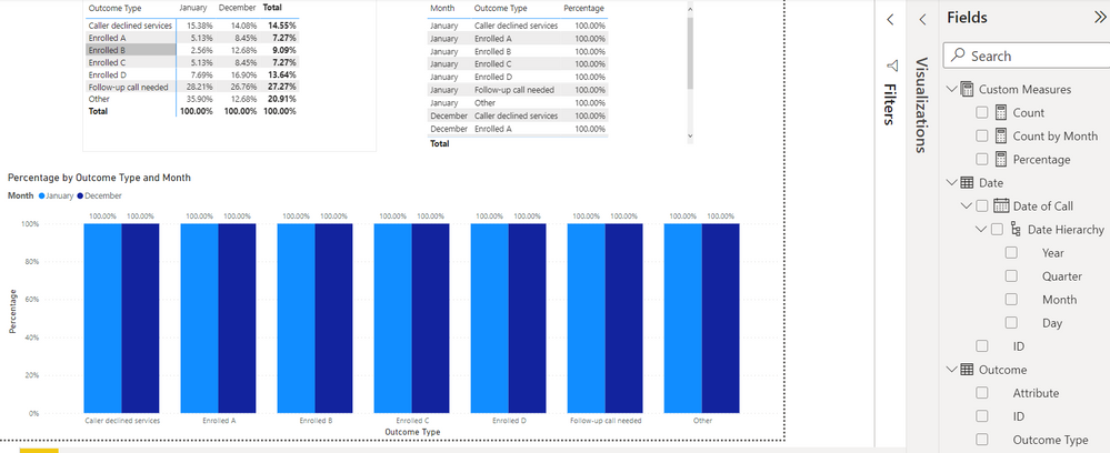
But I'd like to show the % by column, (I made below matrix in PBI and had month on the columns, but it should be same idea if I had month on rows), so the per month data would add up to 100%. Please see the matrix and a desired chart made in Excel below:
I was trying to make some measures to calculate the %, but I'm having trouble to get a total count of all categories for one month. Whenever I had the Axis added (which will show the categories on chart), it will give me the value of each bar of 100%.
Any suggestions on the mearsures please?
Thanks very much in advance!
EG
Solved! Go to Solution.
- Mark as New
- Bookmark
- Subscribe
- Mute
- Subscribe to RSS Feed
- Permalink
- Report Inappropriate Content
Hi @egnhc ,
Here's my solution.
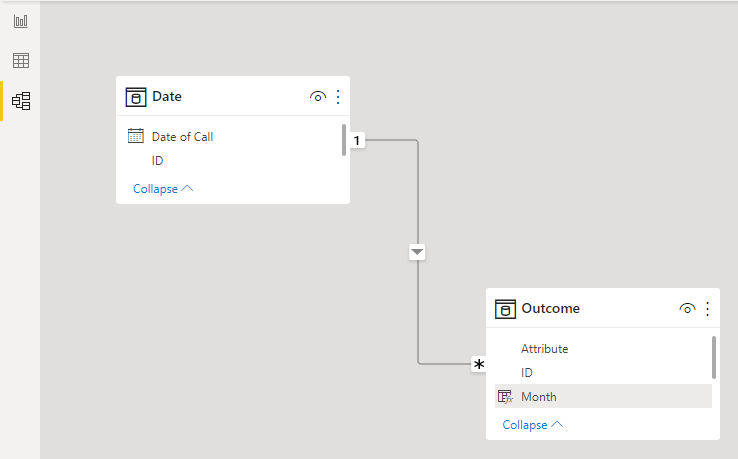
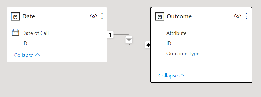
The relationship is as follows.
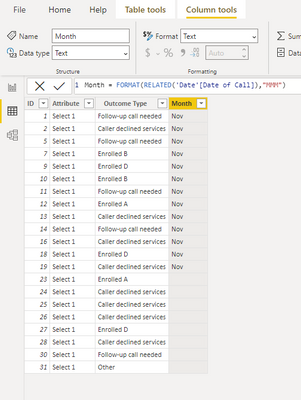
1.Create a calculated column in the Outcome table.
Month = FORMAT(RELATED('Date'[Date of Call]),"MMM")
2.Create a measure.
Measure = DIVIDE(COUNT('Outcome'[ID]),CALCULATE(COUNT(Outcome[ID]),ALLEXCEPT(Outcome,Outcome[Month])))
3.Create the chart visual as follows.
Best Regards,
Stephen Tao
If this post helps, then please consider Accept it as the solution to help the other members find it more quickly.
- Mark as New
- Bookmark
- Subscribe
- Mute
- Subscribe to RSS Feed
- Permalink
- Report Inappropriate Content
Hi,
You can use ALLSELECTED to achieve this:
I hope this post helps to solve your issue and if it does consider accepting it as a solution and giving the post a thumbs up!
My LinkedIn: https://www.linkedin.com/in/n%C3%A4ttiahov-00001/
Did I answer your question? Mark my post as a solution!
Proud to be a Super User!
- Mark as New
- Bookmark
- Subscribe
- Mute
- Subscribe to RSS Feed
- Permalink
- Report Inappropriate Content
Hi ValtteriN,
Thanks for your suggestion. However my values are count of text/string. Some functions like SUM doesn't work on this type of data. I tried to add some COUNTX calculation to it but couldn't get it straightened out.
Do you have any suggestions with text values?
Thanks again!
EG
- Mark as New
- Bookmark
- Subscribe
- Mute
- Subscribe to RSS Feed
- Permalink
- Report Inappropriate Content
Hi @egnhc ,
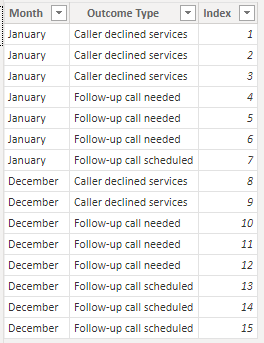
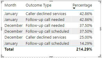
I created dummy data and then used measures to calculate percentages.
1.Create the following three metrics separately.
Count = COUNT('Table'[Outcome Type])Count by Month = CALCULATE(COUNT('Table'[Outcome Type]),FILTER(ALLSELECTED('Table'),[Month]=MAX('Table'[Month])))Percentage = DIVIDE([Count],[Count by Month])
You can check more details from the attachment.
Best Regards,
Stephen Tao
If this post helps, then please consider Accept it as the solution to help the other members find it more quickly.
- Mark as New
- Bookmark
- Subscribe
- Mute
- Subscribe to RSS Feed
- Permalink
- Report Inappropriate Content
Hi Stephen @Anonymous
Thank you for the suggesttion!
However, I'd like to have the X Axis to show outcome type instead of month. I had a picture in the original post that I made in Excel to show the desired chart. The purpose is to see/compare the data over months with different outcome type.
I was able to create measures that manually add up the counts for outcome type (I only listed two outcome types here as example):
But the issue with this calculation is that my data source potentially will be updated so the outcome type name will be changed. Then the Outcome total measure will need to be manually updated to the new name.
Is there a way to create measures by outcome type so I can drag Outcome Type to the Axis when creating the bar chart?
Thanks!
EG
- Mark as New
- Bookmark
- Subscribe
- Mute
- Subscribe to RSS Feed
- Permalink
- Report Inappropriate Content
Hi @egnhc ,
If you want the axis to show the Outcome Type, then you swap it with the month.
I don't think you need to make the formula static, like 'Outcome'[Outcome Type] IN { "Caller declined services" }.
My formula is a dynamic, have you tried to modify it according to my formulas?
If you are still in doubt, please provide your dummy data and expected results.
Best Regards,
Stephen Tao
If this post helps, then please consider Accept it as the solution to help the other members find it more quickly.
- Mark as New
- Bookmark
- Subscribe
- Mute
- Subscribe to RSS Feed
- Permalink
- Report Inappropriate Content
Hi Stephen @Anonymous ,
Yes I tried your measures but it didn't come out as expected.
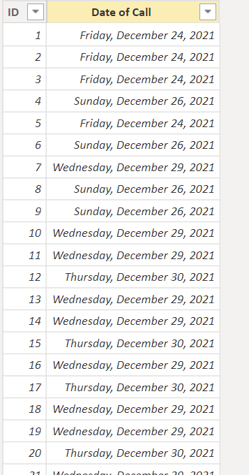
I forgot to mention that my date/month table and outcome type table are two different tables. I don't know if that complicates the issue. (Maybe it changes everything?? Sorry!!)
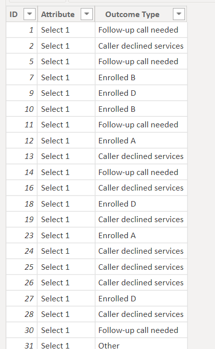
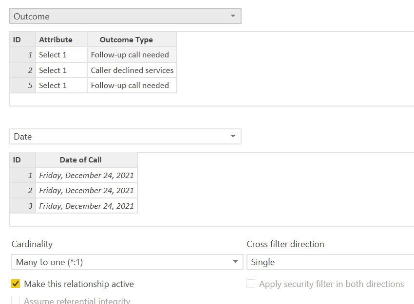
There isn't an option for me to upload the dummy data, so I attached some screenshots for the chart and my two tables.
Right now the bar chart is showing 100% for all the bars.
The desired chart would be the bar to show % as the matrix indicated (e.g. the Jan bar for Caller declined services would show 15.38%).
Thanks again!!
EG
- Mark as New
- Bookmark
- Subscribe
- Mute
- Subscribe to RSS Feed
- Permalink
- Report Inappropriate Content
Hi @egnhc ,
Is the relationship between the two tables connected by the ID column?
What is the relationship?
Best Regards,
Stephen Tao
If this post helps, then please consider Accept it as the solution to help the other members find it more quickly.
- Mark as New
- Bookmark
- Subscribe
- Mute
- Subscribe to RSS Feed
- Permalink
- Report Inappropriate Content
Hi Stephen @Anonymous ,
Yes, it's connected by the ID column. Please see screenshots.
Thanks!!
EG
- Mark as New
- Bookmark
- Subscribe
- Mute
- Subscribe to RSS Feed
- Permalink
- Report Inappropriate Content
Hi @egnhc ,
Here's my solution.
The relationship is as follows.
1.Create a calculated column in the Outcome table.
Month = FORMAT(RELATED('Date'[Date of Call]),"MMM")
2.Create a measure.
Measure = DIVIDE(COUNT('Outcome'[ID]),CALCULATE(COUNT(Outcome[ID]),ALLEXCEPT(Outcome,Outcome[Month])))
3.Create the chart visual as follows.
Best Regards,
Stephen Tao
If this post helps, then please consider Accept it as the solution to help the other members find it more quickly.
Helpful resources

Power BI Dataviz World Championships
The Power BI Data Visualization World Championships is back! Get ahead of the game and start preparing now!

Power BI Monthly Update - November 2025
Check out the November 2025 Power BI update to learn about new features.

| User | Count |
|---|---|
| 59 | |
| 43 | |
| 42 | |
| 23 | |
| 17 |
| User | Count |
|---|---|
| 190 | |
| 122 | |
| 96 | |
| 66 | |
| 47 |
