FabCon is coming to Atlanta
Join us at FabCon Atlanta from March 16 - 20, 2026, for the ultimate Fabric, Power BI, AI and SQL community-led event. Save $200 with code FABCOMM.
Register now!- Power BI forums
- Get Help with Power BI
- Desktop
- Service
- Report Server
- Power Query
- Mobile Apps
- Developer
- DAX Commands and Tips
- Custom Visuals Development Discussion
- Health and Life Sciences
- Power BI Spanish forums
- Translated Spanish Desktop
- Training and Consulting
- Instructor Led Training
- Dashboard in a Day for Women, by Women
- Galleries
- Data Stories Gallery
- Themes Gallery
- Contests Gallery
- QuickViz Gallery
- Quick Measures Gallery
- Visual Calculations Gallery
- Notebook Gallery
- Translytical Task Flow Gallery
- TMDL Gallery
- R Script Showcase
- Webinars and Video Gallery
- Ideas
- Custom Visuals Ideas (read-only)
- Issues
- Issues
- Events
- Upcoming Events
The Power BI Data Visualization World Championships is back! Get ahead of the game and start preparing now! Learn more
- Power BI forums
- Forums
- Get Help with Power BI
- Desktop
- Re: Show dynamic Top N and other values.
- Subscribe to RSS Feed
- Mark Topic as New
- Mark Topic as Read
- Float this Topic for Current User
- Bookmark
- Subscribe
- Printer Friendly Page
- Mark as New
- Bookmark
- Subscribe
- Mute
- Subscribe to RSS Feed
- Permalink
- Report Inappropriate Content
Show dynamic Top N and other values.
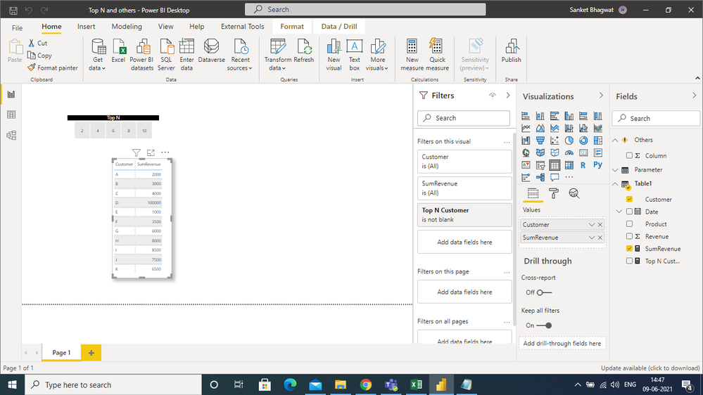
I first created a dynamic Top N slicer according to Customer, but then I was not able to proceed further.
I found one article on the community,https://community.powerbi.com/t5/DAX-Commands-and-Tips/Dynamic-dashboard-that-shows-TOP-N-and-OTHER-...
but that didn't gave me a satisfactory answer.
If someone knows any workaround then do please let me know.
I have attached screenshot of the data.
Regards,
Sanket Bhagwat
Solved! Go to Solution.
- Mark as New
- Bookmark
- Subscribe
- Mute
- Subscribe to RSS Feed
- Permalink
- Report Inappropriate Content
Hi, @SanketBhagwat
According to your description, I can roughly understand your requirement, I think you can try these measures to achieve your requirement:
First you should create a table for the slicer, which you seems to have finished:
- Create three measures like this:
SumRevenue = SUM('Table'[Revenue])Rank =
RANKX(ALL('Table'),CALCULATE([SumRevenue]),,DESC,Dense)SumRevenue1 =
var _topN=SELECTEDVALUE(Slicer[Top N])
return
IF([Rank]<=_topN,[SumRevenue],"OTHER")
- Then you can create a slicer and a table chart to place them like this:
And you can get what you want.
You can download my test pbix file below
Thank you very much!
Best Regards,
Community Support Team _Robert Qin
If this post helps, then please consider Accept it as the solution to help the other members find it more quickly.
- Mark as New
- Bookmark
- Subscribe
- Mute
- Subscribe to RSS Feed
- Permalink
- Report Inappropriate Content
Hi everyone, I'm new to power bi. Please help me separate the data from the virtual table into the corresponding tables as follows:
I want to separate the data lines and from the arrow to fill the data before the arrow in the columns in the respective tables, please help me, thanks a lot
- Mark as New
- Bookmark
- Subscribe
- Mute
- Subscribe to RSS Feed
- Permalink
- Report Inappropriate Content
Hi, @SanketBhagwat
According to your description, I can roughly understand your requirement, I think you can try these measures to achieve your requirement:
First you should create a table for the slicer, which you seems to have finished:
- Create three measures like this:
SumRevenue = SUM('Table'[Revenue])Rank =
RANKX(ALL('Table'),CALCULATE([SumRevenue]),,DESC,Dense)SumRevenue1 =
var _topN=SELECTEDVALUE(Slicer[Top N])
return
IF([Rank]<=_topN,[SumRevenue],"OTHER")
- Then you can create a slicer and a table chart to place them like this:
And you can get what you want.
You can download my test pbix file below
Thank you very much!
Best Regards,
Community Support Team _Robert Qin
If this post helps, then please consider Accept it as the solution to help the other members find it more quickly.
- Mark as New
- Bookmark
- Subscribe
- Mute
- Subscribe to RSS Feed
- Permalink
- Report Inappropriate Content
Thanks @v-robertq-msft for the reply.
Yes, I think that can be one of the ways to achieve the same.
Although visually it doesn't look proper, but it definitely serves the purpose.
Regards,
Sanket Bhagwat
Helpful resources

Power BI Dataviz World Championships
The Power BI Data Visualization World Championships is back! Get ahead of the game and start preparing now!

Power BI Monthly Update - November 2025
Check out the November 2025 Power BI update to learn about new features.

| User | Count |
|---|---|
| 59 | |
| 43 | |
| 42 | |
| 23 | |
| 17 |
| User | Count |
|---|---|
| 190 | |
| 122 | |
| 96 | |
| 66 | |
| 47 |


