Huge last-minute discounts for FabCon Vienna from September 15-18, 2025
Supplies are limited. Contact info@espc.tech right away to save your spot before the conference sells out.
Get your discount- Power BI forums
- Get Help with Power BI
- Desktop
- Service
- Report Server
- Power Query
- Mobile Apps
- Developer
- DAX Commands and Tips
- Custom Visuals Development Discussion
- Health and Life Sciences
- Power BI Spanish forums
- Translated Spanish Desktop
- Training and Consulting
- Instructor Led Training
- Dashboard in a Day for Women, by Women
- Galleries
- Data Stories Gallery
- Themes Gallery
- Contests Gallery
- Quick Measures Gallery
- Notebook Gallery
- Translytical Task Flow Gallery
- TMDL Gallery
- R Script Showcase
- Webinars and Video Gallery
- Ideas
- Custom Visuals Ideas (read-only)
- Issues
- Issues
- Events
- Upcoming Events
Score big with last-minute savings on the final tickets to FabCon Vienna. Secure your discount
- Power BI forums
- Forums
- Get Help with Power BI
- Desktop
- Re: Show dates with no values in line chart
- Subscribe to RSS Feed
- Mark Topic as New
- Mark Topic as Read
- Float this Topic for Current User
- Bookmark
- Subscribe
- Printer Friendly Page
- Mark as New
- Bookmark
- Subscribe
- Mute
- Subscribe to RSS Feed
- Permalink
- Report Inappropriate Content
Show dates with no values in line chart
Hi!
I am creating a line chart that shows me how many users have signed up per date.
My dataset is simply the list of users and their account creation date. However, some dates there were zero new users. I would like to include those dates too, but as zeros on the chart.
Example dataset:
| UserId | Created_date |
| 001 | 08/11/2022 |
| 002 | 12/11/2022 |
| 003 | 12/11/2022 |
| 004 | 15/11/2022 |
| 005 | 16/11/2022 |
| 006 | 22/11/2022 |
| 007 | 24/11/2022 |
Thank you for any advice!
Solved! Go to Solution.
- Mark as New
- Bookmark
- Subscribe
- Mute
- Subscribe to RSS Feed
- Permalink
- Report Inappropriate Content
Hi @barn,
You can try to create a calendar table with full date value and use it as axis on your chart.
Then you can write a measure formula to count users based on current date, and add +0 to the end of expression to auto replace the blank result to zero.
formula =
VAR currDate =
    MAX ( Calendar[Date] )
RETURN
    CALCULATE (
        COUNTA ( Table[UserId] ),
        FILTER ( ALLSELECTED ( Table ), [Created_date] = currDate )
    ) + 0
After these steps, you can use this format on chart as value to finish the design of chart graph.
Regards,
Xiaoxin Sheng
- Mark as New
- Bookmark
- Subscribe
- Mute
- Subscribe to RSS Feed
- Permalink
- Report Inappropriate Content
It shall be achieveable with this:
1) create a Date table,
2) link Date[Date] with Ceated_date column.
3) pull the Date[Date] column in the X-axis in your chart visual.
then you will see what you expect.
- Mark as New
- Bookmark
- Subscribe
- Mute
- Subscribe to RSS Feed
- Permalink
- Report Inappropriate Content
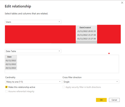
By "link Date[Date] with Ceated_date column", do you mean in the model relationship manager?
I've got my date table, and have created the relationship, but it doesn't seem to pull through when I try to add it to the x-axis.
Screenshot:
- Mark as New
- Bookmark
- Subscribe
- Mute
- Subscribe to RSS Feed
- Permalink
- Report Inappropriate Content
what do you mean by pull through? a screenshot would be good.
- Mark as New
- Bookmark
- Subscribe
- Mute
- Subscribe to RSS Feed
- Permalink
- Report Inappropriate Content
Sorry, I just mean it doesn't display on my chart
- Mark as New
- Bookmark
- Subscribe
- Mute
- Subscribe to RSS Feed
- Permalink
- Report Inappropriate Content
May i see how User Count is defined?


