FabCon is coming to Atlanta
Join us at FabCon Atlanta from March 16 - 20, 2026, for the ultimate Fabric, Power BI, AI and SQL community-led event. Save $200 with code FABCOMM.
Register now!- Power BI forums
- Get Help with Power BI
- Desktop
- Service
- Report Server
- Power Query
- Mobile Apps
- Developer
- DAX Commands and Tips
- Custom Visuals Development Discussion
- Health and Life Sciences
- Power BI Spanish forums
- Translated Spanish Desktop
- Training and Consulting
- Instructor Led Training
- Dashboard in a Day for Women, by Women
- Galleries
- Data Stories Gallery
- Themes Gallery
- Contests Gallery
- QuickViz Gallery
- Quick Measures Gallery
- Visual Calculations Gallery
- Notebook Gallery
- Translytical Task Flow Gallery
- TMDL Gallery
- R Script Showcase
- Webinars and Video Gallery
- Ideas
- Custom Visuals Ideas (read-only)
- Issues
- Issues
- Events
- Upcoming Events
Get Fabric Certified for FREE during Fabric Data Days. Don't miss your chance! Request now
- Power BI forums
- Forums
- Get Help with Power BI
- Desktop
- Re: Show a KPI visual for each row in the dataset
- Subscribe to RSS Feed
- Mark Topic as New
- Mark Topic as Read
- Float this Topic for Current User
- Bookmark
- Subscribe
- Printer Friendly Page
- Mark as New
- Bookmark
- Subscribe
- Mute
- Subscribe to RSS Feed
- Permalink
- Report Inappropriate Content
Show a KPI visual for each row in the dataset
Hello,
I would like to display my company's KPI's in a dashboard. For this I would like to use a "gague chart" for each KPI. My data looks like this:
| KPI | Target | Result |
| kpi1 | 90% | 75% |
| kpi2 | 85% | 80% |
| kpi3 | 85% | 75% |
Now how do I convert each row in to a separate visual?
Thanks for helping me out!
Solved! Go to Solution.
- Mark as New
- Bookmark
- Subscribe
- Mute
- Subscribe to RSS Feed
- Permalink
- Report Inappropriate Content
Hi, @Anonymous ;
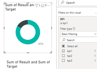
Since this is a custom visual, Lengend and small multiples are not visible;
So my suggestion is to copy and paste multiple Gauge visuals, and then change the filter condition for each visual, as follows:
Best Regards,
Community Support Team _ Yalan Wu
If this post helps, then please consider Accept it as the solution to help the other members find it more quickly.
- Mark as New
- Bookmark
- Subscribe
- Mute
- Subscribe to RSS Feed
- Permalink
- Report Inappropriate Content
@Anonymous Hi, I too am wondering how to achieve this with the caveat of displaying the gauges dynamically depending on whether a particular KPI row contains data.
For example, say I had 10 different KPI categories, but for this account only 3 of the KPIs contained any target and value so I would only displaye 3 gauegs for wach KPI. Also keeping in mind the possibility that new KPIs could arise and would need to be factored in.
- Mark as New
- Bookmark
- Subscribe
- Mute
- Subscribe to RSS Feed
- Permalink
- Report Inappropriate Content
Hi, @Anonymous ;
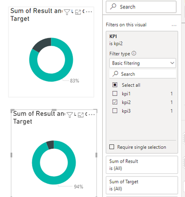
Since this is a custom visual, Lengend and small multiples are not visible;
So my suggestion is to copy and paste multiple Gauge visuals, and then change the filter condition for each visual, as follows:
Best Regards,
Community Support Team _ Yalan Wu
If this post helps, then please consider Accept it as the solution to help the other members find it more quickly.
- Mark as New
- Bookmark
- Subscribe
- Mute
- Subscribe to RSS Feed
- Permalink
- Report Inappropriate Content
I can move forward with this, thanks!
- Mark as New
- Bookmark
- Subscribe
- Mute
- Subscribe to RSS Feed
- Permalink
- Report Inappropriate Content
Helpful resources

Power BI Monthly Update - November 2025
Check out the November 2025 Power BI update to learn about new features.

Fabric Data Days
Advance your Data & AI career with 50 days of live learning, contests, hands-on challenges, study groups & certifications and more!


