Join us at the 2025 Microsoft Fabric Community Conference
Microsoft Fabric Community Conference 2025, March 31 - April 2, Las Vegas, Nevada. Use code FABINSIDER for a $400 discount.
Register now- Power BI forums
- Get Help with Power BI
- Desktop
- Service
- Report Server
- Power Query
- Mobile Apps
- Developer
- DAX Commands and Tips
- Custom Visuals Development Discussion
- Health and Life Sciences
- Power BI Spanish forums
- Translated Spanish Desktop
- Training and Consulting
- Instructor Led Training
- Dashboard in a Day for Women, by Women
- Galleries
- Webinars and Video Gallery
- Data Stories Gallery
- Themes Gallery
- Power BI DataViz World Championships Gallery
- Quick Measures Gallery
- R Script Showcase
- COVID-19 Data Stories Gallery
- Community Connections & How-To Videos
- 2021 MSBizAppsSummit Gallery
- 2020 MSBizAppsSummit Gallery
- 2019 MSBizAppsSummit Gallery
- Events
- Ideas
- Custom Visuals Ideas (read-only)
- Issues
- Issues
- Events
- Upcoming Events
The Power BI DataViz World Championships are on! With four chances to enter, you could win a spot in the LIVE Grand Finale in Las Vegas. Show off your skills.
- Power BI forums
- Forums
- Get Help with Power BI
- Desktop
- Re: Share your thoughts on the new format pane (pr...
- Subscribe to RSS Feed
- Mark Topic as New
- Mark Topic as Read
- Float this Topic for Current User
- Bookmark
- Subscribe
- Printer Friendly Page
- Mark as New
- Bookmark
- Subscribe
- Mute
- Subscribe to RSS Feed
- Permalink
- Report Inappropriate Content
Share your thoughts on the new format pane (preview)
Hit Reply to tell us what you think about the new format pane so we can continue to improve.
For example:
- What changes would you like to see?
- If you turned off the preview switch, why?
- Any suggestions for addititional settings or capabilities?
Thanks,
-Power BI team
To read more about the feature see the announcement in the Power BI Product Blog
- Mark as New
- Bookmark
- Subscribe
- Mute
- Subscribe to RSS Feed
- Permalink
- Report Inappropriate Content
Thank you for the video! Apologies, this was my mistake, looks like the team is still working on the fix for this.
- Mark as New
- Bookmark
- Subscribe
- Mute
- Subscribe to RSS Feed
- Permalink
- Report Inappropriate Content
Although it is taking some getting used to - I want to call out there is lots of good in this new pane that everyday users will appreciate. Well done team.
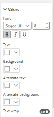
Can I please ask that you consider putting 'Color' next to every field that involves colour. Take for example the matrix 'Values' menu. None of the these fields use the word "Color" so when you search it doesn't show up. I find it easiest to use the search menu to bring everything up and set all my colours at once for a cohesive result. This has made the navigation slow and frustrating.
- Mark as New
- Bookmark
- Subscribe
- Mute
- Subscribe to RSS Feed
- Permalink
- Report Inappropriate Content
@Kaycee I agree. Search needs a keyword to make "COLOR" show. Same goes for if I type the word "SIZE".
- Mark as New
- Bookmark
- Subscribe
- Mute
- Subscribe to RSS Feed
- Permalink
- Report Inappropriate Content
What a step backwards. Now it takes much more work to reach specific format attributes for a control. Plus it is very unintuitive and needs a LOT more work.
- Mark as New
- Bookmark
- Subscribe
- Mute
- Subscribe to RSS Feed
- Permalink
- Report Inappropriate Content
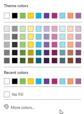
I can't see a 'No Fill' option for the Background of 'Title' in any visual type. This will make pretty much all our external facing models difficult to manage. Will have to set a template up which include 'No Fill' for all visuals instead of using the Visualizations pane. What a pain.
Old
New
- Mark as New
- Bookmark
- Subscribe
- Mute
- Subscribe to RSS Feed
- Permalink
- Report Inappropriate Content
The 'No Fill' option for the Background of 'Title' in any visual type is still not in April 2022 release - Can you confirm whether this will be fixed ASAP or it is buried somewhere in this unusable 'step forward
'? I just need to know whether to sink time into creating a 'template' containing all visuals with a 'No Fill' title. This would make the whole 'build visuals' interface redundant for our org. Crazy.
- Mark as New
- Bookmark
- Subscribe
- Mute
- Subscribe to RSS Feed
- Permalink
- Report Inappropriate Content
It's already fixed for May's release! Apologies for the inconvenience this is causing you, I'll see if we can get this back ported.
- Mark as New
- Bookmark
- Subscribe
- Mute
- Subscribe to RSS Feed
- Permalink
- Report Inappropriate Content
Excellent news! Still hate the new format pane due to all the other points made in this feed but glad I don't have to create a 'Build Visual' work around
- Mark as New
- Bookmark
- Subscribe
- Mute
- Subscribe to RSS Feed
- Permalink
- Report Inappropriate Content
On the "Action" menu on buttons, it is kind of counterintuitive, that you in the Tooltip option needs to turn the switch on, to turn of tooltip ("No tooltip" = "yes").
It would be much more intuitive, if the tooltip option simply said "Tooltip" and the switch was on by default.
- Mark as New
- Bookmark
- Subscribe
- Mute
- Subscribe to RSS Feed
- Permalink
- Report Inappropriate Content
Yes totally agree. This is already fixed for the upcoming April release.
- Mark as New
- Bookmark
- Subscribe
- Mute
- Subscribe to RSS Feed
- Permalink
- Report Inappropriate Content
Hi,
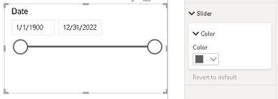
Option to disable slider for Between, Before and After slicer is missing:
It was available in the old format pane:
Regards,
Jarek
- Mark as New
- Bookmark
- Subscribe
- Mute
- Subscribe to RSS Feed
- Permalink
- Report Inappropriate Content
Hi Jarek - are you on the latest build? This toggle has already been re-added.
- Mark as New
- Bookmark
- Subscribe
- Mute
- Subscribe to RSS Feed
- Permalink
- Report Inappropriate Content
I see it and happy to see the slider slicer uses much less height now too.
- Mark as New
- Bookmark
- Subscribe
- Mute
- Subscribe to RSS Feed
- Permalink
- Report Inappropriate Content
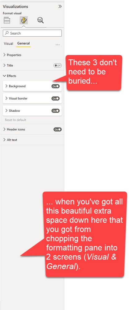
"Background", "Visual Border" and "Shadow" do not need to be obscured by the "Effects" parent menu. It is a totally wasted click.
Can we bring these 3 very important properties out of hiding please? You've got room. Why not use it?
- Mark as New
- Bookmark
- Subscribe
- Mute
- Subscribe to RSS Feed
- Permalink
- Report Inappropriate Content
@RosieL Can you please respond to this seemingly popular idea? Or does this get filed into the category that other have mentioned of, "For those of us who fail to understand the rationale for making it less usable, we are seemingly ignored." ?
I sincerely appreciate all of the whining you have to put up with in this thread. You must love it. Thanks!
- Mark as New
- Bookmark
- Subscribe
- Mute
- Subscribe to RSS Feed
- Permalink
- Report Inappropriate Content
Sorry, this forum doesn't provide an easy way to see what's getting upvoted a bunch. To give some context, this change went through 2 rounds of user testing where it was mentioned changing these settings were often done together so they preferred the merged card. We have upcoming features planned (like a formatting ribbon) which again made sense to merge these. We hear you that this adds a click in the pane today, but we aim to make these frequent user tasks even easier with what we have coming soon. Thanks for your patience.
- Mark as New
- Bookmark
- Subscribe
- Mute
- Subscribe to RSS Feed
- Permalink
- Report Inappropriate Content
Thanks Rosie. We do appreciate it and we suspected that there were other things downstream but in the context of tight deadlines and getting work done, it has bee challenging keeping that on track so sometimes, status quo is just easier.
I think what would ease a lot of concerns is that if there was any wiggle room to have this particular change as optional for some time longer, that would be a great relief to many. I've gotten used to the change but dont have as much invested as some others here so their experience may be more severely impacted.
- Mark as New
- Bookmark
- Subscribe
- Mute
- Subscribe to RSS Feed
- Permalink
- Report Inappropriate Content
Absolutely!!! Would love to see the 'Effects' level removed and the sub-menus promoted!!
- Mark as New
- Bookmark
- Subscribe
- Mute
- Subscribe to RSS Feed
- Permalink
- Report Inappropriate Content
Unless I'm just missing it, I no longer see the option to change the fill on buttons with various actions (on hover, on click, etc.).
We have this feature in multiple reports across multiple workspaces, would hate to lose this feature.
- Mark as New
- Bookmark
- Subscribe
- Mute
- Subscribe to RSS Feed
- Permalink
- Report Inappropriate Content
It should be under the "Style" card. We consolidated the style settings so it's easier to set what a particular state looks like at once (e.g. on hover you want fill and a border) vs. old pane there was a lot of hopping around and swapping the states in each (go to fill, change state to hover. go to border, change state to hover). But let us know your feedback.
- Mark as New
- Bookmark
- Subscribe
- Mute
- Subscribe to RSS Feed
- Permalink
- Report Inappropriate Content
Hello,
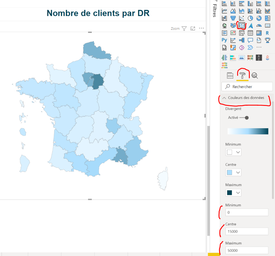
In the new formatting pane, for the Map visual (based on shapes), we don't have the ability to define colors for 'Min', 'Med' and 'Max' value anymore.
Here is a screenshot with the 'standard' pane :
@RosieL : do you think it could be fixed in the forthcoming months?
Thanks !
Bruno
Helpful resources

Join us at the Microsoft Fabric Community Conference
March 31 - April 2, 2025, in Las Vegas, Nevada. Use code MSCUST for a $150 discount!

Power BI Monthly Update - February 2025
Check out the February 2025 Power BI update to learn about new features.

| User | Count |
|---|---|
| 86 | |
| 78 | |
| 54 | |
| 39 | |
| 35 |
| User | Count |
|---|---|
| 102 | |
| 84 | |
| 48 | |
| 48 | |
| 48 |
