- Power BI forums
- Updates
- News & Announcements
- Get Help with Power BI
- Desktop
- Service
- Report Server
- Power Query
- Mobile Apps
- Developer
- DAX Commands and Tips
- Custom Visuals Development Discussion
- Health and Life Sciences
- Power BI Spanish forums
- Translated Spanish Desktop
- Power Platform Integration - Better Together!
- Power Platform Integrations (Read-only)
- Power Platform and Dynamics 365 Integrations (Read-only)
- Training and Consulting
- Instructor Led Training
- Dashboard in a Day for Women, by Women
- Galleries
- Community Connections & How-To Videos
- COVID-19 Data Stories Gallery
- Themes Gallery
- Data Stories Gallery
- R Script Showcase
- Webinars and Video Gallery
- Quick Measures Gallery
- 2021 MSBizAppsSummit Gallery
- 2020 MSBizAppsSummit Gallery
- 2019 MSBizAppsSummit Gallery
- Events
- Ideas
- Custom Visuals Ideas
- Issues
- Issues
- Events
- Upcoming Events
- Community Blog
- Power BI Community Blog
- Custom Visuals Community Blog
- Community Support
- Community Accounts & Registration
- Using the Community
- Community Feedback
Register now to learn Fabric in free live sessions led by the best Microsoft experts. From Apr 16 to May 9, in English and Spanish.
- Power BI forums
- Forums
- Get Help with Power BI
- Desktop
- Re: Share your thoughts on the new On-Object Inter...
- Subscribe to RSS Feed
- Mark Topic as New
- Mark Topic as Read
- Float this Topic for Current User
- Bookmark
- Subscribe
- Printer Friendly Page
- Mark as New
- Bookmark
- Subscribe
- Mute
- Subscribe to RSS Feed
- Permalink
- Report Inappropriate Content
Share your thoughts on the new On-Object Interaction feature (preview)
Hit Reply to tell us what you think about the new On-Object Interaction feature so we can continue to improve.
For example:
- What changes would you like to see?
- If you turned off the preview switch, why?
- Any suggestions for addititional settings or capabilities?
Thanks,
-Power BI team
To read more about the feature, see the announcement in the Power BI Product Blog or our documentation on how to Use on-object interaction
FAQs:
- Q: How can I open multiple panes at once?
- A: You can CTRL + click or right click on the unselected pane you wish to open and choose "Open in new pane"
- Q: Where did aggregations move to?
- A: It's still on right click of a field, or you can use the new flyout aggregations dropdown while choosing or swapping a field.
- Q: Where did drillthrough and tooltip page setup move to?
- A: Drillthrough is now in the page settings of the format pane under Page Information > Page type > Drillthrough or Tooltip.
- Mark as New
- Bookmark
- Subscribe
- Mute
- Subscribe to RSS Feed
- Permalink
- Report Inappropriate Content
Thank you for making the effort to test it so thoroughly, I myself have only tested it for a few hours at a time at most due to how inefficient it is, even after the latest updates, so I really appreciate the time taken. Reading your review/commentary, I'm reminded of everything I (and many others) have said so far, and again, I think the biggest gap in consideration of the 'OOI' concept is 'scale'.
Like yourself I work on a large volume of different reports and for those that do, such missteps in the UX/UI are provably inefficient and counter-intuitive, and lead to unavoidable frustration and time lost. And just to reinforce an important point you made, It's not a case of 'getting used to' the new interface, it's that it simply doesn't work as well for those of us who work in high volume in a way that heavily relies on continuous comparison and editing of the same fields across different objects and pages etc. In such a situation, consistency is key, and the new interface is simply too inconsistent. If you only occasionally dabble in physical report building and layout, then sure, the new interface might not be so problematic, but for those of us who work in such a way that we FEEL every extra click or moment lost because we have to hesitate on the next click, such issues are rather painful.
So again, the latest updates are appreciated, but we really do just need the option to make the panes on the right-hand side behave EXACTLY as they currently do. The current/legacy behaviour works, and it works REALLY well, and the new behaviour is not an improvement for those that rely on it.
- Mark as New
- Bookmark
- Subscribe
- Mute
- Subscribe to RSS Feed
- Permalink
- Report Inappropriate Content
I completely agree with your comments. Despite all the improvements with the December update, bugs don't allow you to use it for long without losing patience.
- Mark as New
- Bookmark
- Subscribe
- Mute
- Subscribe to RSS Feed
- Permalink
- Report Inappropriate Content
Have tried it again since hearing about the updates over the past few months - still feels so much less intuitive, and I really struggled to get into a workflow. Everything felt like more effort and harder to find what I needed.
The standard interface is just better.
- Mark as New
- Bookmark
- Subscribe
- Mute
- Subscribe to RSS Feed
- Permalink
- Report Inappropriate Content
Yes totally totally totally agree!
It's really a 'pane' in the butt switching between 'Data' and visual build because I need to see which tables I'm pulling the data from and there is no option to keep all panes open (correct me if I'm wrong).
Microsoft developers, please for goodness of humanity, listen to feedback and refine this if it's to be made compulsory. Thanks!
- Mark as New
- Bookmark
- Subscribe
- Mute
- Subscribe to RSS Feed
- Permalink
- Report Inappropriate Content
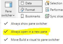
Go to the 'View' menu and in the 'Pane switcher' dropdown make sure you have a check mark next to 'Always open in a new pane' (see image below).
- Mark as New
- Bookmark
- Subscribe
- Mute
- Subscribe to RSS Feed
- Permalink
- Report Inappropriate Content
Ok thanks for this. But in any case, it's still a pain seeing so many interface changes when it's not making any revolutionary impact and only serves to irritate us users.
- Mark as New
- Bookmark
- Subscribe
- Mute
- Subscribe to RSS Feed
- Permalink
- Report Inappropriate Content
agree. Hard to understand why MS wants to annoy the majority of its professional PBI userbase.
- Mark as New
- Bookmark
- Subscribe
- Mute
- Subscribe to RSS Feed
- Permalink
- Report Inappropriate Content
Seems that their focus is on making the UI as similar to Excel as possible in order to make it easier for new users. However, their efforts have continued to make work harder to accomplish for those who do more than dabble in report development and maintenance. To me, the focus on new customer familiarity is misplaced when the changes negatively impact older customers who often have so much more invested in the product.
- Mark as New
- Bookmark
- Subscribe
- Mute
- Subscribe to RSS Feed
- Permalink
- Report Inappropriate Content
the "standard" interface is much easier to use. With this new interface, it is very hard to find the fields I need
- Mark as New
- Bookmark
- Subscribe
- Mute
- Subscribe to RSS Feed
- Permalink
- Report Inappropriate Content
Hi,
I've tried it two times. Can't keep using it...
1) It is adding clicks to an already "click-consuming" flow when working on reports.
2) Things in menus take too much screen real estate, paddings on elements, crosses to eliminate a field, etc., are way too big.
3) You're breaking things such as editing same type of visual, i.e. edit four slicers at once to setup positioning, height, etc.
4) Splitting format and "build a visual" in two panels, is not efficient.
5) While i like the functionality of selecting an area on a visual and gaining focus on the format pane for the selected area, i think the functionality and the customization capabilities should improve, specially in matrix visuals.
6) The format icon shortcut on visuals is too big, and bothers while moving the mouse around and hovering on visuals.
Keep working on improvements for the UI, but focus on making the workflows more efficient, make sure you involve people that works on a daily basis with the desktop interface to have a proper vision of what it means to work with this app. Count how many clicks cost each of the actions you are doing constantly, and are being forced to repeat.
Thanks
- Mark as New
- Bookmark
- Subscribe
- Mute
- Subscribe to RSS Feed
- Permalink
- Report Inappropriate Content
Agree 100%, even though the new options are helpful and it IS a major improvement, the 'old' UI is still demonstrably faster for those of us that work across multiple objects across multiple reports on a daily basis etc. Every extra click and unintuitive interaction is time lost and while minor at first glance, costs real time at scale.
Stated more simply, it's still a step down in efficiency for those that need it, where usually UI development should go in the opposite direction, and so the best solution is to have the option to at least maintain the most efficient approach for those of us that require it.
- Mark as New
- Bookmark
- Subscribe
- Mute
- Subscribe to RSS Feed
- Permalink
- Report Inappropriate Content
Hello,
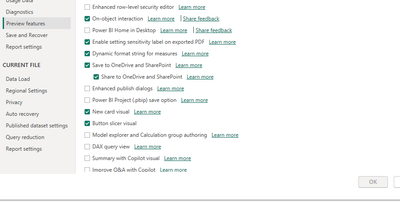
I not able to add this feature, After clicking ok, It greays out. Restrated power bi desktop few times, still "On-Object Interaction feature (preview)" is not enabled. I am using latest dec-23 update. Thanks.
- Mark as New
- Bookmark
- Subscribe
- Mute
- Subscribe to RSS Feed
- Permalink
- Report Inappropriate Content
Did you have Python or R script enabled or recently updated? Check those 2 under options, if the link is broken PBI won't let you change any preview options.
- Mark as New
- Bookmark
- Subscribe
- Mute
- Subscribe to RSS Feed
- Permalink
- Report Inappropriate Content
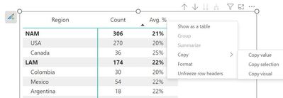
On matrix/table visuals, can we have right-click options to sort by (any) field/value, or copy a range of data as in Excel? Currently both options in PBI are extremely limited:
1) Sort: no right-click option; the default "..." does not work with calculation group on column (for example, a CG of total + highest value, it doesn't allow sorting by either, b/c PBI treats them together as a group)
2) Copy: right-click options (copy value/selection/visual) are not well done, for example, there is no option to easily copy an entire table, user is forced to select certain row(s) manually first, otherwise only "copy visual" option shows up, not the other 2
I mean, these are the kind of real "On-object" interactions we are looking for, where OOI can add real value, not just editing chart titles, which is too trivial to discuss.
- Mark as New
- Bookmark
- Subscribe
- Mute
- Subscribe to RSS Feed
- Permalink
- Report Inappropriate Content
1000 times this. I wish the PowerBI team would focus on usability improvements for the report viewers like this first instead of changing the UI for the designers. Easy sorting and copy / Paste from matrix are things we get asked about from end users regularily. Even allowing sorting when the column is a dimension would be great (someting I believe even Excel cannot do)
- Mark as New
- Bookmark
- Subscribe
- Mute
- Subscribe to RSS Feed
- Permalink
- Report Inappropriate Content
Hi,
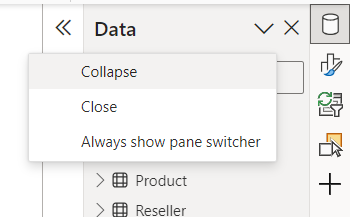
There are should be more convenient way to collapse panes in pane switcher, maybe a button.
For now if I expand it and then want to callapse - the only way to do it is to click on tick and then select collapse. It seemed intuitive for me to click on 'close' - but after that the pane disappears from pane switcher and I have to go to its options to return it back.
- Mark as New
- Bookmark
- Subscribe
- Mute
- Subscribe to RSS Feed
- Permalink
- Report Inappropriate Content
Thank you for your reply. I have the latest version and I found that this new button is there when I create a new report from scratch, but not in reports created before.
- Mark as New
- Bookmark
- Subscribe
- Mute
- Subscribe to RSS Feed
- Permalink
- Report Inappropriate Content
There's a new collapse button on these panes in the December release - if you're able to upgrade, does that do as you're expecting?
- Mark as New
- Bookmark
- Subscribe
- Mute
- Subscribe to RSS Feed
- Permalink
- Report Inappropriate Content
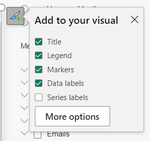
I enabled it again due to the December update. Unfortunately, 5 minutes in, I'm already frustrated. I have a small text field at the bottom.
I wanted to edit the text. When I click on the text to edit, the "Add title here" takes over all the space and I can't do anything. I at first started to move the visual higher, resize it, make my edit, move it down, but figured that can't be the solution. Then I finally realized that the solution is to turn the Title off in the Format pane. I'm a developer with 4 years of experience and just wasted 5 minutes on this 😉
Solution 1: Always show the title bar when enabled, so that we developers learn that we should turn it off and not leave it on but with no string.
Solution 2: Add the little Format button for all visuals, even if for now it only option it has the "Title" checkbox for those visuals which don't support on-object editing yet for a very intuitive way to enable/disable the title.
- Mark as New
- Bookmark
- Subscribe
- Mute
- Subscribe to RSS Feed
- Permalink
- Report Inappropriate Content
Hi @RHOU thanks for the feedback. Can you share which visual type you ran into this issue with? It's hard to see from your screenshots.
- Mark as New
- Bookmark
- Subscribe
- Mute
- Subscribe to RSS Feed
- Permalink
- Report Inappropriate Content
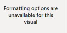
By the way, one other UI improvement that would help this issue, is to allow multi-selecting visuals and making format changes.
Right now, as soon as I select more than one visual I get the error below. So it's not even possible to multi-select to turn the title on and off.
I understand that some formatting options have to be unique to one visual, but it would be really nice to have all the options that apply to the visual (even if different types) would be changed by multi selecting visuals and then making the formatting change. The format painter doesn't work because it changes everything, not just a few selected formatting attributes.
Helpful resources

Microsoft Fabric Learn Together
Covering the world! 9:00-10:30 AM Sydney, 4:00-5:30 PM CET (Paris/Berlin), 7:00-8:30 PM Mexico City

Power BI Monthly Update - April 2024
Check out the April 2024 Power BI update to learn about new features.

| User | Count |
|---|---|
| 96 | |
| 93 | |
| 82 | |
| 70 | |
| 64 |
| User | Count |
|---|---|
| 118 | |
| 106 | |
| 93 | |
| 79 | |
| 72 |
