FabCon is coming to Atlanta
Join us at FabCon Atlanta from March 16 - 20, 2026, for the ultimate Fabric, Power BI, AI and SQL community-led event. Save $200 with code FABCOMM.
Register now!- Power BI forums
- Get Help with Power BI
- Desktop
- Service
- Report Server
- Power Query
- Mobile Apps
- Developer
- DAX Commands and Tips
- Custom Visuals Development Discussion
- Health and Life Sciences
- Power BI Spanish forums
- Translated Spanish Desktop
- Training and Consulting
- Instructor Led Training
- Dashboard in a Day for Women, by Women
- Galleries
- Data Stories Gallery
- Themes Gallery
- Contests Gallery
- QuickViz Gallery
- Quick Measures Gallery
- Visual Calculations Gallery
- Notebook Gallery
- Translytical Task Flow Gallery
- TMDL Gallery
- R Script Showcase
- Webinars and Video Gallery
- Ideas
- Custom Visuals Ideas (read-only)
- Issues
- Issues
- Events
- Upcoming Events
The Power BI Data Visualization World Championships is back! Get ahead of the game and start preparing now! Learn more
- Power BI forums
- Forums
- Get Help with Power BI
- Desktop
- Re: Share your thoughts on the new On-Object Inter...
- Subscribe to RSS Feed
- Mark Topic as New
- Mark Topic as Read
- Float this Topic for Current User
- Bookmark
- Subscribe
- Printer Friendly Page
- Mark as New
- Bookmark
- Subscribe
- Mute
- Subscribe to RSS Feed
- Permalink
- Report Inappropriate Content
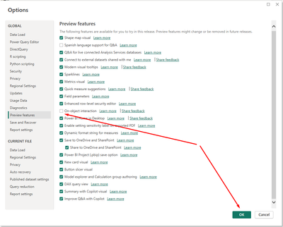
Share your thoughts on the new On-Object Interaction feature (preview)
Hit Reply to tell us what you think about the new On-Object Interaction feature so we can continue to improve.
For example:
- What changes would you like to see?
- If you turned off the preview switch, why?
- Any suggestions for addititional settings or capabilities?
Thanks,
-Power BI team
To read more about the feature, see the announcement in the Power BI Product Blog or our documentation on how to Use on-object interaction
FAQs:
- Q: How can I open multiple panes at once?
- A: You can CTRL + click or right click on the unselected pane you wish to open and choose "Open in new pane"
- Q: Where did aggregations move to?
- A: It's still on right click of a field, or you can use the new flyout aggregations dropdown while choosing or swapping a field.
- Q: Where did drillthrough and tooltip page setup move to?
- A: Drillthrough is now in the page settings of the format pane under Page Information > Page type > Drillthrough or Tooltip.
- Mark as New
- Bookmark
- Subscribe
- Mute
- Subscribe to RSS Feed
- Permalink
- Report Inappropriate Content
i have tried multiple times with it and I really dont like it. Its like starting again with something more difficult to use. How do you turn it off. I go to your Sparkline page to make a sparkline (I have done this before) and the only informaiton is on the old way of working.
I have sat here for half an hour trying to figure it it. So annoying.
- Mark as New
- Bookmark
- Subscribe
- Mute
- Subscribe to RSS Feed
- Permalink
- Report Inappropriate Content
Hi DebbieE,
Yes agreed, I too haven't been able to keep it on for very long for similar reasons, too inefficient basically.
To your question though, just go to the usual 'Preview' section in your options, deselect it there, confirm your selection then restart PBI, which should see the 'old/current' UI back in place.
- Mark as New
- Bookmark
- Subscribe
- Mute
- Subscribe to RSS Feed
- Permalink
- Report Inappropriate Content
I say No. The original approach is more convenient and can get the job done with fewer clicks.
- Mark as New
- Bookmark
- Subscribe
- Mute
- Subscribe to RSS Feed
- Permalink
- Report Inappropriate Content
Sorry but this not have UX !!! Please. Not GO !!!
- Mark as New
- Bookmark
- Subscribe
- Mute
- Subscribe to RSS Feed
- Permalink
- Report Inappropriate Content
I wonder how many times we have to repeat the complaints of inefficencies and requiring more effort to do the same work? These comments have been coming in for a year now, but MS persists in going down this design road.
- Mark as New
- Bookmark
- Subscribe
- Mute
- Subscribe to RSS Feed
- Permalink
- Report Inappropriate Content
Thank you for taking feedback from the community on the On-Object Interaction Feature; love the willingness to always improve 🙂.
The recent updates to the feature, particularly in the November 2023 version, have definitely improved the tool. However, I have decided to continue to turn it off because it is not as intuitive as working without it.
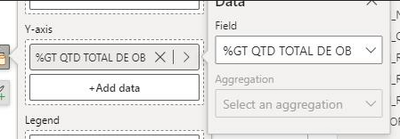
More specifically, my main reason for not using the feature is that it requires more effort to create a visual than not using it. One of the recent updates allowed the fields pane to be expanded so that all text for fields/measures could be viewed. However, when trying to add data to the visual, the second pane cannot be expanded. This is very limiting and it would be great to add the expansion feature to this level (See red highlight in image below showing where the user cannot expand the pane)
Yany
- Mark as New
- Bookmark
- Subscribe
- Mute
- Subscribe to RSS Feed
- Permalink
- Report Inappropriate Content
I've always really appreciated the new BI updates, I've been using Power BI since 2008 and for me a big difference are the monthly updates, but the "On-object interaction feature" was the worst experience and disappointment I've had, and they are already months and months of failed attempts at updates that simply don't make the experience better compared to the current one, so I always return to the default by turning off the feature. There is no way to be productive using this preview.
- Mark as New
- Bookmark
- Subscribe
- Mute
- Subscribe to RSS Feed
- Permalink
- Report Inappropriate Content
I gave it a few months of updates and tried it for 2 days after the Nov update. Turned it off again out of frustration. It's breaking my workflow and slowing down development considerably. I realize all I'm trying to accomplish is get the settings set up to try and emulate the current functionality.
- Mark as New
- Bookmark
- Subscribe
- Mute
- Subscribe to RSS Feed
- Permalink
- Report Inappropriate Content
Very sad...
Each month I try to use it and every time have to turn this off.
It's like as if who develops it doesn't use it at all. Otherwise they would experience all kinds of problems:
* "build visual pane suddenly collapses when clicking on an object other that visual and it takes extra click to get it open again
* "Build a visual" and "format" are two separate panes (instead of one) that take screen space so the report is smaller.
Turn off again
- Mark as New
- Bookmark
- Subscribe
- Mute
- Subscribe to RSS Feed
- Permalink
- Report Inappropriate Content
Similar results with me. While I'm forcing myself to use the new interface, I experience random issues, including pinned panes closing. When I'm in a crunch to get work done, I revert to the old interface to avoid confusion, aggravation, and impediments to progress.
- Mark as New
- Bookmark
- Subscribe
- Mute
- Subscribe to RSS Feed
- Permalink
- Report Inappropriate Content
Hard to turn it off again. This is just too awkward and as noted in a few of the replies to related post Re: Share your thoughts on the new On-Object Inter... - Page 2 - Microsoft Fabric Community .... completely random functionality is missing.
- Mark as New
- Bookmark
- Subscribe
- Mute
- Subscribe to RSS Feed
- Permalink
- Report Inappropriate Content
Hi There, apologies if this has been shared already, when using the on-object interaction i couldnt seem to change my values on a matrix visual to % of Column Total, usually under the Show Value As option this was there, but it wasnt showing any show value as options for me (or similar) while using this preview feature. Once i turned this feature off i could access these options again using the same columns in my data
- Mark as New
- Bookmark
- Subscribe
- Mute
- Subscribe to RSS Feed
- Permalink
- Report Inappropriate Content
This feature brokes my Desktop so I wasn't able anymore drag&drop column in visual field list. I had to turn the feature off to be able work.
- Mark as New
- Bookmark
- Subscribe
- Mute
- Subscribe to RSS Feed
- Permalink
- Report Inappropriate Content
I have experienced some annoying situations with this functionality, despite insisting on its use or stubbornness.
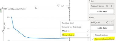
For example, in a project where a colleague has applied the implicit calculation to a measurement, transforming from "total" to "percentage", using "Show value as > Percent of grand total", when this feature is enabled it is not possible to do this.
1- using PBI with disabled on-object interaction, is possible change it:
2- when it is enabled, is impossible:
- Mark as New
- Bookmark
- Subscribe
- Mute
- Subscribe to RSS Feed
- Permalink
- Report Inappropriate Content
I am not fan of this feature, but it seems to me you can simply right-click on the field and change it, screenshot below with it enabled >>
- Mark as New
- Bookmark
- Subscribe
- Mute
- Subscribe to RSS Feed
- Permalink
- Report Inappropriate Content
I'm not fan too, but I'm just supporting a project.
I have a doubt about your screenshot: are you using any field in the table or a measure that calculates, for example, a distinct number of records (like the case I took)?
I don't have access to PBI to test right now, that's why I post here.
- Mark as New
- Bookmark
- Subscribe
- Mute
- Subscribe to RSS Feed
- Permalink
- Report Inappropriate Content
I tested both sum(amount) as measure and as field, on table and bar chart visuals, it works, give it a try when you can, although any measure needs to return a scalar value, not a table for it to work on a chart.
- Mark as New
- Bookmark
- Subscribe
- Mute
- Subscribe to RSS Feed
- Permalink
- Report Inappropriate Content
I really don't know how to explain why, but I can't do this when the feature is enabled.
If I use the column then I can apply some aggregation, for example, "Count" or "Count (Distinct)".
However, using a measure that makes the DISTINCTCOUNT (like previous aggregation) and then applying the "% GT" is not possible using object interaction, only if I disabled it.
I just tested creating a new look and even with it I can't do it.
- Mark as New
- Bookmark
- Subscribe
- Mute
- Subscribe to RSS Feed
- Permalink
- Report Inappropriate Content
X-Axis goal lines are not allowed either. It is only possible without OnObject Interaction.
- Mark as New
- Bookmark
- Subscribe
- Mute
- Subscribe to RSS Feed
- Permalink
- Report Inappropriate Content
Here's another example, thanks!
- Mark as New
- Bookmark
- Subscribe
- Mute
- Subscribe to RSS Feed
- Permalink
- Report Inappropriate Content
I was just watching a video on DAX Query View by Marco Russo and even he had problems with the new interface (for 30 seconds).
That speaks volumes.
Proud to be a Super User!
daxformatter.com makes life EASIER!
Helpful resources

Power BI Dataviz World Championships
The Power BI Data Visualization World Championships is back! Get ahead of the game and start preparing now!

Power BI Monthly Update - November 2025
Check out the November 2025 Power BI update to learn about new features.

| User | Count |
|---|---|
| 59 | |
| 43 | |
| 42 | |
| 23 | |
| 17 |
| User | Count |
|---|---|
| 190 | |
| 122 | |
| 96 | |
| 66 | |
| 47 |


