FabCon is coming to Atlanta
Join us at FabCon Atlanta from March 16 - 20, 2026, for the ultimate Fabric, Power BI, AI and SQL community-led event. Save $200 with code FABCOMM.
Register now!- Power BI forums
- Get Help with Power BI
- Desktop
- Service
- Report Server
- Power Query
- Mobile Apps
- Developer
- DAX Commands and Tips
- Custom Visuals Development Discussion
- Health and Life Sciences
- Power BI Spanish forums
- Translated Spanish Desktop
- Training and Consulting
- Instructor Led Training
- Dashboard in a Day for Women, by Women
- Galleries
- Data Stories Gallery
- Themes Gallery
- Contests Gallery
- QuickViz Gallery
- Quick Measures Gallery
- Visual Calculations Gallery
- Notebook Gallery
- Translytical Task Flow Gallery
- TMDL Gallery
- R Script Showcase
- Webinars and Video Gallery
- Ideas
- Custom Visuals Ideas (read-only)
- Issues
- Issues
- Events
- Upcoming Events
The Power BI Data Visualization World Championships is back! Get ahead of the game and start preparing now! Learn more
- Power BI forums
- Forums
- Get Help with Power BI
- Desktop
- Shape map color saturation doesn't work properly
- Subscribe to RSS Feed
- Mark Topic as New
- Mark Topic as Read
- Float this Topic for Current User
- Bookmark
- Subscribe
- Printer Friendly Page
- Mark as New
- Bookmark
- Subscribe
- Mute
- Subscribe to RSS Feed
- Permalink
- Report Inappropriate Content
Shape map color saturation doesn't work properly
Hi!
I'm trying to create a shape map but when I add my values in "Color saturation" they change either to Count, Sum or whatever instead of show them as they are. I have marked "No calculation" as you can see in the pic but still "Sum" the values.
I've watched several videos on youtube and all of them just drag the values (like population for each region) and it works fine for them...
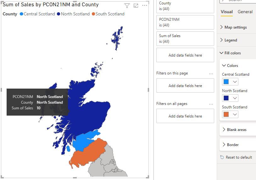
If I add the Counties in the legend then it says "Sum" but the values are actually correct (see pic below). But another issue I have is that the saturation is not working. It changes the colors completely instead of darker the bigger number. I don't have any option for this, just to change the color manually.
These are the dummy values I'm trying:
| County | Sales |
| North Scotland | 10 |
| Central Scotland | 50 |
| South Scotland | 75 |
Any help is much appreciated!
Thank you! 🙂
Solved! Go to Solution.
- Mark as New
- Bookmark
- Subscribe
- Mute
- Subscribe to RSS Feed
- Permalink
- Report Inappropriate Content
Hi again,
Witch map are you using?
do you have smaller granularity in the model for the location? seems that your are using a bigger granularity and the map does not recognize the location , thats why you have the same value everywhere.
Did I answer your question? Mark my post as a solution! Appreciate your Kudos!! ;-
Best Regards
BC
Best regards
Bruno Costa | Super User
Did I help you to answer your question? Accepted my post as a solution! Appreciate your Kudos!!
Take a look at the blog: PBI Portugal
- Mark as New
- Bookmark
- Subscribe
- Mute
- Subscribe to RSS Feed
- Permalink
- Report Inappropriate Content
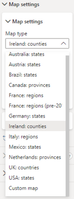
Thank you! I'm using a custom map, but I think the issue it's what you said. I had only values for the 3 areas of Scotland (as a test) but my map also includes England.
I tried adding all zeros as values for the rest of the regions and now it colourises accordingly with no "sum" or "count" ! (see pic below)
Thank you very much for taking your time to help me! 🙂 🙂
- Mark as New
- Bookmark
- Subscribe
- Mute
- Subscribe to RSS Feed
- Permalink
- Report Inappropriate Content
hello alicia_mtz
If i´m not wrong, when you add some field in the legend the saturation will not work, try to remove the legend please.
Did I answer your question? Mark my post as a solution! Appreciate your Kudos!! ;-
Best Regards
BC
Best regards
Bruno Costa | Super User
Did I help you to answer your question? Accepted my post as a solution! Appreciate your Kudos!!
Take a look at the blog: PBI Portugal
- Mark as New
- Bookmark
- Subscribe
- Mute
- Subscribe to RSS Feed
- Permalink
- Report Inappropriate Content
Thanks for your reply! Sorry I forgot to say in my original post that I already tried that.
The saturation doesn't work as it becomes "Count sales" and value 3 for all regions, so the colour is the same (see pic below). I don't know why is doing that if I have marked "No calculation" !!
Do you know why is this happening?
Thank you! 🙂 🙂
Helpful resources

Power BI Dataviz World Championships
The Power BI Data Visualization World Championships is back! Get ahead of the game and start preparing now!

| User | Count |
|---|---|
| 41 | |
| 39 | |
| 37 | |
| 29 | |
| 24 |
| User | Count |
|---|---|
| 122 | |
| 111 | |
| 83 | |
| 69 | |
| 68 |


