Get Fabric certified for FREE!
Don't miss your chance to take the Fabric Data Engineer (DP-700) exam on us!
Learn more- Power BI forums
- Get Help with Power BI
- Desktop
- Service
- Report Server
- Power Query
- Mobile Apps
- Developer
- DAX Commands and Tips
- Custom Visuals Development Discussion
- Health and Life Sciences
- Power BI Spanish forums
- Translated Spanish Desktop
- Training and Consulting
- Instructor Led Training
- Dashboard in a Day for Women, by Women
- Galleries
- Data Stories Gallery
- Themes Gallery
- Contests Gallery
- QuickViz Gallery
- Quick Measures Gallery
- Visual Calculations Gallery
- Notebook Gallery
- Translytical Task Flow Gallery
- TMDL Gallery
- R Script Showcase
- Webinars and Video Gallery
- Ideas
- Custom Visuals Ideas (read-only)
- Issues
- Issues
- Events
- Upcoming Events
We've captured the moments from FabCon & SQLCon that everyone is talking about, and we are bringing them to the community, live and on-demand. Starts on April 14th. Register now
- Power BI forums
- Forums
- Get Help with Power BI
- Desktop
- Re: Shape Map Legend Colors
- Subscribe to RSS Feed
- Mark Topic as New
- Mark Topic as Read
- Float this Topic for Current User
- Bookmark
- Subscribe
- Printer Friendly Page
- Mark as New
- Bookmark
- Subscribe
- Mute
- Subscribe to RSS Feed
- Permalink
- Report Inappropriate Content
Shape Map Legend Colors
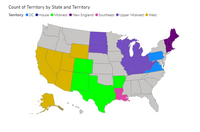
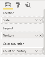
So maybe I am working with this visual wrong. I have a shape map that I am trying to get to change colors based on a region. In the location pane I put in my state column, this represents every state in the USA. I then dragged the Territory Column into the legend pane. When I go to the roller and select data colors, it breaks out each of my territories into separate colors, exactly how I would like it to. Ex. Midwest territory would show the color green for all territories in the midwest. However, On my visual it seems to only be selecting the first territories color and fills every state with that color. In the filter pane, if I remove all territories and select one by one, the color will only pick up for those states within the territory.
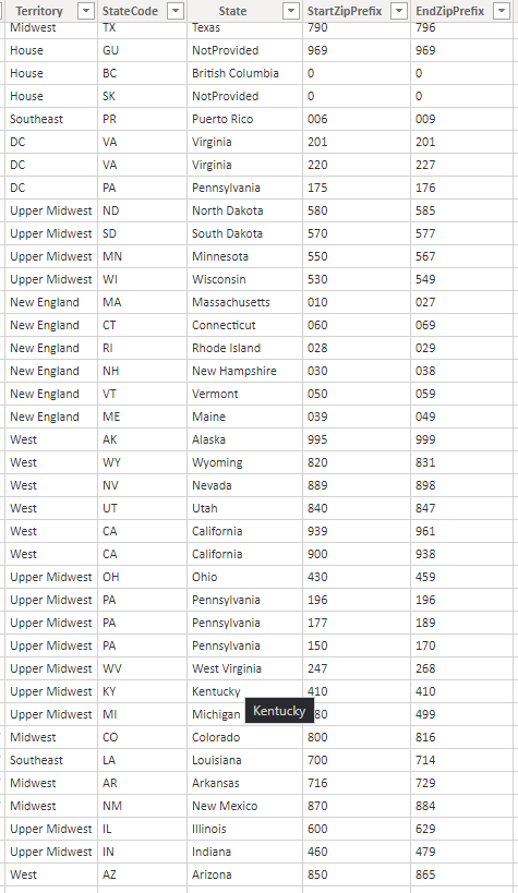
The data is all in a table called regions. Regions has an id, State, and Territory.
Solved! Go to Solution.
- Mark as New
- Bookmark
- Subscribe
- Mute
- Subscribe to RSS Feed
- Permalink
- Report Inappropriate Content
Hello @Jmccoy
I've made a sample data according to the image and plot it into a shape map.
To get the color you have to plot values into color saturation.
- Mark as New
- Bookmark
- Subscribe
- Mute
- Subscribe to RSS Feed
- Permalink
- Report Inappropriate Content
Hello Team,
I am currently working with Power BI Shape Maps, where I have implemented a time slicer. I am using three columns for maps: Location, Dates Column, and Legend.
I have created a measure to calculate Achievements based on the Dates.
Now, I want to create another measure using the above measure to generate ranges for achievements using the Percentile function. However, the Percentile function does not seem to accept measures directly.
I attempted to address this by creating a summarized table and generating a column for the achievements. But, when the time slicer changes (i.e., transitioning from the start date to the end date), the data changes accordingly. Unfortunately, the ranges do not dynamically adjust for the modified data.
I am seeking guidance on creating a measure for ranges using the achievement measure. For example, the desired output ranges are: 1-30, 31-45, 46-75, 76-99.
Thank you,
Vikas.K
- Mark as New
- Bookmark
- Subscribe
- Mute
- Subscribe to RSS Feed
- Permalink
- Report Inappropriate Content
Hello @Jmccoy
I've made a sample data according to the image and plot it into a shape map.
To get the color you have to plot values into color saturation.
- Mark as New
- Bookmark
- Subscribe
- Mute
- Subscribe to RSS Feed
- Permalink
- Report Inappropriate Content
Haha of course it would be that simple. Thank you for your help, I appreciate the time.
- Mark as New
- Bookmark
- Subscribe
- Mute
- Subscribe to RSS Feed
- Permalink
- Report Inappropriate Content
Hello @Jmccoy ,
Can you please share some data in table format so can try and check it out?
- Mark as New
- Bookmark
- Subscribe
- Mute
- Subscribe to RSS Feed
- Permalink
- Report Inappropriate Content
- Mark as New
- Bookmark
- Subscribe
- Mute
- Subscribe to RSS Feed
- Permalink
- Report Inappropriate Content
Please provide it in table format so can use it from here.
Can't take the values from the image.
- Mark as New
- Bookmark
- Subscribe
- Mute
- Subscribe to RSS Feed
- Permalink
- Report Inappropriate Content
I have tried copying and pasting from an excel table, as well as tried manually entering the data into a table within this message box.
- Mark as New
- Bookmark
- Subscribe
- Mute
- Subscribe to RSS Feed
- Permalink
- Report Inappropriate Content
I am unable to provide the table format. I keeep getting the following errors:
Your post has been changed because invalid HTML was found in the message body. The invalid HTML has been removed. Please review the message and submit the message when you are satisfied.
Correct the highlighted errors and try again. Post flooding detected (community received posts of a unique message more than 1 times within 3,600 seconds)
Helpful resources

New to Fabric Survey
If you have recently started exploring Fabric, we'd love to hear how it's going. Your feedback can help with product improvements.

Power BI DataViz World Championships - June 2026
A new Power BI DataViz World Championship is coming this June! Don't miss out on submitting your entry.

Join our Fabric User Panel
Share feedback directly with Fabric product managers, participate in targeted research studies and influence the Fabric roadmap.

| User | Count |
|---|---|
| 51 | |
| 37 | |
| 35 | |
| 19 | |
| 17 |
| User | Count |
|---|---|
| 70 | |
| 65 | |
| 39 | |
| 33 | |
| 23 |


