- Power BI forums
- Get Help with Power BI
- Desktop
- Service
- Report Server
- Power Query
- Mobile Apps
- Developer
- DAX Commands and Tips
- Custom Visuals Development Discussion
- Health and Life Sciences
- Power BI Spanish forums
- Translated Spanish Desktop
- Training and Consulting
- Instructor Led Training
- Dashboard in a Day for Women, by Women
- Galleries
- Data Stories Gallery
- Themes Gallery
- Contests Gallery
- QuickViz Gallery
- Quick Measures Gallery
- Visual Calculations Gallery
- Notebook Gallery
- Translytical Task Flow Gallery
- TMDL Gallery
- R Script Showcase
- Webinars and Video Gallery
- Ideas
- Custom Visuals Ideas (read-only)
- Issues
- Issues
- Events
- Upcoming Events
Learn from the best! Meet the four finalists headed to the FINALS of the Power BI Dataviz World Championships! Register now
- Power BI forums
- Forums
- Get Help with Power BI
- Desktop
- Re: Separating data
- Subscribe to RSS Feed
- Mark Topic as New
- Mark Topic as Read
- Float this Topic for Current User
- Bookmark
- Subscribe
- Printer Friendly Page
- Mark as New
- Bookmark
- Subscribe
- Mute
- Subscribe to RSS Feed
- Permalink
- Report Inappropriate Content
Separating data
Hello,
I have a table like this,
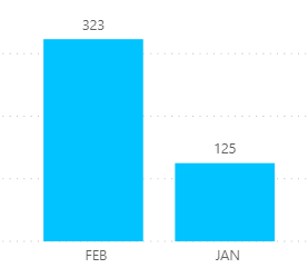
How to get graph, having JAN and FEB on X-axis, with sum of A JAN and T JAN for JAN and sum of A FEB and T FEB for FEB.
Thanks!
Solved! Go to Solution.
- Mark as New
- Bookmark
- Subscribe
- Mute
- Subscribe to RSS Feed
- Permalink
- Report Inappropriate Content
Hi @NithinBN
Wasn't sure exactly what you wanted but this PBIX file contains both of these charts
Regards
Phil
If I answered your question please mark my post as the solution.
If my answer helped solve your problem, give it a kudos by clicking on the Thumbs Up.
Did I answer your question? Then please mark my post as the solution.
If I helped you, click on the Thumbs Up to give Kudos.
Blog :: YouTube Channel :: Connect on Linkedin
Proud to be a Super User!
- Mark as New
- Bookmark
- Subscribe
- Mute
- Subscribe to RSS Feed
- Permalink
- Report Inappropriate Content
Hi,
Is this the result you're looking for?
To get this I transformed the table in Power Query Editor with these steps:
1. Created a new 'JAN' column that summed the values from columns 'A JAN' and 'T JAN'
2. Created a new 'FEB' column that summed the values from columns 'A FEB' and 'T FEB'
3. Removed all columns other than 'JAN' and 'FEB'
4. Then highlighted the 'JAN' and 'FEB columns and unpivoted the table.
You can then create the above graph. Hope that was the type of solution you were looking for!
Jo
Helpful resources
| User | Count |
|---|---|
| 55 | |
| 37 | |
| 23 | |
| 17 | |
| 17 |
| User | Count |
|---|---|
| 69 | |
| 58 | |
| 39 | |
| 21 | |
| 21 |


