Fabric Data Days starts November 4th!
Advance your Data & AI career with 50 days of live learning, dataviz contests, hands-on challenges, study groups & certifications and more!
Get registered- Power BI forums
- Get Help with Power BI
- Desktop
- Service
- Report Server
- Power Query
- Mobile Apps
- Developer
- DAX Commands and Tips
- Custom Visuals Development Discussion
- Health and Life Sciences
- Power BI Spanish forums
- Translated Spanish Desktop
- Training and Consulting
- Instructor Led Training
- Dashboard in a Day for Women, by Women
- Galleries
- Data Stories Gallery
- Themes Gallery
- Contests Gallery
- QuickViz Gallery
- Quick Measures Gallery
- Visual Calculations Gallery
- Notebook Gallery
- Translytical Task Flow Gallery
- TMDL Gallery
- R Script Showcase
- Webinars and Video Gallery
- Ideas
- Custom Visuals Ideas (read-only)
- Issues
- Issues
- Events
- Upcoming Events
Get Fabric Certified for FREE during Fabric Data Days. Don't miss your chance! Request now
- Power BI forums
- Forums
- Get Help with Power BI
- Desktop
- Re: Seemingly simple date issue...
- Subscribe to RSS Feed
- Mark Topic as New
- Mark Topic as Read
- Float this Topic for Current User
- Bookmark
- Subscribe
- Printer Friendly Page
- Mark as New
- Bookmark
- Subscribe
- Mute
- Subscribe to RSS Feed
- Permalink
- Report Inappropriate Content
Seemingly simple date issue...
My company rents band & orchestra instruments to school children. I have a handful of data query tables and I've created a calendar table.
For this issue, I think all I need to focus on are these two tables:
- 'Calendar'
- 'Rental Accounts - scrental'
I created a new column (as opposed to a new measure) in the rental accounts table for customer rentals with this formula:
Current Rentals = CALCULATE(COUNTROWS('Rental Accounts - scrental'),'Rental Accounts - scrental'[Return Date]=BLANK(),'Rental Accounts - scrental'[rnt_dunn]="P" || 'Rental Accounts - scrental'[rnt_dunn]="N")
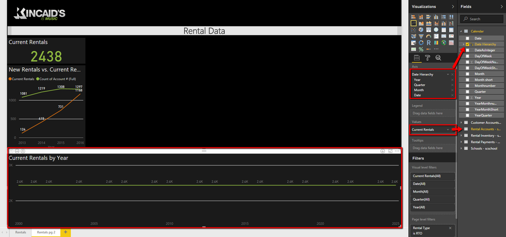
which results in a simple card:

I have multiple date columns within the rental accounts table (posting date, contract date, etc.). Using the contract date, I can see how many rentals we began in a given year against the current rentals (ones that are still out being rented, from above) like this:

What I want and can't seem to be able to do is create a line chart much like the Dow Jones line chart. What was the dow at yesterday? last year? ten years ago? I simply want to keep a "running line chart" of the total number of current rentals. In other words, today, as you can see, there are 2,438. If two are returned today, tomorrow the total would be 2,436. X-axis would be a generic date (which is where I think the 'Calendar' table I created comes in) and the Y-axis would simply be the number of current rentals.
When I try this, all I get is this:

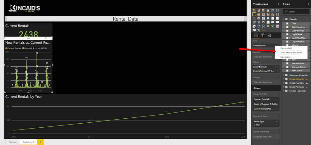
I have a feeling there is an issue with the relationships. However, when I try to create a 1:* relationship between the 'Calendar' table (Date) and the 'Rental Account - scrental' table (Contract Date, for instance), it screws up the table above it, removing the heirarchy from it and makes the table I'm trying to create into, essentially, the same thing as the what the table above it was originally:

I'm feeling pretty stupid here. I've been searching for date help all over the place, but getting nowhere. Any help would be appreciated!
- Mark as New
- Bookmark
- Subscribe
- Mute
- Subscribe to RSS Feed
- Permalink
- Report Inappropriate Content
Hi @kincaids,
In the Fig3, the line in “Current Rentals by Year” chart is flat, which is caused by the current Rentals measure result in each year is same. How do you get the Current Rentals chart in Fig3? The orange line look normal.
For your Fig4, you select the contract date as Axis, the contract date column only including year in resurce data, right? If it is, please try to add filter, and check if it works fine.
Current Rentals = CALCULATE(COUNTROWS('Rental Accounts - scrental'),'Rental Accounts - scrental'[Return Date]=BLANK(),'Rental Accounts - scrental'[rnt_dunn]="P" || 'Rental Accounts - scrental'[rnt_dunn]="N",Filter(Rental Accounts - scrental,Rental Accounts - scrental[contract date]<=MAX(Calendar[Date])))
Best Regards,
Angelia
- Mark as New
- Bookmark
- Subscribe
- Mute
- Subscribe to RSS Feed
- Permalink
- Report Inappropriate Content
I added names for each picture in my original post. Could you edit your previous post to reflect the image names and then post a short reply so I know you've done that? Thanks! I'm having a hard time following your though process...
- Mark as New
- Bookmark
- Subscribe
- Mute
- Subscribe to RSS Feed
- Permalink
- Report Inappropriate Content
Hi @kincaids,
Sorrr for inconvenience, I update the reply, please verify and feel free to ask if you have any question.
Best Regards,
Angelia
- Mark as New
- Bookmark
- Subscribe
- Mute
- Subscribe to RSS Feed
- Permalink
- Report Inappropriate Content
Well, things have changed - it took a couple years for me to get around to it, but I'm working on rebuilding my data, and this is still an issue. Again, I'm trying to get a line graph that shows how many current rentals we have at any given time over the past 6 years (and into the future). This is what it looks like right now:


Your help in figuring out why it's showing today's current rental number across all time rather than what the current rental number actually was at each point in time would be greatly appreciated.
- Mark as New
- Bookmark
- Subscribe
- Mute
- Subscribe to RSS Feed
- Permalink
- Report Inappropriate Content
The more I'm thinking about this, I'm sure a lot of the problem now revolves around table relationships - there currently isn't one between the calendar table and any other table.
I did try to make a 1:* relationship between the date column in the calendar and the system date column in the scrental table, but that screwed a lot of my data up. I deleted the relationship, then deleted and re-added the system date to the different visuals that used it as the Axis, and everything is now back to normal.
I would really appreciate some help on this - thanks!
- Mark as New
- Bookmark
- Subscribe
- Mute
- Subscribe to RSS Feed
- Permalink
- Report Inappropriate Content
If you alter the expression from your original calculated column to something like the following it should work as a measure. The code below assumes that you don't have an active relationship between the 'Date' table and the rentals table.
Current Rentals =
VAR _maxDate = MAX( 'Date'[Date] )
CALCULATE(
	COUNTROWS('Rental Accounts - scrental'),
	FILTER( ALL('Rental Accounts - scrental'[Contract Date],'Rental Accounts - scrental'[Return Date])
		'Rental Accounts - scrental'[Contract Date] >= _maxDate
		&& ( 'Rental Accounts - scrental'[Return Date] = BLANK()
                   || 'Rental Accounts - scrental'[Return Date] <= _maxDate )
	)
	,'Rental Accounts - scrental'[rnt_dunn] IN {"P" ,"N" }
)
If you did have a relationship between your date table and your rentals table you could use the following variation of the measure that uses the CROSSFILTER function to effectively turn off the relationship.
Current Rentals =
VAR _maxDate = MAX( 'Date'[Date] )
CALCULATE(
	COUNTROWS('Rental Accounts - scrental'),
	FILTER( ALL('Rental Accounts - scrental'[Contract Date],'Rental Accounts - scrental'[Return Date])
		'Rental Accounts - scrental'[Contract Date] >= _maxDate
		&& ( 'Rental Accounts - scrental'[Return Date] = BLANK()
                   || 'Rental Accounts - scrental'[Return Date] <= _maxDate )
	)
	,'Rental Accounts - scrental'[rnt_dunn] IN {"P" ,"N" }
        , CROSSFILTER( 'Rental Accounts - scrental'[Contract Date], 'Date'[Date], None)
)
PS. Just an FYI, but in cases like this where you are taking a fresh look at an old problem it's probably better to start a new thread and link back to this old one rather than replying to the old thread. The reason is that people who answer questions on the forum would look at threads like this, see that there are 5 posts and assume you are in a back and forth discussion with someone about your issue.
- Mark as New
- Bookmark
- Subscribe
- Mute
- Subscribe to RSS Feed
- Permalink
- Report Inappropriate Content
Thanks for the posting tip - that makes sense.
Since I'm not using the old data anymore and am rebuilding this, not all my terminology was exactly the same, so I changed your code to the current terminology, but I'm getting an error (and can't figure out why.
Current Rentals =
VAR _maxDate = MAX( 'Calendar'[Date] )
CALCULATE(
	COUNTROWS('scrental'),
	FILTER( ALL('scrental'[Contract Date],'scrental'[Return Date])
		'scrental'[Contract Date] >= _maxDate
		&& ( 'scrental'[Return Date] = BLANK()
                   || 'scrental'[Return Date] <= _maxDate )
	)
	,'scrental'[Dunn] IN {"P" ,"N" }
)
Here's an image of the error:
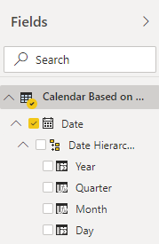
And here's an image of the applicable tables/fields:
- Mark as New
- Bookmark
- Subscribe
- Mute
- Subscribe to RSS Feed
- Permalink
- Report Inappropriate Content
Oops, sorry I missed out the RETURN statement in the expression. Try the following:
Current Rentals =
VAR _maxDate = MAX( 'Calendar'[Date] )
RETURN CALCULATE(
	COUNTROWS('scrental'),
	FILTER( ALL('scrental'[Contract Date],'scrental'[Return Date])
		'scrental'[Contract Date] >= _maxDate
		&& ( 'scrental'[Return Date] = BLANK()
                   || 'scrental'[Return Date] <= _maxDate )
	)
	,'scrental'[Dunn] IN {"P" ,"N" }
)
- Mark as New
- Bookmark
- Subscribe
- Mute
- Subscribe to RSS Feed
- Permalink
- Report Inappropriate Content
- Mark as New
- Bookmark
- Subscribe
- Mute
- Subscribe to RSS Feed
- Permalink
- Report Inappropriate Content
yep, just a missing comma after the ALL() function.
Current Rentals =
VAR _maxDate =
    MAX ( 'Calendar'[Date] )
RETURN
    CALCULATE (
        COUNTROWS ( 'scrental' ),
        FILTER (
            ALL ( 'scrental'[Contract Date], 'scrental'[Return Date] ),
            'scrental'[Contract Date] >= _maxDate
                && (
                    'scrental'[Return Date] = BLANK ()
                        || 'scrental'[Return Date] <= _maxDate
                )
        ),
        'scrental'[Dunn] IN { "P", "N" }
    )
- Mark as New
- Bookmark
- Subscribe
- Mute
- Subscribe to RSS Feed
- Permalink
- Report Inappropriate Content
Thanks again for all your help. Unfortunately, while the change got your code working, it isn't doing what I am expecting it to do:
"Total Current Rentals" should be 2280. The Current Rentals have all but disappeared from "New vs. Current Rentals" and the "% Renting, Returned & Owned" reports - this year's info is all that seems to remain, but not what I believe to be the exact number, but close.
On the report I've been trying to get ("Current Rentals Over Time"), I added the arrows, not to point to anything, but to show what I would roughly expect the graph to look like. We rent a lot of instruments around back-to-school time, then some slowly get returned over the course of the year, then we get a bunch more the next fall, etc.
Let me know if you have any other ideas. Thanks for your help.
- Mark as New
- Bookmark
- Subscribe
- Mute
- Subscribe to RSS Feed
- Permalink
- Report Inappropriate Content
Can you post an example data set (it only has to be enough rows to illustrate your scenario)?
If you posted 10-20 rows and were able to say that based off that data set you would expect the result for month 1 to be x, month 2 to be y and month 3 to be z. At the moment I'm speculating about what I think your data probably looks like and I'm obviously making an incorrect assumption somewhere.
- Mark as New
- Bookmark
- Subscribe
- Mute
- Subscribe to RSS Feed
- Permalink
- Report Inappropriate Content
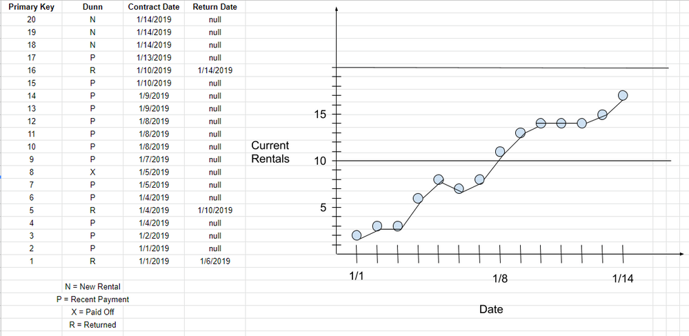
As time passes, I simply want to see what the current rentals count is over time. Here's an image of something I worked up quickly.
Let me know if you have any questions. If it helps you think through things, these are long term rentals that people rent toward ownership, not instruments that are rented for a few days and brought right back.
- Mark as New
- Bookmark
- Subscribe
- Mute
- Subscribe to RSS Feed
- Permalink
- Report Inappropriate Content
Of course, no sooner than I post, then I see a slight mistake in my data. There is a single instrument that has been paid off (Primary Key #8), reducing the total number of current rentals by one. The problem is, I don't see anywhere in the data provided by our PoS software that gives a payoff date, so I'm not sure how or when that would get calculated. This could be a problem... ugh
- Mark as New
- Bookmark
- Subscribe
- Mute
- Subscribe to RSS Feed
- Permalink
- Report Inappropriate Content
Obviously I can't really help with the missing pay out date - you'll need to dig through your data and see if you can find if it's possible to link this up to a transaction or derive it in some other way. (for the time being I just excluded Dunn = "X" as they are not on going rentals)
So there was one basic issue in the calc in that I had inverted the greater than and less than conditions on the date filters. But the other thing I could see was that in the running calculation we don't actually want to exclude Dunn="R" otherwise we mask out all the return dates and we will not see any of those dips in the data like on Jan-6 where we have a return but no new rentals on that date.
So the following code gives me the same graph as the one you plotted in Excel
Current Rentals =
VAR _maxDate =
    MAX ( 'Calendar'[Date] )
RETURN
    CALCULATE (
        COUNTROWS ( 'scrental' ),
        FILTER (
            ALL ( 'scrental'[Contract Date], 'scrental'[Return Date] ),
            'scrental'[Contract Date] <= _maxDate
                && (
                    'scrental'[Return Date] = BLANK ()
                        || 'scrental'[Return Date] > _maxDate
                )
        )
       , 'scrental'[Dunn] <> "X"
    )
The other thing I noticed was that the "P" records are payments. I assume being rentals that you would get multiple payments per instrument, so you may want to look at changing the COUNTROWS( 'scrental' ) to count distinct instrument, customer or contract id's with something like DISTINCTCOUNT( 'scrental'[contract id] ).
- Mark as New
- Bookmark
- Subscribe
- Mute
- Subscribe to RSS Feed
- Permalink
- Report Inappropriate Content
It's definitely closer to what I'm expecting to see. I'm sure it's still off, though, because of the payoff issue.
I think I found a date for rental payoffs. I imported another table, "sctrans", which is the Transactions table. Here's the information from that table I think you need:
Table Name: sctrans
Date Column: Gen Ledger Date
Column for types of Transactions: Transaction Type
Targeted Transaction Type: Contract Payoff
If you're able to add that into the code, it may do the trick. Thanks again for taking the time to help me figure this out - I greatly appreciate it!
- Mark as New
- Bookmark
- Subscribe
- Mute
- Subscribe to RSS Feed
- Permalink
- Report Inappropriate Content
I would not suggest solving this by changing the existing DAX to make it more complicated. I would suggest changing the query to look up the pay off date and insert it into the Return Date column (or make a new derived column if you like that combines the return date and payoff date). Then we just have to remove the filter excluding the X records and everything should just work.
- Mark as New
- Bookmark
- Subscribe
- Mute
- Subscribe to RSS Feed
- Permalink
- Report Inappropriate Content
That makes complete sense. Unfortunately, I'm not sure how to create the new column when the dates for returns are on one table ('scrental') and the dates of the payoffs are on another ('sctrans'). I've been trying to research it to no avail.
Helpful resources

Fabric Data Days
Advance your Data & AI career with 50 days of live learning, contests, hands-on challenges, study groups & certifications and more!

Power BI Monthly Update - October 2025
Check out the October 2025 Power BI update to learn about new features.


