Become a Certified Power BI Data Analyst!
Join us for an expert-led overview of the tools and concepts you'll need to pass exam PL-300. The first session starts on June 11th. See you there!
Get registered- Power BI forums
- Get Help with Power BI
- Desktop
- Service
- Report Server
- Power Query
- Mobile Apps
- Developer
- DAX Commands and Tips
- Custom Visuals Development Discussion
- Health and Life Sciences
- Power BI Spanish forums
- Translated Spanish Desktop
- Training and Consulting
- Instructor Led Training
- Dashboard in a Day for Women, by Women
- Galleries
- Webinars and Video Gallery
- Data Stories Gallery
- Themes Gallery
- Contests Gallery
- Quick Measures Gallery
- Notebook Gallery
- Translytical Task Flow Gallery
- R Script Showcase
- Ideas
- Custom Visuals Ideas (read-only)
- Issues
- Issues
- Events
- Upcoming Events
Power BI is turning 10! Let’s celebrate together with dataviz contests, interactive sessions, and giveaways. Register now.
- Power BI forums
- Forums
- Get Help with Power BI
- Desktop
- Re: Scorecard snapshot to be included into monthly...
- Subscribe to RSS Feed
- Mark Topic as New
- Mark Topic as Read
- Float this Topic for Current User
- Bookmark
- Subscribe
- Printer Friendly Page
- Mark as New
- Bookmark
- Subscribe
- Mute
- Subscribe to RSS Feed
- Permalink
- Report Inappropriate Content
Scorecard snapshot to be included into monthly report (powerpoint)
HI
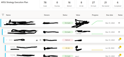
I have created a scorecard with goals and sub-goals like this:
then I have built a report using the scorecard dataset in order to be able to have a good view of data to be included as snapshot in my montlhy report in powerpoint.
of course the visual table used is not good in order to show the goals and sub-goal structure as well as the fact that the table is too long and it cannot fit into one page.
does anyone have a good suggestion on how to make a good screenshot of a table or a scorecard (socrecard for instance doesn't show the lastest comment but only the icon related to the comment) to be included into a powerpoint monthly report?
thanks for your help, Andrea
- Mark as New
- Bookmark
- Subscribe
- Mute
- Subscribe to RSS Feed
- Permalink
- Report Inappropriate Content
Hi,
How did you manage to create this table? Is it automated process?
Thanks,
Viktor
- Mark as New
- Bookmark
- Subscribe
- Mute
- Subscribe to RSS Feed
- Permalink
- Report Inappropriate Content
Hi @asc002 ,
I checked the settings in service and it seems to be by design. I didn't find any setting to fix the hierarchy.
You can submit an idea for it at https://ideas.powerbi.com/forums and wait for users with the same needs as you to vote for you to help make it happen as soon as possible.
Best Regards,
Community Support Team _Charlotte
If this post helps, then please consider Accept it as the solution to help the other members find it more quickly.
Helpful resources
| User | Count |
|---|---|
| 84 | |
| 76 | |
| 74 | |
| 49 | |
| 39 |
| User | Count |
|---|---|
| 114 | |
| 56 | |
| 51 | |
| 42 | |
| 42 |


