Join the #PBI10 DataViz contest
Power BI is turning 10, and we’re marking the occasion with a special community challenge. Use your creativity to tell a story, uncover trends, or highlight something unexpected.
Get started- Power BI forums
- Get Help with Power BI
- Desktop
- Service
- Report Server
- Power Query
- Mobile Apps
- Developer
- DAX Commands and Tips
- Custom Visuals Development Discussion
- Health and Life Sciences
- Power BI Spanish forums
- Translated Spanish Desktop
- Training and Consulting
- Instructor Led Training
- Dashboard in a Day for Women, by Women
- Galleries
- Webinars and Video Gallery
- Data Stories Gallery
- Themes Gallery
- Contests Gallery
- Quick Measures Gallery
- Notebook Gallery
- Translytical Task Flow Gallery
- R Script Showcase
- Ideas
- Custom Visuals Ideas (read-only)
- Issues
- Issues
- Events
- Upcoming Events
Join us for an expert-led overview of the tools and concepts you'll need to become a Certified Power BI Data Analyst and pass exam PL-300. Register now.
- Power BI forums
- Forums
- Get Help with Power BI
- Desktop
- Re: Scatter with date on X and time on Y
- Subscribe to RSS Feed
- Mark Topic as New
- Mark Topic as Read
- Float this Topic for Current User
- Bookmark
- Subscribe
- Printer Friendly Page
- Mark as New
- Bookmark
- Subscribe
- Mute
- Subscribe to RSS Feed
- Permalink
- Report Inappropriate Content
Scatter with date on X and time on Y
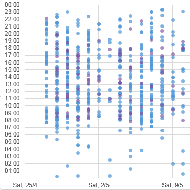
I have this chart in Excel where I plot dates on the X and hours on the Y axis. Each dot is an event. This helps visualize busy times.
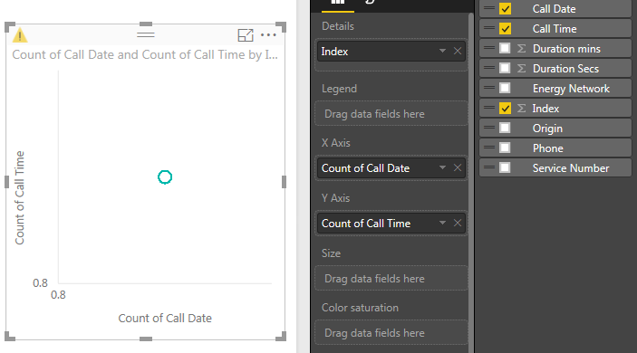
I'm trying to create the same chart in Power BI Desktop, but am failing miserably. The Y axis shows a count of times and the X axis shows a count of dates. I have created an Index column and dragged it to the details, the model shows the correct date format, but I still see only one data point in the middle of the chart. No date hierarchy. The only option is to switch to distinct count.
Is it possible to
- Mark as New
- Bookmark
- Subscribe
- Mute
- Subscribe to RSS Feed
- Permalink
- Report Inappropriate Content
Hi @teylyn,
Here is Scatter Plot - Categorical X Axis chart which will help to get categorical variable on X-axis and on Y-axis.
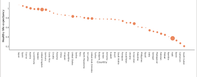
Download link for the custom visual file in this page
https://pbivizedit.com/gallery/scatter-plot-with-categorical-data
This was made with our Custom Visual creator tool PBIVizEdit.com. With this tool,
- anyone, irrespective of technical skills, can create their own visuals
- 15 minutes to create a visual from scratch
- opens up many additional attributes to edit (for e.g. labels, tooltips, legends position, etc)
Give this a shot and let us know if you face any problem/errors.
You can use the editor to modify your visual further (some modifications cannot be done in Power BI window and have to be in editor).
Thanks,
Team PBIVizEdit
- Mark as New
- Bookmark
- Subscribe
- Mute
- Subscribe to RSS Feed
- Permalink
- Report Inappropriate Content
Here's a sample workbook implementing that method - the link does not work anymore,
can you provide the new link please?
thanks
- Mark as New
- Bookmark
- Subscribe
- Mute
- Subscribe to RSS Feed
- Permalink
- Report Inappropriate Content
Hi, any chance you can show how you managed to do this in Excel? I've been trawling the web to find a way to do this in an Excel chart. So far I've only been able to produce a heatmap pivot table or a Surface chart. When I try to produce a scatter chart I can't get the time to appear on the Y axis.
- Mark as New
- Bookmark
- Subscribe
- Mute
- Subscribe to RSS Feed
- Permalink
- Report Inappropriate Content
Unreal that it lacks this simple capability; this is a fairly common use case. Needs a fix.
- Mark as New
- Bookmark
- Subscribe
- Mute
- Subscribe to RSS Feed
- Permalink
- Report Inappropriate Content
Hi Teyln,
I have similar problem now.I want simple XY scatter plot with date on x axis and times on Y axis.How can I do this using Power BI.looks like you encounterd similar problem a while back.Appreciate your help.Thanks You.
- Mark as New
- Bookmark
- Subscribe
- Mute
- Subscribe to RSS Feed
- Permalink
- Report Inappropriate Content
I got it to work correctly. It is not a huge problem, just that the charting works differently. You can get only numeric values on either axis of a scatter chart, and then split the things you are aggregating in th bubbles using details and legend. The closest you can get is datevalues (or monthvalues, or weeknum) - and you want whatever you use to represent an atomic unit in your dataset (no aggregation). Then it works quite beautifully.
- Mark as New
- Bookmark
- Subscribe
- Mute
- Subscribe to RSS Feed
- Permalink
- Report Inappropriate Content
Nopes. Doesn't work with numeric values on both the axis. I have numeric values for weekdays, and numeric values for the hour of the day. Then I want the size of bubble to be the number of vistors. Can't get it. Work perfectly in a matrix layout. But not for the scatter plot. How unintuitive. MS People may have some intelligent reason for this seemingly dumb implementation.
- Mark as New
- Bookmark
- Subscribe
- Mute
- Subscribe to RSS Feed
- Permalink
- Report Inappropriate Content
I got it to work correctly. It is not a huge problem, just that the charting works differently. You can get only numeric values on either axis of a scatter chart, and then split the things you are aggregating in th bubbles using details and legend. The closest you can get is datevalues (or monthvalues, or weeknum) - and you want whatever you use to represent an atomic unit in your dataset (no aggregation). Then it works quite beautifully.
- Mark as New
- Bookmark
- Subscribe
- Mute
- Subscribe to RSS Feed
- Permalink
- Report Inappropriate Content
I have a similar issue.I want to plot 2 months dates on x axis and time intervals in a span of 24 hours with 15 min intervals break on Y -aixs.So for each day i have 96 Time Stamps.I just need to plot on X and Y with out any aggregation.This is very imp requirement to us.So can anyone pls help.We tried but no luck,everytime trying to drag this field onto visual I am getting the count of Date and Count of time,Which doesnt make anysense.Appreciate quick response and help.
- Mark as New
- Bookmark
- Subscribe
- Mute
- Subscribe to RSS Feed
- Permalink
- Report Inappropriate Content
Ive just run into this same problem. Wow. Power BI can't handle dates on scatter plots. In 2016. For info, Tableau handles dates perfectly.
Disclaimer: I don't work for Tableau
- Mark as New
- Bookmark
- Subscribe
- Mute
- Subscribe to RSS Feed
- Permalink
- Report Inappropriate Content
I agree it's a big gap, along with not having a Duration data type in DAX (though it exists in Power Query).
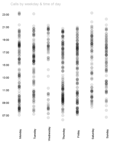
Despite their Known Limitations, you can do date-time 'scatterplots' with simple R visuals - e.g. http://stackoverflow.com/questions/7160565/how-to-create-a-time-scatterplot-with-r Though formatting, and converting to POSIXct, can be a bit fiddly.
Here's the code I used to plot Call Times by Weekday for the visual shown below:
library(ggplot2)    # Needed for ggplot
library(ggthemes)   # has a clean theme for ggplot2
library(scales)        # Needed for scale_x_datetime

#Convert the time format, and account for timezone (so X axis starts at midnight not 08:00!)
dataset$`Call Time`<- as.POSIXct(dataset$`Call Time`,format="%Y-%m-%dT%H:%M:%OS", tz="GMT")
# Avoid having to reference dataset$ each time in function calls
attach(dataset)

#Plot the dataset by Week Day (re-ordered from alphabetic) and Call Time
ggplot(dataset, aes(x=reorder(`Week Day`,`Week Day Number`), y=`Call Time`)) +
#Show points with 90% transparency to cater for overtyping, and ignore NA results in the dataset
  geom_point(alpha=0.1, size=4, na.rm=TRUE) +
#Set the X axis to hourly breaks
  scale_y_datetime(breaks=date_breaks("2 hours"), labels=date_format("%H:%M")) +

#Now some formatting
#Apply tidy Tufte theme with no axis ticks
  theme_tufte(base_family="Arial", ticks=FALSE) +
#Clear axis labels and set Title
  labs(x=NULL, y=NULL, title="Calls by weekday & time of day") +
#Rotate X axis
  theme(axis.text.x = element_text(angle = 90)) +
#Format Title
  theme(plot.title=element_text(hjust=0, color="grey", size=12))
- Mark as New
- Bookmark
- Subscribe
- Mute
- Subscribe to RSS Feed
- Permalink
- Report Inappropriate Content
HUGE PROBLEM! PLEASE SORT IT OUT MICROSOFT. Nobody wants a scatter chart that only gives you the option to have a count of values on the X and y axis...
- Mark as New
- Bookmark
- Subscribe
- Mute
- Subscribe to RSS Feed
- Permalink
- Report Inappropriate Content
The Scatter charts are designed for measures on x and y axis that is why when you add a text member is will turn this into a count - this happens in all visuals when you put a dimension member into a values field.
Edit: You can use date on the play axis.
- Mark as New
- Bookmark
- Subscribe
- Mute
- Subscribe to RSS Feed
- Permalink
- Report Inappropriate Content
seems the issue is that Power BI doesn't like using dates and times on the Axes. I tested the following and it worked.
Use an integer to represent the Day 1, 2, 3 etc
Use a decimal number to represent the time 12.5, 14.75 etc
Add a unique ID column (can be A, B, C or what ever)
Set the default aggreagation for the first 2 columns to be SUM and the third to be DO NOT Aggregate
Put the first 2 on your axes, and the third on details.
Not perfect, but it may get you going. I assume R can do this, but this looks non-trivial to get started (doable, but not trivial).
* Matt is an 8 times Microsoft MVP (Power BI) and author of the Power BI Book Supercharge Power BI.
I will not give you bad advice, even if you unknowingly ask for it.
- Mark as New
- Bookmark
- Subscribe
- Mute
- Subscribe to RSS Feed
- Permalink
- Report Inappropriate Content
@MattAllington has nailed it. I tried responding last night, but the forum was eating my replies.
Here's a sample workbook implementing that method (I use dates and an explicit measure rather than a numeric date column, but the effect is the same). This is because the axes of a scatter plot seem to only take a measure, and cannot display literal field values.
Helpful resources

Join our Fabric User Panel
This is your chance to engage directly with the engineering team behind Fabric and Power BI. Share your experiences and shape the future.

Power BI Monthly Update - June 2025
Check out the June 2025 Power BI update to learn about new features.

| User | Count |
|---|---|
| 79 | |
| 73 | |
| 58 | |
| 36 | |
| 32 |
| User | Count |
|---|---|
| 90 | |
| 62 | |
| 61 | |
| 49 | |
| 45 |
