Join us at FabCon Vienna from September 15-18, 2025
The ultimate Fabric, Power BI, SQL, and AI community-led learning event. Save €200 with code FABCOMM.
Get registered- Power BI forums
- Get Help with Power BI
- Desktop
- Service
- Report Server
- Power Query
- Mobile Apps
- Developer
- DAX Commands and Tips
- Custom Visuals Development Discussion
- Health and Life Sciences
- Power BI Spanish forums
- Translated Spanish Desktop
- Training and Consulting
- Instructor Led Training
- Dashboard in a Day for Women, by Women
- Galleries
- Data Stories Gallery
- Themes Gallery
- Contests Gallery
- Quick Measures Gallery
- Notebook Gallery
- Translytical Task Flow Gallery
- TMDL Gallery
- R Script Showcase
- Webinars and Video Gallery
- Ideas
- Custom Visuals Ideas (read-only)
- Issues
- Issues
- Events
- Upcoming Events
Enhance your career with this limited time 50% discount on Fabric and Power BI exams. Ends September 15. Request your voucher.
- Power BI forums
- Forums
- Get Help with Power BI
- Desktop
- Scatter plot with Date in X axis
- Subscribe to RSS Feed
- Mark Topic as New
- Mark Topic as Read
- Float this Topic for Current User
- Bookmark
- Subscribe
- Printer Friendly Page
- Mark as New
- Bookmark
- Subscribe
- Mute
- Subscribe to RSS Feed
- Permalink
- Report Inappropriate Content
Scatter plot with Date in X axis
Hi to all,
I have realized two measures that gives me the date at which some events occur and the intensity. The table appears like this:
| Event | Date | Intensity |
| event1 | 15/05/2022 | 20% |
| event2 | 30/05/2022 | 50% |
| event3 | 15/04/2022 | 80% |
| event4 | 31/12/2022 | 90% |
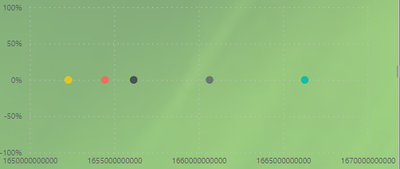
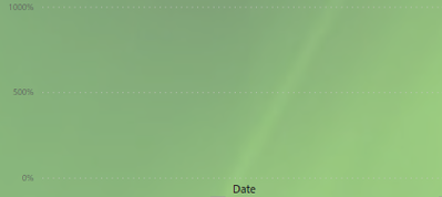
I would like to plot every event on a scatter graphic with Date in X axis and Intensity in Y axis. I tried with standard scatterplot visual but the only thing I get is some uncomprehensible "numbers" on X axis and no Date at all (as for the Intensity it is correct that in Year 2021 all event are 0%).
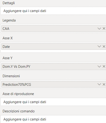
the settings a the following (sorry it is in italian!)
Can anyone give some hints?
Thanks
G
Solved! Go to Solution.
- Mark as New
- Bookmark
- Subscribe
- Mute
- Subscribe to RSS Feed
- Permalink
- Report Inappropriate Content
Hi @gunicotra
Here is Scatter Plot - Categorical X Axis chart which will help to get categorical data or Date on X-axis and also on Y-axis. Hope this helps you.
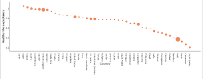

Download link for the custom visual file in this page
https://pbivizedit.com/gallery/scatter-plot-with-categorical-data
This was made with our Custom Visual creator tool PBIVizEdit.com. With this tool,
- anyone, irrespective of technical skills, can create their own visuals
- 15 minutes to create a visual from scratch
- opens up many additional attributes to edit (for e.g. labels, tooltips, legends position, etc)
Give this a shot and let us know if you face any problem/errors.
You can use the editor to modify your visual further (some modifications cannot be done in Power BI window and have to be in editor).
Thanks,
Team PBIVizEdit
- Mark as New
- Bookmark
- Subscribe
- Mute
- Subscribe to RSS Feed
- Permalink
- Report Inappropriate Content
Hi @gunicotra
Here is Scatter Plot - Categorical X Axis chart which will help to get categorical data or Date on X-axis and also on Y-axis. Hope this helps you.


Download link for the custom visual file in this page
https://pbivizedit.com/gallery/scatter-plot-with-categorical-data
This was made with our Custom Visual creator tool PBIVizEdit.com. With this tool,
- anyone, irrespective of technical skills, can create their own visuals
- 15 minutes to create a visual from scratch
- opens up many additional attributes to edit (for e.g. labels, tooltips, legends position, etc)
Give this a shot and let us know if you face any problem/errors.
You can use the editor to modify your visual further (some modifications cannot be done in Power BI window and have to be in editor).
Thanks,
Team PBIVizEdit
- Mark as New
- Bookmark
- Subscribe
- Mute
- Subscribe to RSS Feed
- Permalink
- Report Inappropriate Content
Thanks Mayank_Yavda! It works percfectly 🙂
- Mark as New
- Bookmark
- Subscribe
- Mute
- Subscribe to RSS Feed
- Permalink
- Report Inappropriate Content
@gunicotra , I see a measure on x-axis, Have tried putting the date on that?
refer if needed
https://docs.microsoft.com/en-us/power-bi/visuals/power-bi-visualization-scatter
- Mark as New
- Bookmark
- Subscribe
- Mute
- Subscribe to RSS Feed
- Permalink
- Report Inappropriate Content
Hi amitchandak!
yes I tried but this seems not to be working:
Helpful resources
| User | Count |
|---|---|
| 56 | |
| 54 | |
| 54 | |
| 49 | |
| 30 |
| User | Count |
|---|---|
| 173 | |
| 89 | |
| 70 | |
| 46 | |
| 45 |
