FabCon is coming to Atlanta
Join us at FabCon Atlanta from March 16 - 20, 2026, for the ultimate Fabric, Power BI, AI and SQL community-led event. Save $200 with code FABCOMM.
Register now!- Power BI forums
- Get Help with Power BI
- Desktop
- Service
- Report Server
- Power Query
- Mobile Apps
- Developer
- DAX Commands and Tips
- Custom Visuals Development Discussion
- Health and Life Sciences
- Power BI Spanish forums
- Translated Spanish Desktop
- Training and Consulting
- Instructor Led Training
- Dashboard in a Day for Women, by Women
- Galleries
- Data Stories Gallery
- Themes Gallery
- Contests Gallery
- QuickViz Gallery
- Quick Measures Gallery
- Visual Calculations Gallery
- Notebook Gallery
- Translytical Task Flow Gallery
- TMDL Gallery
- R Script Showcase
- Webinars and Video Gallery
- Ideas
- Custom Visuals Ideas (read-only)
- Issues
- Issues
- Events
- Upcoming Events
Get Fabric Certified for FREE during Fabric Data Days. Don't miss your chance! Request now
- Power BI forums
- Forums
- Get Help with Power BI
- Desktop
- Re: Scatter plot with 2 measures in Y Axis ( probl...
- Subscribe to RSS Feed
- Mark Topic as New
- Mark Topic as Read
- Float this Topic for Current User
- Bookmark
- Subscribe
- Printer Friendly Page
- Mark as New
- Bookmark
- Subscribe
- Mute
- Subscribe to RSS Feed
- Permalink
- Report Inappropriate Content
Scatter plot with 2 measures in Y Axis ( problem )
Hi guys,
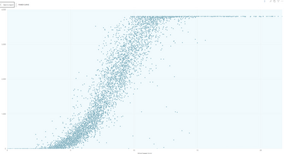
I have a problem with the scatter plot, i'm doing a power curve (for wind turbines) with
X Axis: Wind speed
Y Axis: Power
Giving something like this
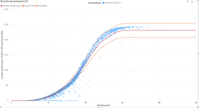
This is great, the problem is that i need to see (at the same time) the expected power, having something like this
X Axis: Wind speed
Y Axis 1: Power
Y Axis 2: Exp Power
The problem is that i can't put 2 Y axis in the visual. The other option that i have (and i used in other scatters) is to put in legend, but it is not possible in my system due to my database doesnt have these 3 valeus only and they are in columns (instead of rows).
Anyone knows another scatter plot visual or any help to do that?
Kind regards!
Did I answer your question? Mark my post as a solution! Appreciate with a Kudos!! (Click the Thumbs Up Button)
Solved! Go to Solution.
- Mark as New
- Bookmark
- Subscribe
- Mute
- Subscribe to RSS Feed
- Permalink
- Report Inappropriate Content
Hi @dobregon
Try using a Line and Clustered Column Chart. Put the Power values in the Line area.
For the Shapes (Line Values) set the Stroke Width to 0 and turn on Show Marker, then set the marker size and color. You can Customize each series individually if you wish.
Regards
Phil
Did I answer your question? Then please mark my post as the solution.
If I helped you, click on the Thumbs Up to give Kudos.
Blog :: YouTube Channel :: Connect on Linkedin
Proud to be a Super User!
- Mark as New
- Bookmark
- Subscribe
- Mute
- Subscribe to RSS Feed
- Permalink
- Report Inappropriate Content
Hi @dobregon
If it can help you I found a turnaround to have everything on a single view
I did it by superposing the scatter chart and the line chart visuals and disable the background. Then fix the Min and Max values for the X and Y axis, hiding the titles and the axis on one of the visuals and it does the trick !
Have fun,
Cado
- Mark as New
- Bookmark
- Subscribe
- Mute
- Subscribe to RSS Feed
- Permalink
- Report Inappropriate Content
Could you use Python visuals? Can you supply some sample data and I'll see what I can knock together.
Regards
Phil
Did I answer your question? Then please mark my post as the solution.
If I helped you, click on the Thumbs Up to give Kudos.
Blog :: YouTube Channel :: Connect on Linkedin
Proud to be a Super User!
- Mark as New
- Bookmark
- Subscribe
- Mute
- Subscribe to RSS Feed
- Permalink
- Report Inappropriate Content
@PhilipTreacy thanks for the reply, i've never used phyton visuals. i need to take a look more further in this type of visuals.
I have a simple/stupid question, the phyton visuals has the posibility to be filtered when you click on a project/device/whatever... from other visuals? like i have in other visual a map of projects in the world and if i click there i want that the phyton visuals will be filtered.
Regards!
Did I answer your question? Mark my post as a solution! Appreciate with a Kudos!! (Click the Thumbs Up Button)
- Mark as New
- Bookmark
- Subscribe
- Mute
- Subscribe to RSS Feed
- Permalink
- Report Inappropriate Content
Hi @dobregon
If it can help you I found a turnaround to have everything on a single view
I did it by superposing the scatter chart and the line chart visuals and disable the background. Then fix the Min and Max values for the X and Y axis, hiding the titles and the axis on one of the visuals and it does the trick !
Have fun,
Cado
- Mark as New
- Bookmark
- Subscribe
- Mute
- Subscribe to RSS Feed
- Permalink
- Report Inappropriate Content
Hello Cado, do you know if there is a way to change the scale of both plots at the same time, when we use a filter?
- Mark as New
- Bookmark
- Subscribe
- Mute
- Subscribe to RSS Feed
- Permalink
- Report Inappropriate Content
@Cado_one jaja i just find the same solution 30min ago!
It is not the best solution becasue we need to not put auto de X axis and Y axis but it seems work.
but i prefer that Microsoft creates a new visual that can do this type of thins, or new features in the scatter plots, or whatever
Thanks a lot!
Did I answer your question? Mark my post as a solution! Appreciate with a Kudos!! (Click the Thumbs Up Button)
- Mark as New
- Bookmark
- Subscribe
- Mute
- Subscribe to RSS Feed
- Permalink
- Report Inappropriate Content
I've never used Python visual yet but it's a good occasion to start 🙂
I can give you a sample data but I don't find the button to attach the file to this message and the drag & drop is not working, how do you do that ?
Regards,
Cado
- Mark as New
- Bookmark
- Subscribe
- Mute
- Subscribe to RSS Feed
- Permalink
- Report Inappropriate Content
Hi @dobregon
Try using a Line and Clustered Column Chart. Put the Power values in the Line area.
For the Shapes (Line Values) set the Stroke Width to 0 and turn on Show Marker, then set the marker size and color. You can Customize each series individually if you wish.
Regards
Phil
Did I answer your question? Then please mark my post as the solution.
If I helped you, click on the Thumbs Up to give Kudos.
Blog :: YouTube Channel :: Connect on Linkedin
Proud to be a Super User!
- Mark as New
- Bookmark
- Subscribe
- Mute
- Subscribe to RSS Feed
- Permalink
- Report Inappropriate Content
@PhilipTreacy This is very usefull, i can use it, but the problem is that i have thousand of points for me visual and the scatter plots can work with 3500 values and the line&clustered chart works with lower number of values. This produces average numbers to reduce the information
Do you know another visual / or other solution? For the moment, probably i will use it
Did I answer your question? Mark my post as a solution! Appreciate with a Kudos!! (Click the Thumbs Up Button)
- Mark as New
- Bookmark
- Subscribe
- Mute
- Subscribe to RSS Feed
- Permalink
- Report Inappropriate Content
I am currently facing the exactly same issue to build power curves for wind turbines.
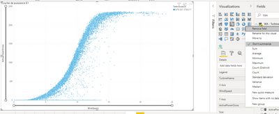
To have all the points displayed in the scatter chart we can check the "Don't summarize" option for wind speed and for power.
But with line and clustered column chart I don't have this option so I'm forced to have averaged or summed values ...
How can we deal with that ?
Best regards Cado
- Mark as New
- Bookmark
- Subscribe
- Mute
- Subscribe to RSS Feed
- Permalink
- Report Inappropriate Content
@Cado_one it seems that we are doing the same visuals (exactly wind turbine power curves :D)
The scatter plot is the good one to create the visual becasue it has a limit of 3500 points (the line chart doesnt have that number of points)
So, if you are goind to do Power VS wind, you need to use the scatter plot
The scatter plot has an option to show yo differnet points depending of the legend, so if you want to compare and you are able to use it is the best way
Related to the line clustered chart, i have used 3 measures (power, powerexpetect and wind speed) all of them with average agregation becasue the visual as it can't take all the points it needs to aggregate the information. The problem in that type of vissual is the precission, becasue scatter plot has more precision (due to number of points) than this chart.
On the other hand you can use phyton visuals that it can give to you everhing
Did I answer your question? Mark my post as a solution! Appreciate with a Kudos!! (Click the Thumbs Up Button)
Helpful resources

Power BI Monthly Update - November 2025
Check out the November 2025 Power BI update to learn about new features.

Fabric Data Days
Advance your Data & AI career with 50 days of live learning, contests, hands-on challenges, study groups & certifications and more!


