A new Data Days event is coming soon!
This time we’re going bigger than ever. Fabric, Power BI, SQL, AI and more. We're covering it all. You won't want to miss it.
Learn more- Power BI forums
- Get Help with Power BI
- Desktop
- Service
- Report Server
- Power Query
- Mobile Apps
- Developer
- DAX Commands and Tips
- Custom Visuals Development Discussion
- Health and Life Sciences
- Power BI Spanish forums
- Translated Spanish Desktop
- Training and Consulting
- Instructor Led Training
- Dashboard in a Day for Women, by Women
- Galleries
- Data Stories Gallery
- Themes Gallery
- Contests Gallery
- QuickViz Gallery
- Quick Measures Gallery
- Visual Calculations Gallery
- Notebook Gallery
- Translytical Task Flow Gallery
- TMDL Gallery
- R Script Showcase
- Webinars and Video Gallery
- Ideas
- Custom Visuals Ideas (read-only)
- Issues
- Issues
- Events
- Upcoming Events
Level up your Power BI skills this month - build one visual each week and tell better stories with data! Get started
- Power BI forums
- Forums
- Get Help with Power BI
- Desktop
- Scatter plot colours
- Subscribe to RSS Feed
- Mark Topic as New
- Mark Topic as Read
- Float this Topic for Current User
- Bookmark
- Subscribe
- Printer Friendly Page
- Mark as New
- Bookmark
- Subscribe
- Mute
- Subscribe to RSS Feed
- Permalink
- Report Inappropriate Content
Scatter plot colours
Hi, have I gone blind? I am not able to find how to change data colours on the scatter chart. Is it possible?
Cheers
Sam
Solved! Go to Solution.
- Mark as New
- Bookmark
- Subscribe
- Mute
- Subscribe to RSS Feed
- Permalink
- Report Inappropriate Content
@Baskar I have that but I cant customise the colours if I have a play axis. I guess I just need to put up with the default ones. No doubt in time it will be fixed.
- Mark as New
- Bookmark
- Subscribe
- Mute
- Subscribe to RSS Feed
- Permalink
- Report Inappropriate Content
Hi!
To change the colors of the scatter plot's bubbles, you need to change theme color.
So select the plot, go to VIEW (top bar) --> themes, and choose or create a theme with the colors you like.
Hope it helps
- Mark as New
- Bookmark
- Subscribe
- Mute
- Subscribe to RSS Feed
- Permalink
- Report Inappropriate Content
Hi @samdthompson ,
You can do the following:
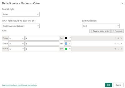
1. Go to Format your visual
2. Expand Markers
3. Expand Color
4. Put the field you want to use as a legend and format it accordingly.
Note: Make sure not to add any field to your legend section.
Hope this helps
- Mark as New
- Bookmark
- Subscribe
- Mute
- Subscribe to RSS Feed
- Permalink
- Report Inappropriate Content
Can I change the colour of markers above a trend line, and below a trend line?
So the ones above the trend line are good and below are bad? Or because it's a trend line I can't create a measure to specify?
- Mark as New
- Bookmark
- Subscribe
- Mute
- Subscribe to RSS Feed
- Permalink
- Report Inappropriate Content
Hi
I am using a bubble scatter plot with many many legends accross many countries.
Because it gets confusing, what I want to do is set the colour of all the bubbles in a specific one (let s say black) and then change 10-15 bubbles of interest to other colours.
How can I do this?
The default colours Powerbi gives me are different for each legend and it will take me hours to make them all black manually. I need to set a default for all of them and then mannually change the ones I want.
Any ideas?
Thanks
- Mark as New
- Bookmark
- Subscribe
- Mute
- Subscribe to RSS Feed
- Permalink
- Report Inappropriate Content
Hey @samdthompson,
If you are using the default Scater Plot visual, then it is the first option under the format tab. See below:
Hope this helps,
Alan
- Mark as New
- Bookmark
- Subscribe
- Mute
- Subscribe to RSS Feed
- Permalink
- Report Inappropriate Content
Yeah, it seems to fall apart since i have the play axis on. Thats super wierd.
- Mark as New
- Bookmark
- Subscribe
- Mute
- Subscribe to RSS Feed
- Permalink
- Report Inappropriate Content
Instead of changing the color put the column in legend .
- Mark as New
- Bookmark
- Subscribe
- Mute
- Subscribe to RSS Feed
- Permalink
- Report Inappropriate Content
@Baskar I have that but I cant customise the colours if I have a play axis. I guess I just need to put up with the default ones. No doubt in time it will be fixed.
- Mark as New
- Bookmark
- Subscribe
- Mute
- Subscribe to RSS Feed
- Permalink
- Report Inappropriate Content
It's been more than a year and I had the same problem, when you animate the scatter chart you can't change colors
Helpful resources

Power BI Monthly Update - April 2026
Check out the April 2026 Power BI update to learn about new features.

Data Days 2026 coming soon!
Sign up to receive a private message when registration opens and key events begin.

New to Fabric Survey
If you have recently started exploring Fabric, we'd love to hear how it's going. Your feedback can help with product improvements.

| User | Count |
|---|---|
| 36 | |
| 33 | |
| 31 | |
| 24 | |
| 18 |
| User | Count |
|---|---|
| 66 | |
| 50 | |
| 33 | |
| 24 | |
| 24 |


