Fabric Data Days starts November 4th!
Advance your Data & AI career with 50 days of live learning, dataviz contests, hands-on challenges, study groups & certifications and more!
Get registered- Power BI forums
- Get Help with Power BI
- Desktop
- Service
- Report Server
- Power Query
- Mobile Apps
- Developer
- DAX Commands and Tips
- Custom Visuals Development Discussion
- Health and Life Sciences
- Power BI Spanish forums
- Translated Spanish Desktop
- Training and Consulting
- Instructor Led Training
- Dashboard in a Day for Women, by Women
- Galleries
- Data Stories Gallery
- Themes Gallery
- Contests Gallery
- Quick Measures Gallery
- Visual Calculations Gallery
- Notebook Gallery
- Translytical Task Flow Gallery
- TMDL Gallery
- R Script Showcase
- Webinars and Video Gallery
- Ideas
- Custom Visuals Ideas (read-only)
- Issues
- Issues
- Events
- Upcoming Events
Join us at FabCon Atlanta from March 16 - 20, 2026, for the ultimate Fabric, Power BI, AI and SQL community-led event. Save $200 with code FABCOMM. Register now.
- Power BI forums
- Forums
- Get Help with Power BI
- Desktop
- Re: Scatter chart and multiple data series
- Subscribe to RSS Feed
- Mark Topic as New
- Mark Topic as Read
- Float this Topic for Current User
- Bookmark
- Subscribe
- Printer Friendly Page
- Mark as New
- Bookmark
- Subscribe
- Mute
- Subscribe to RSS Feed
- Permalink
- Report Inappropriate Content
Scatter chart and multiple data series
I am new to the Power BI and I want to create a scatter chart with two date series. Each one should have a different color.
The first one has the columns: X1, Y1
The second one: X2, Y2
My table contains four columns X1, Y1, X2 and Y2.
I fail with inserting the second data series to the scatter chart. The only idea I have got is to make two transparent diagrams overeach other.
Thank you,
Solved! Go to Solution.
- Mark as New
- Bookmark
- Subscribe
- Mute
- Subscribe to RSS Feed
- Permalink
- Report Inappropriate Content
Hi @GIvanov ,
According to your description, here are my steps you can follow as a solution.
(1) This is my test data.
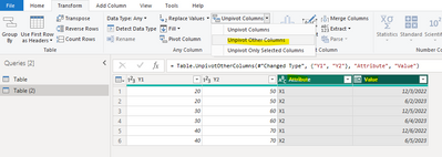
(2)Click "transform data" to enter the power query editor, then select [y1] and [y2] columns, click to transpose other columns, then select [Attribute] and [Value] columns, click to transpose other columns, and then click close and apply.
(3)We can create a calculated column.
Legend = SWITCH(TRUE(),
AND(CONTAINSSTRING('Table'[Attribute-x],1) ,CONTAINSSTRING('Table'[Attribute-y],1)),1,
AND(CONTAINSSTRING('Table'[Attribute-x],2) ,CONTAINSSTRING('Table'[Attribute-y],2)),2)
(4)Then we can create a table.
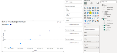
Table 2 = FILTER('Table','Table'[Legend]=1 || 'Table'[Legend]=2)(5) Then the result is as follows.
Best Regards,
Neeko Tang
If this post helps, then please consider Accept it as the solution to help the other members find it more quickly.
- Mark as New
- Bookmark
- Subscribe
- Mute
- Subscribe to RSS Feed
- Permalink
- Report Inappropriate Content
Helpful resources

FabCon Global Hackathon
Join the Fabric FabCon Global Hackathon—running virtually through Nov 3. Open to all skill levels. $10,000 in prizes!

Power BI Monthly Update - October 2025
Check out the October 2025 Power BI update to learn about new features.

| User | Count |
|---|---|
| 79 | |
| 38 | |
| 31 | |
| 27 | |
| 27 |


