FabCon is coming to Atlanta
Join us at FabCon Atlanta from March 16 - 20, 2026, for the ultimate Fabric, Power BI, AI and SQL community-led event. Save $200 with code FABCOMM.
Register now!- Power BI forums
- Get Help with Power BI
- Desktop
- Service
- Report Server
- Power Query
- Mobile Apps
- Developer
- DAX Commands and Tips
- Custom Visuals Development Discussion
- Health and Life Sciences
- Power BI Spanish forums
- Translated Spanish Desktop
- Training and Consulting
- Instructor Led Training
- Dashboard in a Day for Women, by Women
- Galleries
- Data Stories Gallery
- Themes Gallery
- Contests Gallery
- QuickViz Gallery
- Quick Measures Gallery
- Visual Calculations Gallery
- Notebook Gallery
- Translytical Task Flow Gallery
- TMDL Gallery
- R Script Showcase
- Webinars and Video Gallery
- Ideas
- Custom Visuals Ideas (read-only)
- Issues
- Issues
- Events
- Upcoming Events
The Power BI Data Visualization World Championships is back! Get ahead of the game and start preparing now! Learn more
- Power BI forums
- Forums
- Get Help with Power BI
- Desktop
- Scatter Plot with a target line and an average lin...
- Subscribe to RSS Feed
- Mark Topic as New
- Mark Topic as Read
- Float this Topic for Current User
- Bookmark
- Subscribe
- Printer Friendly Page
- Mark as New
- Bookmark
- Subscribe
- Mute
- Subscribe to RSS Feed
- Permalink
- Report Inappropriate Content
Scatter Plot with a target line and an average line
I've a dataset with Month and some values, I also have the target information and also the average information
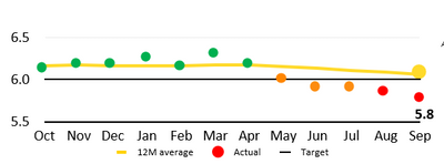
I was wondering how do I visualize all of this in the format below
For instance consider the below dataset
| value | month |
| 67.42436398 | November 1, 2020 |
| 68.32667872 | October 1, 2020 |
| 68.33531963 | September 1, 2020 |
| 69.05157567 | August 1, 2020 |
| 69.99631021 | July 1, 2020 |
| 70.36755373 | June 1, 2020 |
| 70.58675967 | May 1, 2020 |
| 70.34220032 | April 1, 2020 |
| 70.44322918 | March 1, 2020 |
| 71.29026149 | February 1, 2020 |
| 71.16770719 | January 1, 2020 |
| 70.71456397 | December 1, 2019 |
The target could be 70%, now every values above the target would be green, every value thats on the target would be yeelow and those below would be red and the average line (yellow line) would be constant in my case
I'm having a hard time finding any extenal visuals that can help with this
Thanks
Solved! Go to Solution.
- Mark as New
- Bookmark
- Subscribe
- Mute
- Subscribe to RSS Feed
- Permalink
- Report Inappropriate Content
Hi @dollarvora
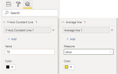
You can create a measure for dot color like below. Put Month in X axis and Value in Y axis. Format Data colors by Field value based on below measure. Then add a Y-Axis Constant Line with value 70 and an Average Line for Value. You can change their colors and line styles.
Dot Color =
VAR thisValue =
    SELECTEDVALUE ( 'Table'[value] )
VAR targetValue = 70
RETURN
    SWITCH (
        TRUE (),
        thisValue > targetValue, "Green",
        thisValue = targetValue, "Yellow",
        thisValue < targetValue, "Red"
    )
Kindly let me know if this helps.
Community Support Team _ Jing Zhang
If this post helps, please consider Accept it as the solution to help other members find it.
- Mark as New
- Bookmark
- Subscribe
- Mute
- Subscribe to RSS Feed
- Permalink
- Report Inappropriate Content
@dollarvora , You will be able to color, Bu will not able draw excat like. Because power will allow on simple Avg line
I have done 4 color, you can do 2
Line in added in this video
Helpful resources

Power BI Dataviz World Championships
The Power BI Data Visualization World Championships is back! Get ahead of the game and start preparing now!

| User | Count |
|---|---|
| 61 | |
| 54 | |
| 41 | |
| 41 | |
| 22 |
| User | Count |
|---|---|
| 171 | |
| 136 | |
| 119 | |
| 80 | |
| 54 |


