FabCon is coming to Atlanta
Join us at FabCon Atlanta from March 16 - 20, 2026, for the ultimate Fabric, Power BI, AI and SQL community-led event. Save $200 with code FABCOMM.
Register now!- Power BI forums
- Get Help with Power BI
- Desktop
- Service
- Report Server
- Power Query
- Mobile Apps
- Developer
- DAX Commands and Tips
- Custom Visuals Development Discussion
- Health and Life Sciences
- Power BI Spanish forums
- Translated Spanish Desktop
- Training and Consulting
- Instructor Led Training
- Dashboard in a Day for Women, by Women
- Galleries
- Data Stories Gallery
- Themes Gallery
- Contests Gallery
- QuickViz Gallery
- Quick Measures Gallery
- Visual Calculations Gallery
- Notebook Gallery
- Translytical Task Flow Gallery
- TMDL Gallery
- R Script Showcase
- Webinars and Video Gallery
- Ideas
- Custom Visuals Ideas (read-only)
- Issues
- Issues
- Events
- Upcoming Events
The Power BI Data Visualization World Championships is back! Get ahead of the game and start preparing now! Learn more
- Power BI forums
- Forums
- Get Help with Power BI
- Desktop
- Scatter Plot or Line Plot with correctly spaced X ...
- Subscribe to RSS Feed
- Mark Topic as New
- Mark Topic as Read
- Float this Topic for Current User
- Bookmark
- Subscribe
- Printer Friendly Page
- Mark as New
- Bookmark
- Subscribe
- Mute
- Subscribe to RSS Feed
- Permalink
- Report Inappropriate Content
Scatter Plot or Line Plot with correctly spaced X values
I'm trying to create a scatter plot with x and y values, similar to how I would do it in Excel. I can write a query to associate distinct numeric x and y values, but when I plot these values, the scatterplot is drawn so that all plots are evenly spaced along the x axis.
For instance, I have three points, (2, 3), (3, 5), and (5, 8). Each point is correctly drawn along the y axis at y=3, 5, and 8, respectively. However, while I would expect (3, 5) and (5, 😎 to be twice the distance along the x-axis as (2, 3) and (3, 5) are, they are instead evenly spaced. Displaying my data as a line plot produces similar behavior.
Each data point also has its own label along the x axis, rather than periodically labeling values as is done with the y-axis. My guess is that it's because Power BI is treating my x-axis data as categories, which would also explain the spacing behavior.
Any idea why this is happening, and how to get the scatterplot to behave like Excel?
EDIT: A scatterplot in R (drag in the data values from the PowerBI query, use "plot(dataset)") also works correctly. So it's not an issue with my data being malformed.
Solved! Go to Solution.
- Mark as New
- Bookmark
- Subscribe
- Mute
- Subscribe to RSS Feed
- Permalink
- Report Inappropriate Content
Hi @Hansinator255 ,
What is your desired result?
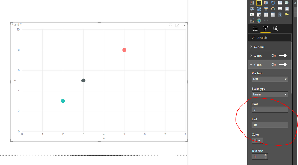
You could modify the X distance and Y distance for your visual in the setting:
Regards,
Daniel He
If this post helps, then please consider Accept it as the solution to help the other members find it more quickly.
- Mark as New
- Bookmark
- Subscribe
- Mute
- Subscribe to RSS Feed
- Permalink
- Report Inappropriate Content
OK, I think I figured it out. While my data is numerical, it was not being statically typed as such, and I had to add a Change Type step to my query to change the X and Y columns to Decimal Number. When I did this, the X and Y axes appeared correctly scaled and I could modify the axis scales for both.
- Mark as New
- Bookmark
- Subscribe
- Mute
- Subscribe to RSS Feed
- Permalink
- Report Inappropriate Content
Hi @Hansinator255 ,
What is your desired result?
You could modify the X distance and Y distance for your visual in the setting:
Regards,
Daniel He
If this post helps, then please consider Accept it as the solution to help the other members find it more quickly.
- Mark as New
- Bookmark
- Subscribe
- Mute
- Subscribe to RSS Feed
- Permalink
- Report Inappropriate Content
@v-danhe-msftThat does look like what I want, and I do get those options for the Y axis on my data. I do not, however, get those options on my X axis and instead get options for displaying categories, even though both my x and y values are numeric.
Note also that an R scatterplot displays this data correctly. I've edited the question post to reflect this.
- Mark as New
- Bookmark
- Subscribe
- Mute
- Subscribe to RSS Feed
- Permalink
- Report Inappropriate Content
Hi @Hansinator255 ,
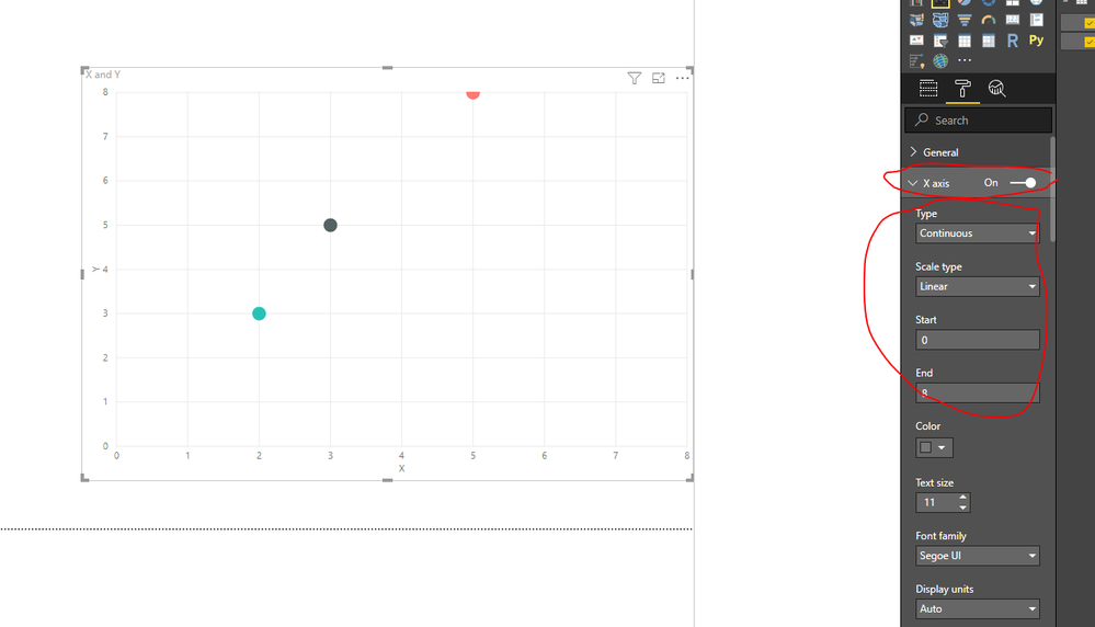
It do could set with the X-axis on my side:
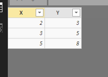
My data(all number):
I suggest you test again or you could download my pbix file to have a view.
Regards,
Daniel He
If this post helps, then please consider Accept it as the solution to help the other members find it more quickly.
- Mark as New
- Bookmark
- Subscribe
- Mute
- Subscribe to RSS Feed
- Permalink
- Report Inappropriate Content
OK, I think I figured it out. While my data is numerical, it was not being statically typed as such, and I had to add a Change Type step to my query to change the X and Y columns to Decimal Number. When I did this, the X and Y axes appeared correctly scaled and I could modify the axis scales for both.
Helpful resources

Power BI Dataviz World Championships
The Power BI Data Visualization World Championships is back! Get ahead of the game and start preparing now!

| User | Count |
|---|---|
| 38 | |
| 37 | |
| 33 | |
| 32 | |
| 29 |
| User | Count |
|---|---|
| 132 | |
| 88 | |
| 82 | |
| 68 | |
| 64 |


