Join the #PBI10 DataViz contest
Power BI is turning 10, and we’re marking the occasion with a special community challenge. Use your creativity to tell a story, uncover trends, or highlight something unexpected.
Get started- Power BI forums
- Get Help with Power BI
- Desktop
- Service
- Report Server
- Power Query
- Mobile Apps
- Developer
- DAX Commands and Tips
- Custom Visuals Development Discussion
- Health and Life Sciences
- Power BI Spanish forums
- Translated Spanish Desktop
- Training and Consulting
- Instructor Led Training
- Dashboard in a Day for Women, by Women
- Galleries
- Webinars and Video Gallery
- Data Stories Gallery
- Themes Gallery
- Contests Gallery
- Quick Measures Gallery
- Notebook Gallery
- Translytical Task Flow Gallery
- R Script Showcase
- Ideas
- Custom Visuals Ideas (read-only)
- Issues
- Issues
- Events
- Upcoming Events
Join us for an expert-led overview of the tools and concepts you'll need to become a Certified Power BI Data Analyst and pass exam PL-300. Register now.
- Power BI forums
- Forums
- Get Help with Power BI
- Desktop
- Re: Scatter Plot for % Variance of Monthly Data on...
- Subscribe to RSS Feed
- Mark Topic as New
- Mark Topic as Read
- Float this Topic for Current User
- Bookmark
- Subscribe
- Printer Friendly Page
- Mark as New
- Bookmark
- Subscribe
- Mute
- Subscribe to RSS Feed
- Permalink
- Report Inappropriate Content
Scatter Plot for % Variance of Monthly Data on Y axis and Yearly Data on X Axis against Select Date
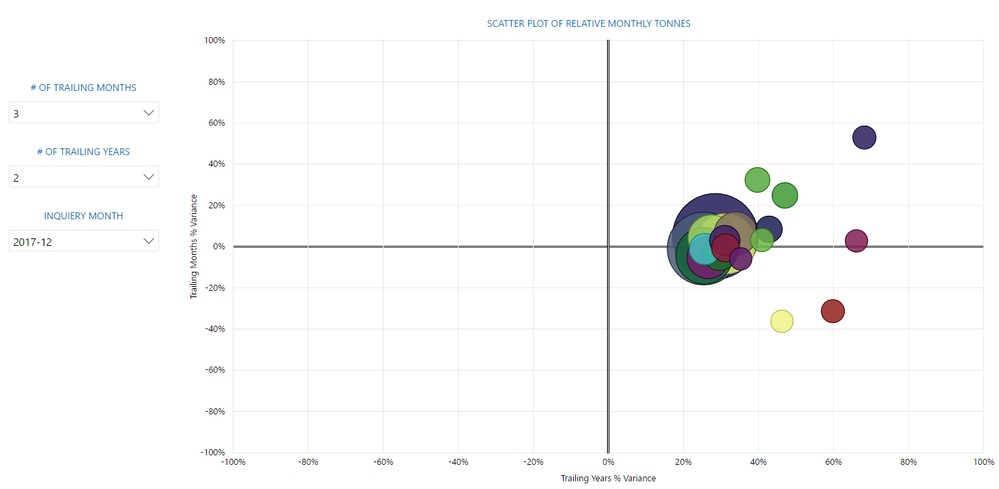
I'm looking for an easier way to create a scatter plot where I can plot the relative variance of Tonnes Collected in the past R months on the Y-axis and relative variance of Tonnes Collected in the past S years for that given month on the X-axis (where R is a selector where you can select 1-12 months, and S is a selector where you can select 1-5 years). The idea is that I can select a given month, say January 2018, and the scatter chart will display the % variance every collector has from the tonnes they collected, on average, in November and December of 2017 on the Y-axis, and the % variance every collector has from the tonnes they collected, on average, in January 2017 and January 2016. This will let me quickly find collectors who are outliers that have made a drastic change to how many tonnes they are collecting, without having to go through and analyse each collector individually.
I have a very ugly solution which I don't think is actually working for the year over year variance. I'm sure there is an easier way to do it but I keep getting hung up on how I will allow the user to select the month he or she wants to analyse, and then have the data compile to that relative date. My crude solution uses two date tables but they need to be unlinked otherwise they filter each other. I'm not sure what question to ask as I'm not sure the best way to tackle this problem, any suggestions or links to existing solutoins are much welcomed!
- Mark as New
- Bookmark
- Subscribe
- Mute
- Subscribe to RSS Feed
- Permalink
- Report Inappropriate Content
Hi @Samboko,
I aggree with your solution that use two unrelated data tables. Per my understanding, if we select a date (for example 2017-12) and specify the previous month number, for example, 3 months, the dataview will be filtered from 2017/9~2017/11. That case, other records are filtered out in visual, we are not able to get and display values in previous years.
Regards,
Yuliana Gu
If this post helps, then please consider Accept it as the solution to help the other members find it more quickly.
Helpful resources

Join our Fabric User Panel
This is your chance to engage directly with the engineering team behind Fabric and Power BI. Share your experiences and shape the future.

Power BI Monthly Update - June 2025
Check out the June 2025 Power BI update to learn about new features.

| User | Count |
|---|---|
| 80 | |
| 76 | |
| 61 | |
| 36 | |
| 32 |
| User | Count |
|---|---|
| 91 | |
| 60 | |
| 59 | |
| 49 | |
| 45 |

