FabCon is coming to Atlanta
Join us at FabCon Atlanta from March 16 - 20, 2026, for the ultimate Fabric, Power BI, AI and SQL community-led event. Save $200 with code FABCOMM.
Register now!- Power BI forums
- Get Help with Power BI
- Desktop
- Service
- Report Server
- Power Query
- Mobile Apps
- Developer
- DAX Commands and Tips
- Custom Visuals Development Discussion
- Health and Life Sciences
- Power BI Spanish forums
- Translated Spanish Desktop
- Training and Consulting
- Instructor Led Training
- Dashboard in a Day for Women, by Women
- Galleries
- Data Stories Gallery
- Themes Gallery
- Contests Gallery
- QuickViz Gallery
- Quick Measures Gallery
- Visual Calculations Gallery
- Notebook Gallery
- Translytical Task Flow Gallery
- TMDL Gallery
- R Script Showcase
- Webinars and Video Gallery
- Ideas
- Custom Visuals Ideas (read-only)
- Issues
- Issues
- Events
- Upcoming Events
Learn from the best! Meet the four finalists headed to the FINALS of the Power BI Dataviz World Championships! Register now
- Power BI forums
- Forums
- Get Help with Power BI
- Desktop
- Re: Scatter Plot Incorrectly Aggregates & Labe...
- Subscribe to RSS Feed
- Mark Topic as New
- Mark Topic as Read
- Float this Topic for Current User
- Bookmark
- Subscribe
- Printer Friendly Page
- Mark as New
- Bookmark
- Subscribe
- Mute
- Subscribe to RSS Feed
- Permalink
- Report Inappropriate Content
Scatter Plot Incorrectly Aggregates & Labels Non Numeric Data
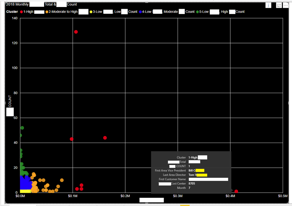
I have built a scatter plot, but the labeling of non-numeric data is being incorrectly aggregated and labeled. The data is a count of events and a total spend (actual metric labels removed for security) for each of our sites in 2018. A site could thus have up to 12 indidivual points on this scatter plot, 1 for each month.
The problem is that in my tooltip a first and last aggregation is placed on the Area Vice President and the Area Director. The label says the AVP and Director is Bill C and Tom V when it should be Rob M and Rachelle W (see data below). I want there to be no aggregation on these points, the same way that I have no aggregation on my Total, Count, Cost Center, Month, Cluster label, etc.
Does anyone have any idea why I cannot remove this aggregation on my non numeric data?
Here is an example of the data structure:
Row | Customer Account Number | Customer Name | Cost Center | Area Vice President | Area Director | Year | Month | COUNT | Total | Cluster |
1078 | ABC123 | Customer A | 8705 | Rob M | Rachelle W | 2018 | 4 | 1 | 0 | 3 |
1079 | ABC123 | Customer A | 8705 | Rob M | Rachelle W | 2018 | 7 | 1 | $410,000 | 1 |
1080 | ABC123 | Customer A | 8705 | Rob M | Rachelle W | 2018 | 10 | 1 | $1,000 | 3 |
Here is a picture of the scatterplot and the incorrect aggregation and labeling:
Solved! Go to Solution.
- Mark as New
- Bookmark
- Subscribe
- Mute
- Subscribe to RSS Feed
- Permalink
- Report Inappropriate Content
hi, @Anonymous
For the field in tooltip, it must be aggregated.
But you could use CONCATENATEX Funtion to create a measure as below then use it in tooltip.
Measure = CONCATENATEX(VALUES(Table1[Area Vice President]),[Area Vice President],UNICHAR(10))
Best Regards,
Lin
If this post helps, then please consider Accept it as the solution to help the other members find it more quickly.
Helpful resources

Join our Fabric User Panel
Share feedback directly with Fabric product managers, participate in targeted research studies and influence the Fabric roadmap.

Power BI Monthly Update - February 2026
Check out the February 2026 Power BI update to learn about new features.

| User | Count |
|---|---|
| 62 | |
| 54 | |
| 40 | |
| 17 | |
| 14 |
| User | Count |
|---|---|
| 96 | |
| 83 | |
| 36 | |
| 30 | |
| 25 |

