FabCon is coming to Atlanta
Join us at FabCon Atlanta from March 16 - 20, 2026, for the ultimate Fabric, Power BI, AI and SQL community-led event. Save $200 with code FABCOMM.
Register now!- Power BI forums
- Get Help with Power BI
- Desktop
- Service
- Report Server
- Power Query
- Mobile Apps
- Developer
- DAX Commands and Tips
- Custom Visuals Development Discussion
- Health and Life Sciences
- Power BI Spanish forums
- Translated Spanish Desktop
- Training and Consulting
- Instructor Led Training
- Dashboard in a Day for Women, by Women
- Galleries
- Data Stories Gallery
- Themes Gallery
- Contests Gallery
- QuickViz Gallery
- Quick Measures Gallery
- Visual Calculations Gallery
- Notebook Gallery
- Translytical Task Flow Gallery
- TMDL Gallery
- R Script Showcase
- Webinars and Video Gallery
- Ideas
- Custom Visuals Ideas (read-only)
- Issues
- Issues
- Events
- Upcoming Events
The Power BI Data Visualization World Championships is back! Get ahead of the game and start preparing now! Learn more
- Power BI forums
- Forums
- Get Help with Power BI
- Desktop
- Re: Scatter Chart using the same column for differ...
- Subscribe to RSS Feed
- Mark Topic as New
- Mark Topic as Read
- Float this Topic for Current User
- Bookmark
- Subscribe
- Printer Friendly Page
- Mark as New
- Bookmark
- Subscribe
- Mute
- Subscribe to RSS Feed
- Permalink
- Report Inappropriate Content
Scatter Chart using the same column for different filters
Hi,
I have a new problem that I couldn't solve by my self yet 🙂
I have this table:
| Var1 | 1.52 |
| Var2 | 1.53 |
| Var1 | 2.1 |
| Var1 | 2.3 |
| Var2 | 2.11 |
| Var2 | 2.22 |
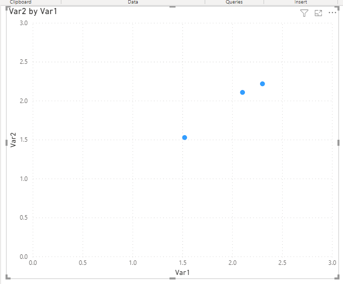
I need to get a Scatter Chart with Var1 as X axis and Var2 as Y axis.
Is this possible?
And it's possible to have slicers to select that vars from slicers?
Thanks!
Solved! Go to Solution.
- Mark as New
- Bookmark
- Subscribe
- Mute
- Subscribe to RSS Feed
- Permalink
- Report Inappropriate Content
@rmocca , Try to pivot this table and then try
https://radacad.com/pivot-and-unpivot-with-power-bi
Transpose : https://yodalearning.com/tutorials/power-query-helps-transposing-data/
- Mark as New
- Bookmark
- Subscribe
- Mute
- Subscribe to RSS Feed
- Permalink
- Report Inappropriate Content
Hi @rmocca
Please see this PBIX file for the code to pivot your data and the scatter visual with slicers.
Regards
Phil
If I answered your question please mark my post as the solution.
If my answer helped solve your problem, give it a kudos by clicking on the Thumbs Up.
Did I answer your question? Then please mark my post as the solution.
If I helped you, click on the Thumbs Up to give Kudos.
Blog :: YouTube Channel :: Connect on Linkedin
Proud to be a Super User!
- Mark as New
- Bookmark
- Subscribe
- Mute
- Subscribe to RSS Feed
- Permalink
- Report Inappropriate Content
@rmocca , Try to pivot this table and then try
https://radacad.com/pivot-and-unpivot-with-power-bi
Transpose : https://yodalearning.com/tutorials/power-query-helps-transposing-data/
- Mark as New
- Bookmark
- Subscribe
- Mute
- Subscribe to RSS Feed
- Permalink
- Report Inappropriate Content
Hi,
I've tried this solution again, duplicating the table and I was able to create the scatter chart successfully.
Thank you.
Regardin selecting variables from a slicer and set them as X and Y axis, is that possible?
- Mark as New
- Bookmark
- Subscribe
- Mute
- Subscribe to RSS Feed
- Permalink
- Report Inappropriate Content
Hi @rmocca,
>>Regardin selecting variables from a slicer and set them as X and Y axis, is that possible?
I don't think this is possible to achieve on your sample table.
AFAIK, current power bi does not allow to use measure expressions as chart axis and it also not support to create dynamic calculated column/table based on slicer/filter selections.
For your scenario, you need to map the value with specific group values first(e.g. id 1, var1; id1, var2...), then you can use the value field on-axis and use slicer with var fields to control which value displayed.
After these steps, you can create a new table with 'var' types and create a slicer with new table fields. Then you can write a measure expression to lookup value from the raw table based on the current axis value and selected 'var' type.
Regards,
Xiaoxin Sheng
- Mark as New
- Bookmark
- Subscribe
- Mute
- Subscribe to RSS Feed
- Permalink
- Report Inappropriate Content
Thanks for your help, but I couldn't make it work.
I don't know how to apply this two things to my model.
I have many other reportes made with the same table, so in the momento I've started to make this changes everything stopped working.
I hope there is an easier way to do that simple report.
Thanks anyway.
Helpful resources

Power BI Dataviz World Championships
The Power BI Data Visualization World Championships is back! Get ahead of the game and start preparing now!

Power BI Monthly Update - November 2025
Check out the November 2025 Power BI update to learn about new features.

| User | Count |
|---|---|
| 66 | |
| 45 | |
| 42 | |
| 29 | |
| 19 |
| User | Count |
|---|---|
| 202 | |
| 130 | |
| 102 | |
| 72 | |
| 55 |

